
Ordinations (Data Reduction and Visualization)
44 Visualizing and Interpreting Ordinations
Learning Objectives
To understand how to interpret and customize ordination graphics.
To assess internal patterns by relating response variables to ordination axes and to one another in the ordination space.
To assess external patterns by considering the characteristics of the explanatory variables:
- Continuous variables can be shown as vectors and/or surfaces, and some ordinations can be rotated to maximize alignment with them
- Categorical variables can be shown as centroids, drawn with altered symbologies, and/or connected using spiders, hulls, and ellipses
Examples
require(vegan, tidyverse, ggvegan, ggordiplots)
Introduction
We’ve discussed a wide range of ordination techniques. Regardless of the technique used, it is important to understand some key principles for visualizing and interpreting ordinations. Here, I provide some general interpretation tips and then consider ways to delve into them, focusing on:
- Internal patterns – patterns from data that were part of the response matrix
- External patterns – relationships between an ordination and data that were not part of the response matrix. We often call these explanatory variables, but they may not be statistically related to the data. The ways that external patterns are explored differ with the characteristics of the variable:
- Continuously distributed variables
- Categorical variables
Note: This chapter focuses on two-dimensional graphs. Three-dimensional graphs are also available through several packages in R – see the PCA chapter for examples. See also vegan::ordisplom() and vegan::ordicloud().
Oak Example
We’ll use the oak plant community dataset to illustrate graphical procedures. Use the load.oak.data.R script to load and make initial adjustments to the oak plant community dataset. The resulting object, Oak1, contains abundances of the 103 most abundant species, each relativized by its maxima.
source("scripts/load.oak.data.R")
Use the quick.metaMDS() function to conduct a NMDS ordination of the Oak1 object for use below. To ensure repeatability of graphics, we’ll set the random number generator immediately before doing so.
source("functions/quick.metaMDS.R")
set.seed(42)
Oak1.z <- quick.metaMDS(dataframe = Oak1,

dimensions = 3)
We’re using a NMDS ordination here because of its flexibility, but many of the techniques discussed here can also be applied to other types of ordinations.
ggplot2 Extensions
The graphical approaches that are described below are available in base R, but many of them have also been ‘translated’ for use within the ggplot2 ‘universe. This often requires re-organizing the data or automating the production of special types of graphics. I illustrate two such packages below.
Dozens of packages have been written that extend ggplot2. To see them, scroll through the list of packages available through CRAN that start with ‘gg’:
https://cran.r-project.org/web/packages/available_packages_by_name.html#available-packages-G
Some highlights that provide additional controls to existing ggplot2 objects:
aplot– aligns subplots to a main plotcowplot– aligns plots and arranges them into complex compound figuresggalt– extra coordinate systems, geoms, transformations, and scalesggExtra– adds marginal histograms/boxplots/density plots to scatterplotsggiraph– makesggplotgraphics interactiveggpubr– publication-ready plotsggrepel– automatically position non-overlapping text labelsggsci– color palettes used by various scientific journals (plus sci-fi movies, TV shows, etc.)ggstar– large range of symbol shapesggtea– palettes and themesggthemes– extra themes, scales, and geoms, including some to replicate the look of graphics by Edward Tuftehrbrthemes– extra themes, scales, and utilities, with an emphasis on typographylemon– tweaks for legends and axis lines, including in facetstvthemes– themes and palettes based on TV showsxkcd– creates graphs using the XKCD style
And, some packages that provide specific types of geometries:
gapmap– gapped clustered heatmap: a heat map with associated dendrogram(s), but with gaps in the heatmap between the groups identified in the dendrogramggalluvial– alluvial plotsggasym– asymmetric square matrix with different elements in upper and lower triangles and along diagonalggChernoff– maps multivariate data as human-like faces (Chernoff 1973) – these are symbols in which elements (smile, brow, nose, eyes) can reflect particular variables. For example, the smile can range from a smile to a frown depending on the measured value for that sample unit. Manly & Navarro Alberto (2017) provide an example of this in their Figure 3.4.ggdendro– dendrograms and tree diagrams. See section about ‘Plotting a regression tree’ in the chapter about univariate regression trees for examples.ggheatmap– constructs heatmapsggmulti– histograms and density functions for high dimensional data- ggord –
ggordiplots–ggplot2versions ofvegan‘s ordiplot functionsggRandomForests– classification and regression forests (aka random forests)ggridges– ridgeline plots showing changes in distributions over time or spaceggspectra– for spectral and wavelength dataheatmaply– interactive cluster heatmapstablesgg– presentation-quality tables, displayed as plots
Additional packages are available through platforms like GitHub, as illustrated below.
The ggvegan Package
To use the object created from an ordination, you need to find and extract the required information (e.g., coordinates). Gavin Simpson has developed functions to simplify this by organizing objects created in vegan in a consistent manner so that they can be used in ggplot2. His approach is described here:
https://github.com/gavinsimpson/ggvegan
Simpson’s functions have been gathered together in a package called ggvegan. It is not currently available through CRAN, but can be installed by downloading the source code from GitHub.
install.packages("devtools")
devtools::install_github("gavinsimpson/ggvegan")
library(ggvegan)
The two key functions are autoplot() and fortify(). Each has methods that are automatically applied depending on the class of the object they are applied to. For example, if we applied autoplot() to an object of class ‘metaMDS’, the autoplot.metaMDS() function is called.
- The
autoplot()function extracts the information (coordinates) and uses them to create a graph, but does not save them to a new object. - The
fortify()function summarizes the coordinates in a dataframe that can then be called when creating aggplot2object.
Let’s save the coordinates in an object:
Oak1.z.gg <- fortify(Oak1.z)
Use str() to compare the information within Oak1.z and Oak1.z.gg.
Note that fortify() summarizes both sites scores and species scores (if the latter were requested). You therefore either have to filter the data to include the set of scores that you want. You can either do so while creating the object or during graphing. If we want to create an object that just contains the site scores:
Oak1.z.gg.sites <- fortify(Oak1.z) %>%

filter(score == "sites")
We can now call these coordinates in regular ggplot2 functions.
The ggordiplots Package
The ggordiplots package makes ggplot2 versions of vegan’s ordiplot functions (see ‘Examining External Patterns with Categorical Variables’ below for examples). It is available from CRAN:
install.packages("ggordiplots")
library(ggordiplots)
The primary function in this package is gg_ordiplot(). Ellipses, hulls, and spiders are each turned on (TRUE) or off (FALSE). I illustrate it below in the ‘Examining External Patterns with Continuously Distributed Variables’ section.
Additional functions include:
gg_envfit()gg_ordisurf()gg_ordibubble()gg_ordicluster()
General Interpretation Tips for Ordinations
Interpretation of ordinations can focus on the axes and/or the points.
Axes:
- Many techniques automatically result in uncorrelated (orthogonal) axes. However, those axes are not important for all ordinations.
- Numerical scales on axes may be useful for PCA. It is often useful to add interpretive aids to the axes, drawing on the meaning that you assign to it based on the loadings. For example:
- Arrows to show that plant size increases as you move in one direction, or that points arrayed to one side tend to drier and those arrayed to the other side tend to be wetter.
- Add line drawings of the two extremes on either end of the axis.
- In eigen-based techniques (PCA, PCoA), the order of the axes is important. In particular, the axes are always in descending order of importance. However, this does not mean that you can only view the first two axes. For example, it is perfectly appropriate to plot PC1 vs. PC3.
- When axes matter, indicate which axes are being graphed and their importance (% of variance explained).
- Numerical scales on axes are generally not useful for NMDS. To avoid axes being over-interpreted, we often do not even show them in a NMDS.
The point cloud:
- Direction of axes (left vs right, up vs down) is often arbitrary. This may vary among runs – for example, if the signs of the loadings in a PCA are reversed between two runs. It is therefore important to generate the loadings, graphics and any interpretive aids in the same run.
- By default, NMDS ordinations are organized to show as much variation as possible – recall that one of the last steps in
metaMDS()was to use PCA to rotate the final coordinates of the NMDS solution. However, this does not mean that you can only view the point cloud from this perspective. - NMDS ordinations can be rotated to focus on any aspect of the ordination cloud without affecting its interpretation. See examples below in the ‘Examining External Patterns with Continuously Distributed Variables’ section.
- Ordinations can be reflected (to mirror image) to emphasize particular patterns in the data. For example, if you have two ordinations of data from the same sample units (e.g., Fig. 19.2 and 19.3 in McCune & Grace 2002), interpretation will be enhanced if groups of sample units are in the same relative position in both graphs.
- Orthogonal rotations (ch. 15 of McCune & Grace 2002) can be used to view NMDS data clouds from another angle. These rotations change the correlation of variables with ordination axes. However, they do not change the cumulative variance explained by the ordination. Varimax rotation is the most common method, though many other rotation methods can also be used. Since rotations and other adjustments affect the correlations of environmental variables with axes, all such adjustments must be completed before you begin to overlay other variables, etc.
Examining Internal Patterns
By internal patterns, I mean patterns from data that were incorporated into the ordination itself.
How well does an ordination ‘fit’ the data? Eigenanalysis techniques (PCA, CA, PCoA) report eigenvalues that correspond to the variation explained or represented by each axis. A more generally applicable technique is to compare the correlations between distances in the original data and distances in ordination space. A Shepard plot is an example of this kind of analysis. McCune & Grace (2002, p. 112) suggest as a rule-of-thumb that an ordination that explains 30-50% of the variation in two axes may be useful and interpretable while an ordination that explains > 50% of the variation is very good. This depends, of course, on sample size, the characteristics of the data, and other considerations.
Correlations of Species Abundances with Ordination Axes
We can also investigate individual variables (i.e., columns in the response matrix). These can also be assessed with techniques like Indicator Species Analysis and TITAN. For simplicity, I’ll focus on the trees within our species data, though our interpretation should bear in mind that the ordination was based on all species.
trees <- Oak_spp %>%
filter(GrowthForm == "Tree") %>%
pull(SpeciesCode)
tree.data <- Oak1 %>%
select(any_of(trees))
The linear correlation between species abundances and individual axes can be easily assessed:
cor(tree.data, Oak1.z$points) %>%
round(2)
        MDS1  MDS2  MDS3
Abgr.t  0.29 -0.30 -0.26
Acma.t  0.28 -0.20 -0.35
Conu.t  0.05 -0.04  0.16
Frla.t -0.27 -0.23 -0.11
Prav.t  0.26  0.03  0.22
Psme.t  0.25 -0.35  0.07
Pyco.t -0.27  0.05 -0.07
Quga.t  0.10  0.25 -0.05
Rhpu.t  0.38 -0.11 -0.29
This returns the correlation between the abundance of each species and site scores on each axis of the ordination. However, this correlation only makes sense if the axes make sense. In a technique like NMDS, this would make more sense after rotating the ordination so that an axis is aligned with an external variable (see ‘Examining External Patterns with Continuously Distributed Variables’ below).
Species Abundances Along Ordination Axes
The vegemite() function in vegan summarizes species abundances (or presence/absences) in a compact table form. The ‘scale’ argument provides a way to summarize abundance in a single digit; see the help file for details. This summary can be sorted by any variable, including the axis scores from an ordination. For example, to arrange the tree species along axis 1 of the NMDS ordination:
vegemite(x = tree.data,

use = Oak1.z$points[,"MDS1"],
scale = "Domin",

zero = "-")
        SSSSSSSSSSSSSSSSSSSSSSSSSSSSSSSSSSSSSSSSSSSSSSS
        ttttttttttttttttttttttttttttttttttttttttttttttt
        aaaaaaaaaaaaaaaaaaaaaaaaaaaaaaaaaaaaaaaaaaaaaaa
        nnnnnnnnnnnnnnnnnnnnnnnnnnnnnnnnnnnnnnnnnnnnnnn
        ddddddddddddddddddddddddddddddddddddddddddddddd
        23443004301033010304121120411242423342231321201
        36313614922307807546664109753452071821527498859
 Frla.t --3--3--------------3--------------------------
 Pyco.t -1312--------1-2---2-----------1------2----1---
 Quga.t 32222233322422322322222322223332222222232322222
 Conu.t --2--2---------------------------3------------2
 Psme.t --1------2--1---1----11--22------2222-2-1-3--2-
 Acma.t --2--1---11-----1--1-22-1-12----212222------23-
 Prav.t -----1------------2-----1-1-----13--12--2--1--2
 Abgr.t ------------------------------------3-----2--3-
 Rhpu.t ---------------------1-----3-------2--------323
47 sites, 9 species
scale:  Domin
The top several rows of this output are the stand numbers, printed compactly and vertically – stand 23 is on the left and stand 19 is on the right. The stands themselves are ordered by their first axis scores:
sort(Oak1.z$points[,1]) %>%
round(2)
Stand23 Stand36 Stand43 Stand41 Stand33 Stand06 Stand01 Stand44
  -1.27   -1.13   -0.94   -0.92   -0.59   -0.48   -0.39   -0.38
Stand39 Stand02 Stand12 Stand03 Stand30 Stand37 Stand08 Stand10
  -0.35   -0.35   -0.32   -0.24   -0.22   -0.17   -0.16   -0.15
Stand07 Stand35 Stand04 Stand46 Stand16 Stand26 Stand14 Stand11
  -0.14   -0.12   -0.09   -0.09   -0.09   -0.01    0.02    0.02
Stand20 Stand09 Stand47 Stand15 Stand13 Stand24 Stand45 Stand22
   0.05    0.05    0.09    0.10    0.11    0.13    0.13    0.13
Stand40 Stand27 Stand31 Stand38 Stand42 Stand21 Stand25 Stand32
   0.21    0.26    0.27    0.29    0.29    0.36    0.54    0.56
Stand17 Stand34 Stand29 Stand18 Stand28 Stand05 Stand19
   0.59    0.60    0.62    0.65    0.70    0.82    1.01
A visual variant of this is tabasco(), which uses a heat map to show the magnitude of each variable. We applied this previously to a dendrogram from an hierarchical cluster analysis, but it can also be applied to ordination axes, continuously distributed external variables, categorical external variables, and other types of data. Let’s view the abundance of each tree species relative to the first axis of the NMDS ordination:
tabasco(x = tree.data,
use = Oak1.z$points[ , "MDS1"])
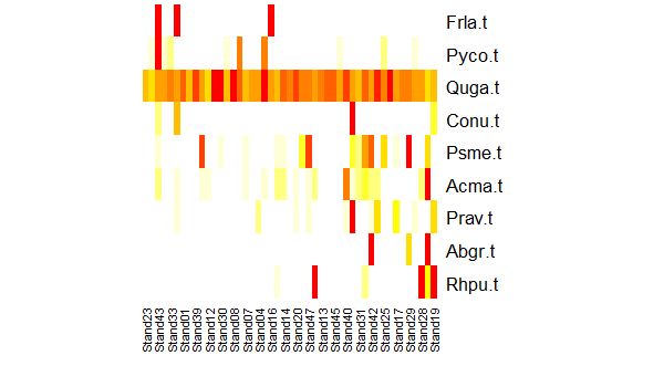
Many trees occur infrequently. The species Frla.t tends to occur in stands with small values on the first ordination axis (i.e., if these coordinates were graphed, it would be in some of the plots on the left side of the ordination. In contrast, species like Abgr.t and Rhpu.t tend to occur in stands with high values on the first ordination axis – if graphed, they would be in some of the plots on the right side of the ordination.
The abundance patterns of each species can be correlated with ordination axes using the vegan::envfit() function.
envfit(Oak1.z ~ .,

data = tree.data,
permutations = 0)
***VECTORS

          NMDS1    NMDS2     r2
Abgr.t  0.54828 -0.83629 0.1725
Acma.t  0.68050 -0.73275 0.1175
Conu.t  0.62233 -0.78276 0.0040
Frla.t -0.61693 -0.78702 0.1276
Prav.t  0.98336  0.18165 0.0700
Psme.t  0.43699 -0.89947 0.1875
Pyco.t -0.96807  0.25069 0.0768
Quga.t  0.25908  0.96586 0.0705
Rhpu.t  0.91547 -0.40239 0.1562
These values can also be used to draw vectors on an ordination, just like we’ve seen with PCA biplots. See the ‘Continuously Distributed External Variables’ section below for an example of this and some caveats about the usage of envfit().
External Patterns
External variables are those that were not part of the response matrix to which an ordination was applied. These might be variables that were not considered during the ordination, or those that were included as constraints during a direct gradient analysis (RDA, dbRDA).
How we visualize external variables depends on whether they are continuously distributed or categorical. Each type of variables is dealt with separately below.
Which External Variables to Focus on?
Generally we would focus our attention on those variables that are statistically significantly related to the response distance matrix. We could visualize patterns related to an external variable that is not statistically related to the distance matrix, though the patterns may be less helpful and we would need to remember when interpreting them that the relationship is not significant.
Some of the functions described below can conduct statistical tests of the fit between an external variable and the locations of the sample units in ordination space. It is important to think carefully about whether these statistical comparisons are necessary or helpful. In particular, the coordinates of the sample units in ordination space are an imperfect representation of the actual data on which the ordination was based. For example:
- The first few PCs from a PCA only capture a subset of the variance in the data
- The coordinates in a NMDS do not perfectly mirror the patterns in the original distance matrix – see the discussion of stress in the NMDS chapter if this does not make sense.
As a result, a statistical test based on the coordinates is an approximation of the actual relationship between the explanatory variable and the distance matrix derived from the sample units. Direct tests of the relationship between an explanatory variable and the distance matrix are accomplished by statistical techniques such as PERMANOVA.
Constrained ordinations such as RDA and dbRDA provide a stronger connection between the original data and the ordination coordinates. However, it is important to remember that a constrained ordination behaves in an unconstrained manner as the number of constraining variables (continuous variables or levels of a categorical variable) increases. Also, if an ordination has three or more constrained axes (e.g., if three continuous variables were tested, or if one categorical variable with four levels was tested), then a two-dimensional ordination is still only showing a subset of the explained variance. See the ‘Comparing Ordination Techniques’ chapter for an example of the connection between NMDS and dbRDA.
Continuously Distributed External Variables
Continuous variables (e.g., pH, elevation, etc.) can be plotted onto an ordination and the correlation with each axis quantified. Symbol sizes can also be made proportional to data values, as illustrated in the NMDS notes. Other common ways to explore these patterns are through vectors and surfaces.
vegan::envfit() for Vectors
A PCA biplot includes a vector representing each variable. One way to add such vectors ourselves is via the vegan::envfit() function. This function can be applied to multiple variables simultaneously and identifies, for each variable, the direction in ordination space in which it changes most rapidly and has maximal correlation with the ordination configuration. It can be applied to variables that were part of the response (as in PCA) and to variables that were not part of the ordination, which is our focus here.
By default, envfit() conducts permutation-based statistical tests of the fit between each variable and the ordination axes. However, I recommend not using these tests for a few reasons:
- As noted in ‘External Patterns’ above, tests between a variable and the representation of a distance matrix in ordination space are not the same as direct tests between a variable and a distance matrix.
- When we are interested in the fit of a variable with an ordination, we’re generally more interested in its overall fit than in its fit with individual axes.
Statistical tests can be turned off by setting the number of permutations to zero.
To illustrate this function, let’s identify the direction of greatest change for the geographic variables of each stand compared to their locations in the Oak1 NMDS ordination:
geog.fit <- envfit(Oak1.z ~ Elev.m + LatAppx + LongAppx,
data = Oak,

permutations = 0)
geog.fit
***VECTORS

            NMDS1    NMDS2     r2
Elev.m   -0.43216 -0.90180 0.0620
LatAppx   0.99236 -0.12338 0.0428
LongAppx  0.93106 -0.36488 0.0513
The resulting vector(s) can be overlaid onto the ordination plot:
plot(Oak1.z,

display= "sites")
plot(geog.fit)
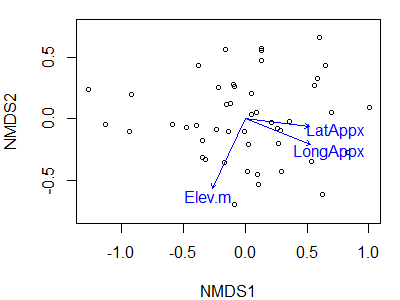
Note that we have to draw the ordination first, and then add the vectors onto it. In this case, I have not hidden the axis labels, values, and tick marks though as previously discussed it is common to do so for NMDS ordinations.
In the PCA notes, we discussed principles for interpreting vectors. Those principles are also applicable here. For example:
- The angle between two vectors indicates the direction of the relationship between them:
- Narrow = positive correlation
- Perpendicular = uncorrelated
- Opposing = negative correlation
- The length of a vector often indicates the strength of the relationship. However, length can be calculated several different ways and it isn’t always clear if/how vectors have been scaled. Borcard et al. (2018) discuss this in detail.
- The relative location of a sample unit or species along a vector is found by extending a perpendicular line from the vector to the data point.
Note: you can always draw a vector on an ordination, but that does not mean that it is meaningful. For example, the relationship between the variable and the ordination space may not be linear. If the response is non-linear, knowing the direction in which it increases most strongly may be of limited utility. Surfaces (see below) are a more useful way to reflect these relationships.
Rotating An Ordination
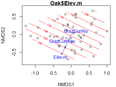
Rather than just overlaying a variable onto an NMDS ordination, it is often helpful to rotate the ordination so that it aligns with one (or more) of the variables. One way to do this is via the vegan::MDSrotate() function. Let’s use it to rotate the ordination with respect to elevation:
Oak1.z.elev <- MDSrotate(Oak1.z, Oak$Elev.m)
The rotated coordinates have the same names as in the original object and can be extracted and used in ggplot2 graphics, etc.
We can verify the rotation by plotting the rotated coordinates and then superimposing the vector for elevation onto it:
plot(Oak1.z.elev,

display = "sites")
plot(envfit(Oak1.z.elev ~ Elev.m,
data = Oak,

permutations = 0))
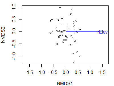
We have now rotated the point cloud so that elevation is perfectly correlated with NMDS1. The correlation between individual species and this axis is now the same as the correlation between the representation of those species in ordination space and elevation – it is not the correlation between those species and elevation.
Note that a rotation like this is perfectly appropriate for ordinations like NMDS and PCoA where the axes have little meaning, but would be inappropriate for ordinations like PCA where the axes have particular meanings.
Surfaces
If your interest is in a single variable, or several variables individually, it can be helpful to map them as surfaces. A surface is like a contour map, and allows you to examine whether the patterns are linear or non-linear.
vegan::ordisurf()
The vegan::ordisurf() function is one way to create a surface. This function fits a generalized additive model (GAM) predicting the variable as a function of the scores on the ordination axes; see Simpson (2011) for an explanation and instructions on how you can further customize the surface calculation.
For example, let’s apply this to elevation:
ordisurf(x = Oak1.z,
y = Oak$Elev.m)
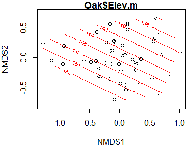
The parallel contours here suggest that there is a linear relationship between elevation and the locations of stands in ordination space. How would these contours look if we applied this to the coordinates that we rotated with respect to elevation (Oak1.z.elev).
What about the relationship with the depth of the A horizon?
ordisurf(x = Oak1.z,
y = Oak$AHoriz)
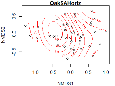
The relationship here is clearly not linear – the lowest values are predicted to be just to the left of center of the point cloud, with values increasing in all directions.
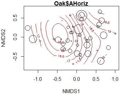
A surface can be produced for any continuous variable, but that doesn’t mean it fits the data well. One way to assess its fit is to make the size of the points proportional to their value of the explanatory variable. The bubble argument does this; we simply need to specify the maximum symbol size to be used. While doing so, I’ll also adjust some of the other arguments.
ordisurf(x = Oak1.z,

y = Oak$AHoriz,
bubble = 5)
The fitted values of the explanatory variable can be obtained using the calibrate() function:
calibrate(ordisurf(Oak1.z,

Oak$AHoriz))
    1     2     3     4     5     6     7     8     9    10
15.26 15.48 15.50 16.45 18.85 15.32 15.82 17.01 17.07 15.81
   11    12    13    14    15    16    17    18    19    20
16.52 15.89 17.38 16.86 17.18 17.42 19.22 19.58 19.00 16.70
   21    22    23    24    25    26    27    28    29    30
17.97 18.71 17.87 18.38 18.46 16.33 17.56 18.72 19.03 15.81
   31    32    33    34    35    36    37    38    39    40
17.54 19.05 15.48 20.05 15.98 17.67 16.18 17.65 15.86 17.39
   41    42    43    44    45    46    47
16.46 17.82 16.91 15.78 18.66 16.43 16.94
These values could be saved and used to calculate the residual for each sample unit, which could also be plotted or examined.
ggordiplots::gg_ordisurf()
To fit a surface with ggordiplots:
gg_ordisurf(ord = Oak1.z,

env.var = Oak$AHoriz,
var.label = "AHoriz",

binwidth = 0.5)

Other Approaches
Some continuously distributed explanatory variables are not well illustrated by vectors or surfaces. For example, suppose your data are from re-measurements of permanent plots. A very helpful way to explore the effect of time might be to connect successive measurements of a given plot with an arrow. These successional vectors can be drawn using the function vegan::ordiarrows(); see its help file for details. Davies et al. (2012) provide an example of this approach.
Categorical External Variables
Categorical variables such as grazing history (yes / no) or drainage class (well / good / moderate / poor) can be examined by considering where the data points associated with each level of a variable occur. This type of display generally focuses on the centroids of each level and/or the perimeter defined by the group.
vegan::envfit() for Centroids
The function envfit() that we used above can also be used to determine and compare the centroids of groups. It deals with variables appropriately based on their class. For categorical variables, it calculates the mean score for each group on each axis of the ordination. As above, we can omit permutation tests of statistical significance by requesting zero permutations.
envfit(Oak1.z ~ GrazCurr,
data = Oak,
permutations = 0)
***FACTORS:

Centroids:
              NMDS1   NMDS2
GrazCurrNo   0.1386  0.1032
GrazCurrYes -0.2447 -0.1821

Goodness of fit:
             r2
GrazCurr 0.1555
Interpretation of a statistical test here would be subject to the same concerns highlighted above for continuous variables.
Plotting this result is not very interesting (try it!).
Considering Continuous and Categorical Variables Simultaneously
Since envfit() recognizes the class of variables and analyzes them appropriately, it can be used to simultaneously examine both types of variables. For example:
envfit(Oak1.z ~ Elev.m + GrazCurr,
data = Oak,
permutations = 0)
***VECTORS

          NMDS1    NMDS2    r2
Elev.m -0.43216 -0.90180 0.062

***FACTORS:

Centroids:
              NMDS1   NMDS2
GrazCurrNo   0.1386  0.1032
GrazCurrYes -0.2447 -0.1821

Goodness of fit:
             r2
GrazCurr 0.1555
Can you figure out how I created this graph?
Symbology
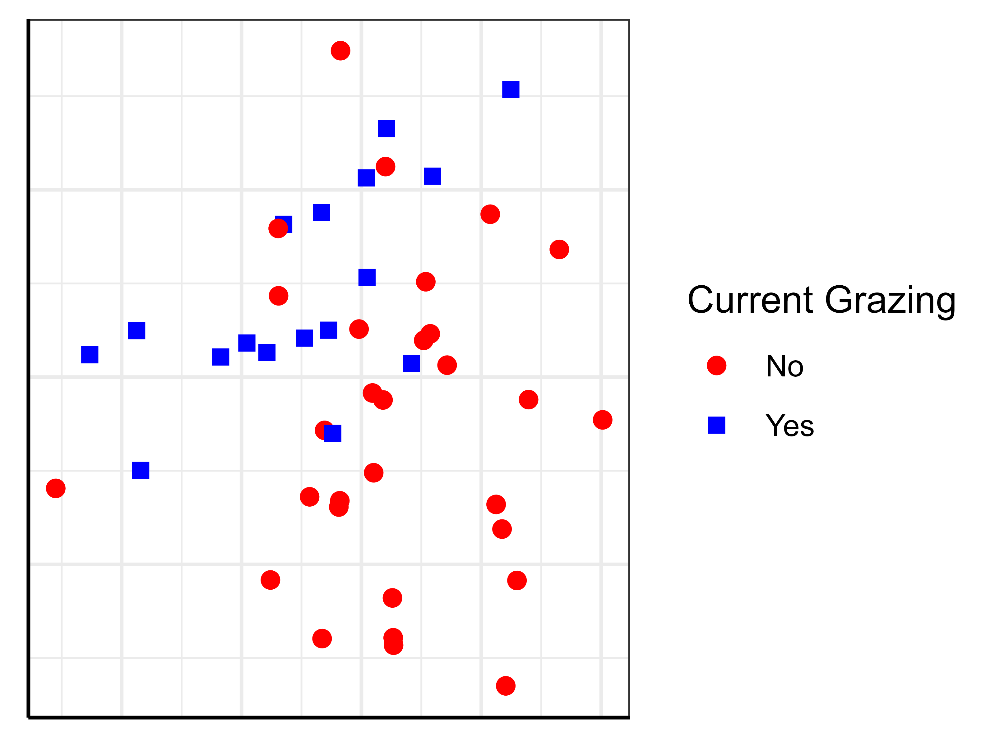
A more interesting way to plot differences among groups is to use a different symbol for each group.
In base R graphing, this requires indexing to select different subsets of the data for each type of symbol. We will often also control other aspects of the figure while doing this. For example, we might plot the two grazing classes in different symbols and colors, and add a legend defining them.
In ggplot2, symbology is much more easily controlled.
See the examples in the ‘General Graphing Principles‘ chapter for examples of how both types of graphics can be customized. The resulting ggplot2 image is repeated here:
Spiders, Ellipses, Hulls, etc.
The vegan package contains several functions designed specifically to visualize the relationship between ordinations and categorical explanatory variables:
| Function | Display Details |
ordispider() |
Connects each data point to the centroid for the group |
ordiellipse() |
Draws an ellipse that encompasses the specified standard deviation or standard error to a specified confidence limit, or an ellipsoid hull than encloses all points |
ordibar() |
Draws a cross showing the standard deviations or standard errors that are also used to locate the ellipse |
ordihull() |
Connects the outermost points in each level. |
ordicluster() |
Overlays dendrogram onto ordination (see the ‘Using Groups‘ chapter for details). |
In base R, each of these functions could be plotted separately or overlain on a graph like the one we created above. To do so, just run the desired function after creating the graph. Depending on whether functions are run before or after plotting the points, the lines will appear either under or above the points.
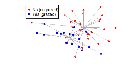
vegan::ordispider()
For example:
plot(Oak1.z,

display= "sites",

type = "n",

xaxt = "n",

yaxt = "n",

xlab = "",

ylab = "")
points(Oak1.z$points[Oak$GrazCurr == "No",],

pch = 19,

col = "red")
points(Oak1.z$points[Oak$GrazCurr == "Yes",],

pch = 15,

col = "blue")
legend(x = "topleft",

pch = c(19,15),

col = c("red", "blue"),

legend = c("No (ungrazed)", "Yes (grazed)"))
ordispider(Oak1.z,

Oak$GrazCurr,

col = "dark grey")
ggordiplots::gg_ordiplot()
With ggordiplots, we can use a single function – for example, let’s add spiders and hulls but not ellipses:
gg_ordiplot(ord = Oak1.z,

groups = Oak$GrazCurr,
ellipse = FALSE,

hull = TRUE,

spiders = TRUE)

Other Approaches
Many other options are possible. For example, in ggplot2 you can use faceting to graph each level of a categorical variable separately. In this situation, you can either graph the sample units from each level only in the relevant level, or you can show them in all levels (e.g., as small grey symbols) and highlight (larger, colored symbols) the relevant sample units in a given level.
Conclusions
I’ve stressed that ordinations primarily are data reduction and visualization tools. The considerations in this chapter primarily focus on visualizations. These visualizations are often most appropriately thought of as supporting a statistical analysis. Once you’ve identified statistically significant patterns through statistical techniques such as PERMANOVA, use ordinations to illustrate those patterns.
Ordinations are a key tool for communicating your conclusions, and are also an opportunity to create memorable and easily understood graphics.
References
Chernoff, H. 1973. The use of faces to represent points in k-dimensional space graphically. Journal of the American Statistical Association 68(342):361–368.
Davies, G.M., J.D. Bakker, E. Dettweiler-Robinson, P.W. Dunwiddie, S.A. Hall, J. Downs, and J. Evans. 2012. Trajectories of change in sagebrush steppe vegetation communities in relation to multiple wildfires. Ecological Applications 22:1562–1577.
Manly, B.F.J., and J.A. Navarro Alberto. 2017. Multivariate statistical methods: a primer. Fourth edition. CRC Press, Boca Raton, FL.
McCune, B., and J.B. Grace. 2002. Analysis of ecological communities. MjM Software Design, Gleneden Beach, OR.
Simpson, G. 2011. What is ordisurf() doing…? http://www.fromthebottomoftheheap.net/2011/06/10/what-is-ordisurf-doing/
PS: vegan Hexagon Logo
Packages in the tidyverse and elsewhere have hexagon logos. I found this on GitHub and thought you might be interested. 🙂
![]()
This image was created by Zane Dax and posted to https://github.com/vegandevs/vegan/issues/436.
Media Attributions
- tabasco.tree
- geog.fit1
- geog.fit2
- ordisurf.elev
- ordisurf.Ahoriz
- ordisurf.Ahoriz2
- ggordisurf.Ahoriz
- ordisurf.envfit
- ggplot.NMDS6
- ordispider
- ggordiplot.spider
- vegan.logo
