
Classification
29 Hierarchical Cluster Analysis
Learning Objectives
To consider ways of classifying sample units into hierarchically organized groups, including the construction of a dendrogram and the choice of group linkage method.
To identify the number of groups present in a set of sample units.
To begin visualizing patterns among sample units.
Key Packages
require(stats, vegan, cluster, dendextend)
Introduction
Hierarchical cluster analysis is a distance-based approach that starts with each observation in its own group and then uses some criterion to combine (fuse) them into groups. Each step in the hierarchy involves the fusing of two sample units or previously-fused groups of sample units. This means that the process of combining n sample units requires n-1 steps.
We begin by illustrating the process of conducting a cluster analysis.
A Simple Example
Step-by-Step Procedure
As an example, we’ll conduct a cluster analysis on five sample units. Our objective is to combine sample units that are most similar together. We begin by converting the data matrix (not shown) into a dissimilarity matrix:
| 1 | 2 | 3 | 4 | |
| 2 | 26 | |||
| 3 | 32 | 14 | ||
| 4 | 42 | 56 | 50 | |
| 5 | 56 | 54 | 36 | 10 |
Recall that this is a symmetric square matrix, but for simplicity we display it as a lower triangle and do not show the first row and last column. This technique can be applied to any type of distance or dissimilarity measure. Since this is a dissimilarity matrix, larger values indicate sample units that are more dissimilar and smaller values indicate sample units that are more similar to one another.
Identify the pair of sample units that are most similar (i.e., have the smallest distance), and fuse (combine) those sample units into a group. In this case, the smallest distance is d5,4 = 10, and sample units 4 and 5 are combined. The distance at which this fusion occurred (10, in this case) is the fusion distance.
Sample units 4 and 5 were each some distance from the other sample units. For example, d4,1 = 42 and d5,1 = 56. How far is sample unit 1 from the group containing sample units 4 and 5? There are several ways to decide this (see ‘Group Linkage Methods’ below). For now, we’ll set this distance to the smaller of the two distances: d4/5,1 = 42. Following the same process, we identify the distance from the combined sample of units 4 and 5 to each of the other sample units in the dissimilarity matrix. Using this information, we update the dissimilarity matrix:
| 1 | 2 | 3 | |
| 2 | 26 | ||
| 3 | 32 | 14 | |
| 4/5 | 42 | 54 | 36 |
Two notes about this dissimilarity matrix:
- Dissimilarities that do not directly involve the combined sample units are unchanged.
- The dimensionality of the dissimilarity matrix has been reduced from 5×5 to 4×4.
Now, we repeat the above steps: identify the smallest distance, fuse those observations together, and recalculate distances from the new group to other sample units. In this case, the smallest distance is d3,2 = 14, and sample units 2 and 3 are combined. Recalculate all distances as before and update the dissimilarity matrix, reducing the dimensionality to 3×3:
| 1 | 2/3 | |
| 2/3 | 26 | |
| 4/5 | 42 | 36 |
Repeat one more time, reducing the dimensionality to 2×2:
| 1/2/3 | |
| 4/5 | 36 |
The final fusion joins groups 1/2/3 and 4/5, so that all sample units are in a single cluster. In this example, that occurs at a distance of 36.
The Fusion Distance Matrix
The fusion distances (aka cophenetic distances) can be summarized in a fusion distance matrix:
| 1 | 2 | 3 | 4 | |
| 2 | 26 | |||
| 3 | 26 | 14 | ||
| 4 | 36 | 36 | 36 | |
| 5 | 36 | 36 | 36 | 10 |
The fusion distance matrix is a numerical summary of the cluster analysis. It has the same dimensionality as the original distance matrix. Fusion distances are repeated wherever multiple sample units are combined at the same fusion distance.
We can assess how well a clustering method matches the actual dissimilarities by the cophenetic correlation, the correlation between the fusion distance matrix and the original (data-based) distance matrix. In this simple example, the correlation is high (0.92). We can also see this visually by plotting the actual distances among sample units against the fusion distances:
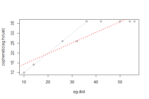
Cophenetic correlations from different cluster analyses of the same data can be compared to determine which one fits better. This can be done via a Mantel test or other methods.
The Dendrogram
The fusion distance matrix is often shown visually as a dendrogram:
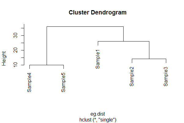
In a dendrogram, the height is the distance at which two sample units or groups of sample units are fused. It is not necessarily the actual distance between them! Refer back to cophenetic distances above if this does not make sense.
McCune & Grace (2002) note that “there is no inherent dimensionality in a dendrogram” (p. 82). The following points are important to keep in mind when interpreting a dendrogram:
- A dendrogram has only one axis. The above example is oriented vertically, but it is also possible – and perfectly appropriate – to orient it horizontally or even circularly.
- The branches may be in no particular order. McCune & Grace (2002, Fig. 10.3) use the helpful analogy of a mobile to describe a dendrogram: the branches are the arms of the mobile and thus each branch can be freely reversed regardless of the order of sample units in other branches. However, sample units are generally arranged such that branches do not cross within the dendrogram.
- The lengths of the segments that parallel the axis are proportional to the values along that axis.
- The segments perpendicular to the axis are of arbitrary length, but are generally drawn to improve the clarity of the dendrogram. For example, they are generally drawn so that sample units are equally spaced within the dendrogram.
Chaining occurs when single sample units are added to existing groups (i.e., groups aren’t combined together). Some chaining is ok, but if the entire dendrogram is chained the cluster analysis has found no structure in the dataset. McCune & Grace (2002) suggest avoiding dendrograms with > 25% chaining.
R Script
The above example distance matrix is available In the GitHub repository. Once you’ve downloaded it to your ‘data’ sub-folder and opened your R project, you can use the below code to conduct the cluster analysis described above.
eg <- read.table("data/cluster.example.txt")
eg.dist <- as.dist(eg) #change to class ‘dist’
eg.hclust <- hclust(eg.dist, method = "single") #cluster analysis
cophenetic(eg.hclust) #fusion distance matrix
cor(eg.dist, cophenetic(eg.hclust)) #cophenetic correlation
lm(cophenetic(eg.hclust) ~ eg.dist) #slope and intercept
plot(eg.dist, cophenetic(eg.hclust))
abline(a = 0, b = 1)
abline(a = 8.8766, b = 0.5405, col = "red", lty = 3, lwd = 2)
plot(eg.hclust) #dendrogram
Group Linkage Methods
Hierarchical polythetic agglomerative clustering requires a method of deciding when to add another sample unit to a group. In our simple example, we combined samples that had the smallest distance. This is called a single linkage method. However, many group linkage methods exist. McCune & Grace (2002, Table 11.1) show that many of these methods are variations of the same combinatorial equation.
Many of the common group linkage methods can be described verbally:
- Single linkage (aka nearest neighbor or ‘best of friends’ or ‘friends of friends’) – an element is added to a group if it is more similar to any single element in that group than to the other elements in the dataset.
- Complete linkage (aka farthest neighbor or ‘worst of friends’) – an element is added to a group if it is more similar to all other sample units in that group than to other sample units in the dataset. Thus, it becomes more difficult for new sample units to join a group as the group size increases.
- Group average – distance between groups is the average of all distances for all pairs of elements
- Median (aka Gower’s method)
- Centroid – distance between groups equals the distance between the centroids
- Ward’s minimum variance method (Ward 1963) – minimizes the error sum of squares (same objective as in ANOVA). The R help files describe this method as aiming ‘at finding compact, spherical clusters’. At the beginning, each sample unit is in its own cluster, and therefore the sum of the distances from each sample unit to its cluster is zero. At each subsequent step, the pair of objects (sample units or cluster centroids) is selected that can be fused while increasing the sum of squared distances as little as possible. This method requires Euclidean distances and is technically incompatible with Bray-Curtis dissimilarity (though people use the two together anyways).
- Flexible beta – a variant of the combinatorial equation. McCune & Grace (2002) recommend using it with beta = -0.25
- McQuitty’s method
I have highlighted in bold the most commonly encountered methods.
The choice of group linkage method can dramatically affect dendrogram structure – see below and McCune & Grace (2002; Fig. 11.4) for examples, and play with the data below to see this for yourself. Singh et al. (2011) found that Ward’s linkage worked better than average or complete linkage methods. McCune & Grace (2002) recommend using Ward’s method, flexible beta with beta = -0.25, or the group average method.
Key Takeaways
The group linkage method chosen can dramatically affect the structure of the resulting dendrogram. Since this isn’t a statistical test, it’s ok to explore alternatives.
Hierarchical Polythetic Agglomerative Cluster Analysis in R
Hierarchical polythetic agglomerative cluster analysis – illustrated in our simple example above – is a commonly used technique. Is it the best technique? Well, that depends on many things, including how important you consider the different questions that distinguish types of cluster analyses. It is also helpful to recall that cluster analysis is not testing hypotheses. If several clustering methods seem appropriate, Legendre & Legendre (2012) recommend that they all be applied and the results compared. If comparable clusters are identified via several methods, those clusters are likely robust and worth explaining.
There are numerous functions to conduct hierarchical cluster analysis in R. We’ll review some of the most common.
stats::hclust()
The hclust() function is available in the stats package, which is automatically loaded when R is opened. Its usage is:
hclust(
d,
method = "complete",
members = NULL
)
The arguments are:
d– the dissimilarity matrix to be analyzedmethod– the agglomeration (aka group linkage) method to be used. Choices are:- Ward’s minimum variance method. In recent versions of R, there are two variations on this method:
ward.D– this used to be the only option for Ward’s method, and was called ‘ward’ in R until version 3.0.3. However, it is not the version that was originally described by Ward (1963) or recommended by McCune & Grace (2002).ward.D2– this is the version that Ward (1963) originally described, and is available as an option for this argument in R 3.1.0 and newer. It differs fromward.Din that the distances are squared during the algorithm. One of the methods recommended by McCune & Grace (2002).
single– Single linkage.complete– Complete linkage. The default method.average– aka UPGMA. One of the methods recommended by McCune & Grace (2002).mcquitty– aka WPGMA.median– aka WPGMC.centroid– aka UPGMC.
- Ward’s minimum variance method. In recent versions of R, there are two variations on this method:
members– a vector assigning sample units to clusters. Optional: this is used to construct a dendrogram beginning in the middle of the cluster analysis (i.e., beginning with the clusters already specified by this argument).
The function returns an object of class ‘hclust’ containing the following components (as usual, most are not displayed automatically; you have to call them to see them):
merge– an n-1 × 2 matrix summarizing the order in which clustering occurred. Each row is a step in the process, and indicates the two clusters that were combined at each step (do you see why there are n-1 steps?). Negative values indicate single plots (indexed by their row number in the original distance matrix) and positive values indicate clusters formed at an earlier step (row) in the clustering process. For example, ‘-10’ would indicate the tenth plot in the distance matrix, while ‘10’ would indicate the cluster formed in step 10 of the clustering process.height– the clustering height (dissimilarity value) at which each step in the clustering process occurred.order– a listing of the sample units, ordered such that a dendrogram of the sample units ordered this way will not have overlapping or crossed branches.labels– the label for each sample unit. Corresponds to the sample unit (row) names in the original data matrix.method– the clustering method used.call– the call which generated this result.dist.method– the distance method used to created.
Oak Example
Let’s apply this to our oak plant community dataset. Use the load.oak.data.R script to load the datafile and make our standard adjustments – removing rare species and relativizing by species maxima. After doing so, the object Oak1.dist contains the Bray-Curtis distance between the 47 stands as calculated from the relativized abundances of 103 common species.
source("scripts/load.oak.data.R")
We’ll apply hierarchical clustering to the compositional data, using Ward’s linkage method (ward.D2):
Oak1.hclust <- hclust(d = Oak1.dist, method = "ward.D2")
Oak1.hclust
Call:
hclust(d = Oak1.dist, method = "ward.D2")

Cluster method   : ward.D2
Distance         : bray
Number of objects: 47
Displaying the output to the screen doesn’t display much useful information, but we can (of course) call components of the output separately:
Oak1.hclust$height
 [1] 0.2687201 0.3130190 0.3752941 0.3991791 0.4249295 0.4332091 0.4412585 0.4459536
 [9] 0.4537384 0.4722402 0.4763079 0.4818018 0.4850890 0.4947853 0.4955957 0.5120773
[17] 0.5132889 0.5172461 0.5304432 0.5318053 0.5415588 0.5558036 0.5828645 0.5840160
[25] 0.5849669 0.6125170 0.6163539 0.6191646 0.6442496 0.6461427 0.6673575 0.7111108
[33] 0.7368921 0.7524170 0.7838412 0.7918328 0.8161702 0.8330401 0.8698169 0.8700274
[41] 0.8775783 1.0135263 1.0889640 1.3354662 1.4127213 1.5661029
Oak1.hclust$merge %>%

head()
     [,1] [,2]
[1,]  -22  -24
[2,]   -1   -2
[3,]  -13  -14
[4,]   -3  -20
[5,]  -26  -31
[6,]  -17  -18
(note that I only show the first 6 lines here)
Refer to the description of the output above to see how to interpret these components.
Customizing Dendrograms
One of the attractive elements of hierarchical cluster analysis is its ability to visualize the similarity among observations via a dendrogram. A dendrogram is a graphical representation of the height and merge components from the hclust() output.
The plot() function automatically creates a dendrogram for objects of class ‘hclust’:
plot(Oak1.hclust)
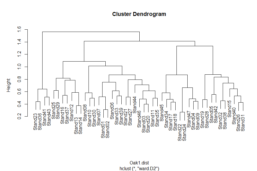
See the interpretive notes for dendrograms in the simple example above. A few follow-up items:
- The dendrogram axis can be scaled in different ways:
- Fusion distances (termed ‘height’ in the above dendrogram)
- Wishart’s objective function – the sum of the error sum of squares from each centroid to the items in that group. Not very easily interpreted.
- % information remaining – a rescaling of Wishart’s function. Declines from 100% when each sample unit is its own group to 0% when all sample units are in the same group.
- When an
hclust()object is plotted, the plotting algorithm orders the branches so that tighter clusters are on the left.
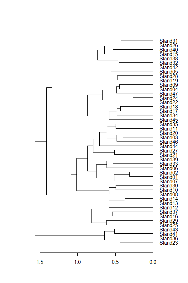
Chaining is relatively common when using the single linkage grouping method with this dataset – try it!
hclust(Oak1.dist, method = "single") %>% plot()

The same information went into both dendrograms, but they produced very different structures. Since the goal of cluster analysis is to identify distinct groups, can you see why a lot chaining is unhelpful?
Class ‘hclust’ Dendrograms
The dendrogram shown above is pretty rudimentary and, of course, can be customized.
In the base function for plotting objects of class ‘hclust’, arguments include:
hang– extent to which labels hang below the plot. If negative (hang = -1), labels are arranged evenly at the bottom of the dendrogram.labels– how to identify each sample unit. By default, the sample units are labeled by their row names or row numbers, but another variable can be substituted here. Although these labels can be continuously distributed variables, they’re most useful if categorical – can you see why?main– the title of the dendrogram.ylab– the caption for the vertical axis.xlab– the caption for the horizontal axis. The subtitle below this caption can be changed using thesubargument; by default it reports the linkage method used.
For example, suppose we were interested in exploring how these groups relate to landform:
plot(Oak1.hclust,
hang = -1,
main = "Oak1",
ylab = "Dissimilarity",
xlab = "Coded by Soil Series",
sub = "BC dissimilarity; ward.D2 linkage",
labels = Oak$SoilSeriesName)

Note that we are not testing hypotheses here.
Class ‘dendrogram’ and the dendextend package
The results of hclust() – and other similar functions – can be converted to class ‘dendrogram’. This class is intended to be generic and applicable to output from both hierarchical cluster analysis and classification and regression trees. It includes some helpful items such as additional controls on plotting details and the ability to alter the order of sample units in a dendrogram. For more information check the help files (?as.dendrogram; ?reorder.dendrogram).
Applying this to our oak example:
Oak1.hclust1 <- as.dendrogram(Oak1.hclust)
plot(Oak1.hclust1, horiz = TRUE)
The dendextend package uses objects of class ‘dendrogram’ and provides the ability to adjust the graphical parameters of a tree (color, size, type of branches, nodes, leaves, and labels), including creating a dendrogram using ggplot2.
Let’s customize our dendrogram a bit:
library(tidyverse); library(dendextend)
Oak1.hclust1 %>%
set("branches_k_color", k = 6) %>%
set("labels_col", k = 6) %>%
plot
Oak1.hclust1 %>%
rect.dendrogram(k = 6, border = 8, lty = 5, lwd = 1)
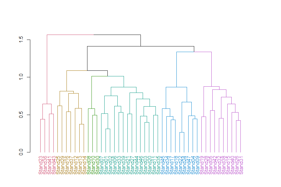
In this dendrogram, colors distinguish stands into 6 groups. Each group can be seen by tracing up the dendrogram until it joins with another group. See ‘How Many Groups?’ below for more information about choosing the number of groups.
The customizations that we did here, and many others, are described in the dendextend vignette (Galili 2023). The package includes other features such as the tanglegram() function which plots two dendrograms against one another, with lines connecting the same observation in each. This permits visual and statistical comparisons of dendrograms.
In addition, dendextend can be combined with the heatmaply package to combine dendrograms with heat maps (see below for another example).
The ggraph package
The ggraph package builds upon ggplot2. I haven’t had a chance to explore this in much detail yet, but the associated vignettes include some impressive and highly customized dendrograms (among other types of graphics).
How Many Groups?
The goal of cluster analysis is to identify discrete groups. The bottom of a dendrogram is not much use – each sample unit is its own group – but the top is not much use either – all sample units are in one group. What we are interested in an intermediate step that classifies the sample units into a reasonable number of groups.
There are many ways to determine how many groups to include in the results of a cluster analysis. The ‘correct’ number of groups is a balance between interpretability, sample size, the desired degree of resolution, and other factors. Too many groups will be difficult to explain (and is counter to the objective of a cluster analysis), whereas too few groups may result in groups that are too heterogeneous to be easily explained.
Exploring the Dendrogram
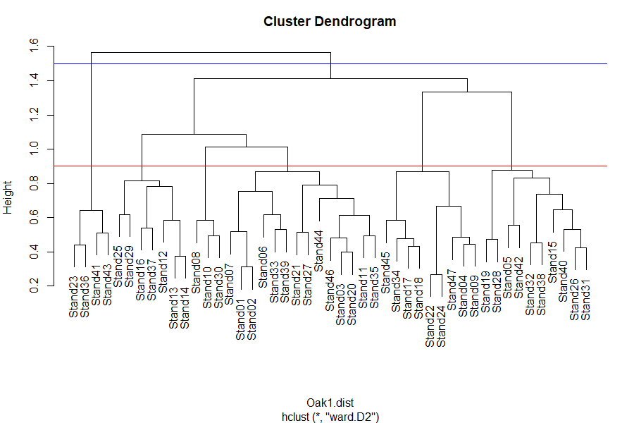
One way to visualize the number of groups at a given level of the dendrogram is to extend a line perpendicular to the dendrogram axis at that level. Every segment the line encounters is a group.
plot(Oak1.hclust)
abline(h = 0.9, col = "red") # 6 groups
abline(h = 1.5, col = "blue") # 2 groups
The identify() function enables you to click on the dendrogram and see which sample units are in a given group:
identify(Oak1.hclust)
To exit this function, press the ‘escape’ button or select ‘Finish’ in the graphing window.
If the output of the identify() function is assigned to a new object, a list is produced of which samples are in each of the selected groups. However, this requires manual input and is therefore not easily scriptable.
The rect.hclust() function automatically identifies which sample units are part of each group at a given level of the dendrogram. It requires that you specify how many groups (k) you want to identify. If this function is implemented when a dendrogram is active in the R Graphics window, the rectangles identifying the groups are simultaneously drawn on the dendrogram:
plot(Oak1.hclust)
group.6 <- rect.hclust(Oak1.hclust, k = 6)
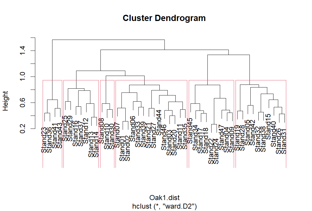
Viewing this object:
group.6
[[1]]
Stand23 Stand36 Stand41 Stand43
     23      36      41      43

[[2]]
Stand12 Stand13 Stand14 Stand16 Stand25 Stand29 Stand37
     12      13      14      16      25      29      37

[[3]]
Stand08 Stand10 Stand30
      8      10      30

[[4]]
Stand01 Stand02 Stand03 Stand06 Stand07 Stand11 Stand20 Stand21 Stand27 Stand33 Stand35
      1       2       3       6       7      11      20      21      27      33      35
Stand39 Stand44 Stand46
     39      44      46

[[5]]
Stand04 Stand09 Stand17 Stand18 Stand22 Stand24 Stand34 Stand45 Stand47
      4       9      17      18      22      24      34      45      47

[[6]]
Stand05 Stand15 Stand19 Stand26 Stand28 Stand31 Stand32 Stand38 Stand40 Stand42
      5      15      19      26      28      31      32      38      40      42
Each group is ‘named’ by an integer, proceeding from left to right across the dendrogram. However, keep in mind that the ordering of these groups is of little utility. The most important thing is to track which sample units are classified to the same group, not the number that group is assigned to.
Scree Plots
Fusion distances can be plotted against the number of clusters to see if there are sharp changes in the scree plot. If so, the preferred number of groups is the number at the elbow of the scree plot. A smaller number of groups will leave considerable variation unexplained, while a larger number of groups will not explain that much more variation than is explained at the elbow.
The required data are available in the merge and height components returned by hclust(). Since we are conducting agglomerative (bottom up) clustering, the last heights represent the last fusions in the dendrogram. We can combine the height and merge components and then plot the last few fusions. Rather than having to re-code this each time, here is a simple function to do so:
scree <- function(hclust.obj, max.size = 12) {
temp <- with(hclust.obj, cbind(height, merge))
colnames(temp) <- c("Height", "JoinsThis", "WithThis")
plot(x = max.size:1,
y = temp[(nrow(temp)-( max.size -1)):nrow(temp), 1],
xlab = "Number of groups", ylab = "Height",
main = hclust.obj $call, type = "b")
tail(temp, max.size)
}
This function is available in the ‘functions’ folder in the GitHub repository. It has two arguments:
hclust.obj– the object produced by thehclust()function.max.size– how many fusions to plot. Default is the last 12.
The arguments are shown in red font in the above code to highlight where they are used.
After downloading this function to the ‘functions’ subfolder in your working directory, load and then apply it:
source("functions/scree.R")
scree(hclust.obj = Oak1.hclust)
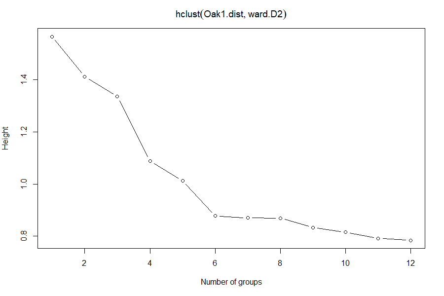
Which number of groups appears to be optimal?
stats::cutree()
A dendrogram can be cut into groups using the cutree() function. The usage is:
cutree(
tree,
k = NULL,
h = NULL
)
The arguments are:
tree– results from ahclust()function.k– desired number of groups. Can be a scalar (e.g., 2 groups) or a vector (e.g., 2:7 groups).h– height(s) where tree should be cut.
You need to specify tree and either k or h.
g6 <- cutree(Oak1.hclust, k = 6); g6
Stand01 Stand02 Stand03 Stand04 Stand05 Stand06 Stand07 Stand08 Stand09 Stand10 Stand11
      1       1       1       2       3       1       1       4       2       4       1
Stand12 Stand13 Stand14 Stand15 Stand16 Stand17 Stand18 Stand19 Stand20 Stand21 Stand22
      5       5       5       3       5       2       2       3       1       1       2
Stand23 Stand24 Stand25 Stand26 Stand27 Stand28 Stand29 Stand30 Stand31 Stand32 Stand33
      6       2       5       3       1       3       5       4       3       3       1
Stand34 Stand35 Stand36 Stand37 Stand38 Stand39 Stand40 Stand41 Stand42 Stand43 Stand44
      2       1       6       5       3       1       3       6       3       6       1
Stand45 Stand46 Stand47
      2       1       2
This information can also be easily summarized:
table(g6)
g6
 1  2  3  4  5  6
14  9 10  3  7  4
The cutree() function can also be used to explore various numbers of groups by varying k:
cutree(Oak1.hclust, k = 2:7) %>%

head()
# Why isn’t k=1 included here?
        2 3 4 5 6 7
Stand01 1 1 1 1 1 1
Stand02 1 1 1 1 1 1
Stand03 1 1 1 1 1 1
Stand04 1 2 2 2 2 2
Stand05 1 2 3 3 3 3
Stand06 1 1 1 1 1 1
This function is similar to rect.hclust() but produces an object of a different class. Each column refers to a different number of groups, and the integers within the column identify which observations are assigned to the same group. I included the head() function above to reduce the output for visual purposes; I obviously would not want to do so if saving the output to an object.
Confusion Matrices
Finally, the results of using different values of k, or different clustering methods, can be compared in a confusion matrix. For example, compare the observations assigned to clusters assigned to 4 or 6 groups:
table(g6, cutree(Oak1.hclust, k = 4))
g6   1  2  3  4
  1 14  0  0  0
  2  0  9  0  0
  3  0  0 10  0
  4  3  0  0  0
  5  7  0  0  0
  6  0  0  0  4
The confusion matrix illustrates the hierarchical nature of this approach – observations that are grouped together earlier in the process are kept together in all subsequent steps. For example, group 1 from the 4-group solution consists of all observations classified to groups 1, 4, and 5 in the 6-group solution.
Other Approaches For Selecting Groups
Other approaches have also been suggested for deciding how many groups to retain:
- McKenna (2003) outlined a method to provide ‘objective significance determination’ of the groups identified in a cluster analysis.
- Indicator Species Analysis (ISA) was originally proposed as a means for deciding how many groups to include in a cluster analysis (Dufrêne & Legendre 1997). ISA can also be used for other purposes; we’ll consider it separately.
- If you have independent data for your sample units (e.g., environmental variables), you can use these data to examine whether the groups make sense. For example, do environmental variables differ among the groups identified through the cluster analysis? This is what McCune et al (2000) did in their cluster analysis of epiphyte species (see their Fig. 3), retaining about 45% of the information and 9 groups.
- Significance can be assessed via bootstrapping using the
pvclust()function in thepvclustpackage (Suzuki & Shimodaira 2006). - The
progenyClustpackage has a method for identifying the optimal number of clusters (Hu & Qutub 2016). - The
NbClustpackage provides 30 different indices to determine the number of clusters in a dataset (Charrad et al. 2014). Of particular interest is the ‘Gap statistic’, which compares the intra-cluster variation for different values of k to a distribution of variation values obtained by Monte Carlo simulations (Tibshirani et al. 2001). The recommended number of clusters (k) is the smallest value of k with a Gap statistic within one standard deviation of the Gap statistic at k+1. This approach can be applied to any clustering method, whether hierarchical or non-hierarchical. For the oak plant community data:
require(NbClust)
NbClust(data = Oak1, diss = Oak1.dist, distance = NULL, method = "ward.D2", index = "gap")
How many groups does this approach suggest for this dataset?
Other Types of Clustering
Other hierarchical clustering techniques have also been developed. Two examples are:
- Fuzzy clustering: All of the variations we’ve listed here classify sample units as being in group A or B, but another way to look at this is in terms of the probability that a given sample unit belongs in each group. For example, some sample units might clearly belong to one group whereas others are marginal – they could just as easily be assigned to group B as to group A. For more information, see Equihua (1990) and Boyce & Ellison (2001). One function for fuzzy clustering is
cluster::fanny(). - Spatially-constrained clustering: When explicit spatial information is available, it can be used to group objects that are near one another and similar. For example, this approach has been used to identify clusters of trees in a mapped forest stand. For more information, see Plotkin et al. (2002). Churchill et al. (2013) used this approach to identify clumps of trees and thereby guide the thinning of forest stands to restore spatial patterning.
Conclusions
It is worth repeating that a cluster analysis does not test hypotheses. It is acceptable to explore various distance measures, clustering techniques, numbers of groups, etc. to identify a preferred solution.
Note that we’ve used a cluster analysis to group sample units with similar compositions. However, we also could have transposed the data matrix and used a cluster analysis to group species that co-occur. See McCune & Grace (2002, p.90) for a description of the considerations when doing so, specifically with respect to relativization.
References
Borcard, D., F. Gillet, and P. Legendre. 2018. Numerical ecology with R. 2nd edition. Springer, New York, NY.
Boyce, R.L., and P.C. Ellison. 2001. Choosing the best similarity index when performing fuzzy set ordination on binary data. Journal of Vegetation Science 12:711-720.
Charrad, M., N. Ghazzali, V. Boiteau, and A. Niknafs. 2014. NbClust: an R package for determining the relevant number of clusters in a data set. Journal of Statistical Software 61(6):1-36.
Churchill, D.J., A.J. Larson, M.C. Dahlgreen, J.F. Franklin, P.F. Hessburg, and J.A. Lutz. 2013. Restoring forest resilience: from reference spatial patterns to silvicultural prescriptions and monitoring. Forest Ecology and Management 291:442-457.
Dufrêne, M., and P. Legendre. 1997. Species assemblages and indicator species: the need for a flexible asymmetrical approach. Ecological Monographs 67:345-366.
Equihua, M. 1990. Fuzzy clustering of ecological data. Journal of Ecology 78:519-534.
Galili, T. 2023. Introduction to dendextend. https://cran.r-project.org/web/packages/dendextend/vignettes/dendextend.html
Hu, C.W., and A.A. Qutub. 2016. progenyClust: an R package for progeny clustering. The R Journal 8:328-338.
Legendre, P., and L. Legendre. 2012. Numerical ecology. Third English edition. Elsevier, Amsterdam, The Netherlands.
Manly, B.F.J., and J.A. Navarro Alberto. 2017. Multivariate statistical methods: a primer. Fourth edition. CRC Press, Boca Raton, FL.
McCune, B., and J.B. Grace. 2002. Analysis of ecological communities. MjM Software Design, Gleneden Beach, OR.
McCune, B., R. Rosentreter, J.M. Ponzetti, and D.C. Shaw. 2000. Epiphyte habitats in an old conifer forest in western Washington, U.S.A. The Bryologist 103:417-427.
McKenna Jr., J.E. 2003. An enhanced cluster analysis program with bootstrap significance testing for ecological community analysis. Environmental Modelling & Software 18:205-220.
Plotkin, J.B., J. Chave, and P.S. Ashton. 2002. Cluster analysis of spatial patterns in Malaysian tree species. American Naturalist 160:629-644.
Singh, W., E. Hjorleifsson, and G. Stefansson. 2011. Robustness of fish assemblages derived from three hierarchical agglomerative clustering algorithms performed on Icelandic groundfish survey data. ICES Journal of Marine Science 68:189-200.
Suzuki, R., and H. Shimodaira. 2006. Pvclust: an R package for assessing the uncertainty in hierarchical clustering. Bioinformatics 22:1540-1542.
Tibshirani, R., G. Walther, and T. Hastie. 2001. Estimating the number of data clusters via the Gap statistic. Journal of the Royal Statistical Society B 63:411–423.
Ward Jr., J.H. 1963. Hierarchical grouping to optimize an objective function. Journal of the American Statistical Association 58:236-244.
Media Attributions
- cophenetic
- dendrogram
- Oak.hclust
- oak.hclust.single
- oak.hclust.soilseries
- oak.hclust1.horizontal
- oak.hclust.dendextend
- oak.hclust.2v6groups
- oak.dendrogram5
- oak.scree
