
Ordinations (Data Reduction and Visualization)
41 CA, DCA, and CCA
Learning Objectives
To appreciate how CA and variations thereof work, and why these techniques can be contentious.
Exercises
Manly & Navarro Alberto (2017; ch. 12.5)
Examples
require(vegan, ggvegan)
Contents:
- Introduction
- The Chi-Square Distance Measure
- Correspondence Analysis (CA)
- Detrended Correspondence Analysis (DCA)
- Canonical Correspondence Analysis (CCA)
- Conclusions
- References
Introduction
Correspondence Analysis (CA), aka reciprocal averaging (Hill 1973), is an alternative to PCA for the analysis of sample × species data. Both techniques are eigenanalysis-based approaches. In addition, they both rely on a single matrix, and therefore are unconstrained or indirect gradient analysis methods. However, they differ in approach: PCA maximizes the variance explained by each axis, while CA maximizes the correspondence between species and sample scores.
Detrended Correspondence Analysis (DCA) and Canonical Correspondence Analysis (CCA) are extensions of CA. DCA, like CA, does not use a second matrix of explanatory variables and therefore is an indirect gradient analysis method. In contrast, CCA requires a second matrix of explanatory variables and therefore is a constrained or direct gradient analysis method.
These are very common analytical approaches, so it’s important to be familiar with them. However, as you’ll see throughout these notes, there are problems with CA and its extensions when applied to community data. That said, there is also disagreement in the literature about the degree to which these problems are ‘fatal’. In my experience, for example, European ecologists tend to be more inclined to use these methods through software such as CANOCO (e.g., Šmilauer & Lepš 2014).
The Chi-Square Distance Measure
Theory
CA and its variants (DCA, CCA) are based on the same theory that contingency tests are based on. You may recall that a contingency table contains categorical rows and columns. Pearson’s chi-square statistic is calculated by comparing the observed and expected values for each element in the table, where the expected values are calculated as:
[latex]\frac {y_{i\bullet} \times y_{\bullet j}}{y_{\bullet\bullet}}[/latex]
where [latex]y_{i\bullet}[/latex] is the sum for row i, [latex]y_{\bullet j}[/latex] is the sum for column j, and [latex]y_{\bullet\bullet}[/latex] is the grand total.
CA preserves the chi-squared distance between sample units:
[latex]D_{i,j} = \sqrt {\sum_{k=1}^p \frac{y_{\bullet\bullet}}{y_{\bullet k}} [ \frac{y_{ik}}{y_{i\bullet}} - \frac{y_{jk}}{y_{j\bullet}} ]^2}[/latex]
where
- [latex]y_{\bullet\bullet}[/latex] is the grand total
- [latex]y_{\bullet k}[/latex] is the total for species k (there are p species all together)
- [latex]y_{i\bullet}[/latex] and [latex]y_{j\bullet}[/latex] are the totals in sample units i and j
- [latex]y_{ik}[/latex] and [latex]y_{jk}[/latex] are the observed values for species k in sample units i and j
Note that the symbology in this equation is different from what was used in the chapter about distance measures.
(Aside: the chi-square distance can also be calculated using a formula that doesn’t adjust for the grand total ([latex]y_{\bullet\bullet}[/latex]); this is the formula in McCune & Grace (2002, p. 50). Legendre & Legendre (2012) consider these to be different distance measures: their D16 includes [latex]y_{\bullet\bullet}[/latex] while D15 does not.)
According to Wildi (2010), what is actually being compared in a chi-squared distance is not the raw data but the deviations from the expected values for each species in each sample unit.
The lower bound of the chi-square distance is zero for sample units that are identical. McCune & Grace (2002), citing Minchin (1987), state that there is no upper bound for the chi-square distance, but Legendre & Legendre (2012) indicate that the upper bound is [latex]\sqrt{2y_{\bullet\bullet}}[/latex].
We talked previously about standardizations, including the ‘standard’ adjustments by species maxima and site totals. Both of these standardizations are built into the Chi-square distance measure.
Chi-square distances are inherently standardized using site totals – note that the abundance of species k in the formula above is divided by the total abundance in each sample unit (i.e., [latex]y_{i\bullet}[/latex] and [latex]y_{j\bullet}[/latex]). One implication of this is that all variables must be measured in the same scale because otherwise the site totals and grand total are rather nonsensical. If data aren’t measured in the same scale, all variables must be relativized (made dimensionless; on a column-by-column basis) before analysis.
Chi-square distances are also inherently standardized using species totals – note the [latex]y_{\bullet k}[/latex] in the denominator of the equation. This results in two issues with this distance measure:
- Changes in the abundance of a species on one sample unit affect the distances associated with that species on all sample units, even where it doesn’t occur.
- The weight given to each species is inversely proportional to its total abundance. In other words, high weight is given to species with low total abundance (i.e., rare species). If species are rare because they haven’t been adequately sampled, it may not be ecologically desirable to give them this much importance. Šmilauer & Lepš (2014) note that it is possible to downweight rare species. I haven’t explored this, but suspect one way to do so would be to standardize by species maxima before calculating chi-square distances.
Example
We will use a sample dataset we’ve used before (see ‘Simple Examples’’ in the Distance Measures chapter) to explore chi-square distances:
| Plot | SppA | SppB | SppC | SppD | SppE |
| 1 | 1 | 1 | 1 | 0 | 0 |
| 2 | 0 | 0 | 0 | 1 | 1 |
| 3 | 1 | 1 | 1 | 1 | 1 |
(Source: Legendre & Legendre 2012, p. 311)
If we add the row and column totals to the matrix margins, we get the following:
| Plot | SppA | SppB | SppC | SppD | SppE | [latex]y_{i\bullet}[/latex] or [latex]y_{j\bullet}[/latex] |
| 1 | 1 | 1 | 1 | 0 | 0 | 3 |
| 2 | 0 | 0 | 0 | 1 | 1 | 2 |
| 3 | 1 | 1 | 1 | 1 | 1 | 5 |
| [latex]y_{\bullet k}[/latex] | 2 | 2 | 2 | 2 | 2 |
By summing across either the row totals or column totals, you can verify that [latex]y_{\bullet\bullet}[/latex] = 10.
Use the chi-square distance formula (above) to calculate the chi-square distance between each pair of plots:
| Plot1 | Plot2 | |
| Plot2 | ||
| Plot3 |
Import the data (Legendre.Legendre.2012.p311.txt) into R and calculate the chi-square distance matrix. Functions such as vegan::vegdist() and labdsv::dsvdis() provide this capability.
test <- read.table("data/Legendre.Legendre.2012.p311.txt",

header = TRUE)
library(vegan)
vegdist(test,

method = "chisq") %>%

round(3)
      Site1 Site2
Site2 2.041
Site3 0.816 1.225
Note that all of the species in this test dataset have the same species totals – the column totals are identical. You could create another test dataset to explore the contributions of common and rare species to the distance calculations.
We can easily use this dataset to explore how changes in the abundance of a species on one sample unit affect the distances among other sample units.
First, subset the data to just include plots 2 and 3 and then calculate the chi-square distance between the two plots. Compare this value to the value calculated above with the full dataset.
vegdist(test[2:3, ],

method = "chisq") %>%

round(3)
      Site2
Site3 1.212
Note that the distance between these two sample units has changed (1.225 to 1.212) even though the data haven’t changed at all.
Second, change the abundance of one species on one plot and recalculate the entire distance matrix.
test %>%
mutate(SppC = c(1, 0, 0)) %>%
vegdist(method = "chisq") %>%
round(3)
      Site1 Site2
Site2 2.062
Site3 1.275 1.061
We altered a species in Site3, so it makes sense that the distances from that site to the other sites are affected. However, note that the distance from Site1 to Site2 is also affected (2.041 to 2.062) even though no abundances on either sample unit were changed!
Correspondence Analysis (CA)
Approach
Manly & Navarro Alberto (2017) note that a sample unit x species data matrix can be thought of as a two-way table of measures of abundance. This means that we can think about:
- The sample units in terms of the abundance of species they contain
- The species in terms of the sample units they occur in
Sample units that share the same species are more similar to one another than those that do not. By the same logic, species that occur in the same sample units are more similar to one another than those that do not. From this perspective, CA is a method for maximizing the correspondence between a sample unit-based classification and a species-based classification. The actual values that are calculated are inter-related: the values for the sample units are weighted averages of the species values while the values for the species are weighted averages of the sample unit values.
McCune & Grace (2002) describe how to conduct a CA using an eigenanalysis approach and a reciprocal averaging approach, and Manly & Navarro Alberto (2017) illustrate the connections between these two approaches. The eigenanalysis approach is the generally accepted technique. Its steps are:
- Convert the sample unit x species matrix to a contingency table (Q) by calculating the contribution of each element to the Pearson chi-square statistic under the null model.
- Obtain eigenvalues and eigenvectors from Q. This is done using the
svd()function as described in the ‘Matrix Algebra’ notes. The formula being used is X = UDV’ where:
Matrix Dimension Notes X m x n The matrix being analyzed. U m x n Loadings (eigenvectors) for rows (samples) in original data matrix. D n x n Diagonal matrix with singular values of X on diagonal. In other words, the eigenvalues. Eigenvalues are referred to as ‘inertia’ in CA and related techniques. As with PCA, the eigenvalues decline in magnitude. The first axis has the largest eigenvalue and maximizes the association between samples and species. V n x n Loadings (eigenvectors) for columns (species) in original data matrix. Note: transposed in equation Note that two eigenvectors (U and V) are produced for each eigenvalue – one related to the samples and the other to the species.
- Use the loadings to calculate scores (coordinates) of sample units and species in ordination space. The second eigenvector is what allows CA to calculate coordinates for species.
- Graph species and sample units on the same plot. This type of graph is known as a bi-plot, though it differs somewhat from the biplots we saw in our discussion of PCA.
CA in R: vegan::cca()
CA can be conducted using several different functions in R. In particular, the vegan and ade4 packages both contain a function named cca(). Only one of these packages should be loaded at a time to avoid confusion. We’ll use the version available in vegan. See the R help files for details about the usage of cca().
Use the ‘load.oak.data.R’ script to load our oak data and make our standard adjustments to it.
source("scripts/load.oak.data.R")
To conduct a CA, we simply specify the name of the object containing the response variables:
ca.Oak1 <- cca(X = Oak1)
This function returns a large number of elements that are described in the help files (?cca.object) or by examining the object with str(). A few elements can be seen using the summary() function, and individual elements can also be referenced. Particular elements of interest:
- Eigenvalues:
eigenvals(ca.Oak1)orsummary(eigenvals(ca.Oak1))[,1:6] %>% round(3)
CA1 CA2 CA3 CA4 CA5 CA6 Eigenvalue 0.514 0.335 0.279 0.251 0.237 0.226 Proportion Explained 0.102 0.066 0.055 0.049 0.047 0.045 Cumulative Proportion 0.102 0.168 0.223 0.272 0.319 0.364 - Site scores:
summary(ca.Oak1)$sites %>% round(3) %>% head()CA1 CA2 CA3 CA4 CA5 CA6 Stand01 -0.400 0.797 -0.439 0.823 -0.382 0.740 Stand02 -0.330 0.435 0.256 0.278 -0.030 0.715 Stand03 0.040 0.561 -0.229 0.611 -1.337 0.749 Stand04 -0.066 0.441 -1.028 -0.491 0.003 -0.098 Stand05 1.756 -3.963 0.830 -1.110 0.002 0.928 Stand06 -0.501 0.121 -0.719 -0.722 -0.250 -1.386 - Species scores:
summary(ca.Oak1)$species %>% round(3) %>% head()
         CA1   CA2    CA3    CA4    CA5    CA6
Quga.t 0.214 0.058 -0.175  0.035 -0.037  0.061
Rhdi.s 0.119 0.316  0.081  0.103 -0.071  0.025
Syal.s 0.409 0.225 -0.597 -0.220  0.124  0.172
Amal.s 0.441 0.550 -1.087 -0.731  0.898  0.453
GAL    0.210 0.539 -0.036  0.351 -0.119  0.338
Povu   0.303 0.005 -0.128 -0.104 -0.084 -0.046
Note that the summary() function for this class of object only returns the first 6 scores for each species and site/sample unit. You can extract all of them from the original object.
To visualize a CA ordination in base R:
plot(ca.Oak1)
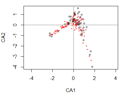
Note again that the plot() function is creating a particular type of graph based on the class of the object being plotted. The first and most obvious thing to note here is the horseshoe / arch effect, which we’ll discuss below.
Sites are shown as circles in the graph; each is approximately located at the centroid of the points of the species that occur at that site. Species are shown as ‘+’ symbols in the graph; each is at the optimum (peak of the assumed unimodal response curve) for that species.
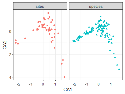
Species and sites can be plotted as points or text using the points()and text() functions, respectively. They can also be plotted on separate graphs – I’ll illustrate this using ggplot2.
Gavin Simpson has written functions to organize the objects created by vegan in a consistent manner for graphing via ggplot2. His functions are available in a package called ggvegan. – see the ‘Visualizing and Interpreting Ordinations‘ chapter for details on how to install it from github.
library(ggvegan)
autoplot(ca.Oak1)
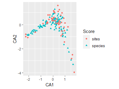
The fortify() function creates a dataframe that contains the necessary elements for graphing in ggplot2. This can be used to provide more customization than is available through autoplot().
For example:
ca.Oak1.gg <- fortify(ca.Oak1)
ggplot(data = ca.Oak1.gg,
aes(x = CA1, y = CA2)) +
geom_point(aes(shape = Score, colour = Score)) +
facet_grid(facets = . ~ Score) +
guides(shape = FALSE, colour = FALSE) +
theme_bw()
Interpretive Difficulties with CA
CA maximizes the separation of species abundances along each axis. Its primary advantages are that it:
- Yields a single outcome for a given dataset
- Permits species and sample units to be plotted as points on the same coordinate system.
However, McCune & Grace (2002) and Faith et al. (1987) give examples of how poorly CA is able to recreate synthetic gradients.
CA carries out a simultaneous ordination of the rows and columns of the data matrix. Thus, it can be difficult to draw inferences based on the association between the results of these ordinations.
CA assumes unimodal (i.e., bell-shaped) species response curves (ter Braak 1987). The optimum abundance of a species should be close to the point representing it in the ordination diagram, and its frequency of occurrence or abundance should decrease with distance from that point. However, this is not always the case:
- Species at the edge of the scatter plot may be absent from most sites – they show up near the sample(s) where they happened to be present.
- Species near the center of the ordination diagram may reach an optimum abundance in that area of ordination space. However, they may also have more than one optimum or be unrelated to the pair of ordination axes under consideration. It is not clear from the ordination which of these is the case. One way to assess this is to order the sample unit × species matrix with respect to sample and species scores on an ordination axis and then review this ordered matrix (ter Braak 1987).
- Species found away from the center of the diagram but not near the edges are most likely to display clear relationships with ordination axes.
Each axis is thought to represent a particular environmental gradient. However, 2nd and higher axes can be distorted if datasets span long gradients. This distortion classically shows up as an arch (horseshoe) in a CA (or PCA) ordination, and is clearly evident in the CA ordination of the Oak1 dataset. It is a mathematical artifact (Podani & Miklos 2002) and is thought to reflect the variability in species response curves.
Axis extremes can be compressed such that the spacing of samples along an axis doesn’t reflect true differences in species composition.
Due to the above problems, McCune & Grace (2002) declare that “there should be no regular application of CA to ecological community data” (p. 154).
Detrended Correspondence Analysis (DCA)
Approach
DCA was developed by Hill & Gauch (1980) in response to several of the above problems with CA. It essentially is a CA followed by a few additional steps:
- Detrending to remove the arch effect – the first axis is divided into segments (default is 26; I’m not sure why) and the samples that fall within each segment are centered to have a mean of zero for the second axis.
- Nonlinear rescaling to correct compression of ends of gradients – segments are expanded or contracted so that the variation among species scores is equal among segments. As a result, species turnover is constant across the gradient. The units of the first DCA axis are now in species standard deviations (beta diversity), and the ‘average’ species is present along the gradient for about 4 standard deviations (McCune & Grace 2002, p. 30).
As a result of these changes, the eigenvalues are no longer directly interpretable (see ‘Interpretive Difficulties with DCA’ below). Instead, the effectiveness of a DCA ordination is calculated as the correlation between the distances among sample units in ordination space and in the original space.
DCA in R: vegan::decorana()
In R, DCA can be conducted using the decorana() function in the vegan package. See the help file for details. For example, arguments can be included to downweight rare species (give less weight to rare species; iweigh), specify the number of segments for detrending (default is 26; mk), etc.
Applying this to our data:
dca.Oak1 <- decorana(Oak1)
Use summary() and related functions to see the results. Individual components can also be returned using indexing similar to that described for CA above. However, only the first four axes are reported.
To graph the results:
plot(dca.Oak1)
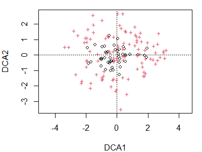
Note that the arch present in the CA ordination is no longer present. Again, sites are indicated by circles and species by ‘+’ symbols. We could use the code above to restrict our attention to sites or species, display points as text, etc.
Interpretive Difficulties with DCA
While DCA is able to remove the arch effect from an ordination, it does so in a rather arbitrary – or at least abstract – manner. After treatment in this fashion, it isn’t entirely clear what the axes mean anymore. Also, detrending and rescaling have altered the eigenvalues such that they no longer represent the fraction of the variance represented by the ordination. As a result of these concerns, McCune & Grace (2002) and Gotelli & Ellison (2004) do not recommend the use of DCA.
Canonical Correspondence Analysis (CCA)
Approach
CCA (aka Constrained Correspondence Analysis) is a direct gradient analysis method. It was developed and popularized by ter Braak (1986, 1987). Like CA, it maximizes the correlation between species and sample scores. However, it does so after using multiple linear regression to constrain each sample unit to be a linear combination of the measured environmental variables. Because of this constraint, CCA yields lower eigenvalues than CA.
The process of conducting a regression followed by an ordination should remind you of ReDundancy Analysis (RDA).
CCA in R: vegan::cca() Again
In R, CCA can be conducted using the same function as CA, except that an additional matrix is specified that contains the environmental data used to constrain the sample scores. See the help file for details.
We’ll use a subset of the explanatory variables from the oak plant community dataset – in this case, the geographic variables (latitude, longitude, elevation). Since these are measured in different units, and have minimum values much greater than zero, we’ll standardize them by their ranges before including them in the analysis.
geog.stand <- Oak %>%
select(LatAppx, LongAppx, Elev.m) %>%
decostand("range")
We can conduct the CCA in two ways. First, we can identify the response and explanatory objects separately:
cca(X = Oak1,
Y = geog.stand)
(note, confusingly, that the response matrix is argument X and the explanatory matrix is argument Y).
Second, we can specify a formula relating the response to the explanatory variables:
cca.Oak1 <- cca(Oak1 ~ Elev.m + LatAppx + LongAppx,
data = geog.stand)
The formula specification is recommended as it provides the most flexibility.
As with CA and DCA, use summary() and related functions to see the results. Individual components of the results can be returned using the indexing described for CA above.
It is important to inspect the eigenvalues of the solution. Note that the constrained and unconstrained eigenvalues are distinguished from one another. There are as many constrained eigenvalues as there were explanatory variables in the constraining dataset; these are labeled as ‘CCA1’, ‘CCA2’, etc. and relate composition to those explanatory variables. The unconstrained eigenvalues (‘CA1’, ‘CA2’, etc.) are the eigenvalues calculated just as in a CA. Furthermore, note that the eigenvalues decline in value within the constrained and unconstrained sets, but may jump up in magnitude as you move from the last constrained axis to the first unconstrained axis. We saw this same behavior with RDA and dbRDA.
To visualize the first two constrained axes of this ordination:
plot(cca.Oak1)
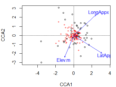
Species or site scores can be displayed as described above for CA.
The resulting ordination can be tested for statistical significance using the anova() or anova.cca() function. The help file notes that this is actually a permutation test rather than an ANOVA, though the type of permutation test is not named. One of the first descriptions of this approach was provided by Legendre et al. (2011). Several options are available:
by = NULL– test set of explanatory variables en masse, as was done inadonis2().by = "term"– test terms in sequential order (sequential or Type I sums of squares), as was done inadonis2().by = "margin"– test marginal effects (partial or Type III sums of squares), as was done inadonis2().by = "axis"– test each constrained axis against the set of explanatory variables.
For example:
anova(cca.Oak1,

by = "axis")
Permutation test for cca under reduced model
Forward tests for axes
Permutation: free
Number of permutations: 999

Model: cca(formula = Oak1 ~ Elev.m + LatAppx + LongAppx, data = geog.stand)
         Df ChiSquare      F Pr(>F)
CCA1      1    0.1842 1.7066  0.055 .
CCA2      1    0.1280 1.1859  0.416
CCA3      1    0.1076 0.9965  0.483
Residual 43    4.6420
---
Signif. codes:  0 ‘***’ 0.001 ‘**’ 0.01 ‘*’ 0.05 ‘.’ 0.1 ‘ ’ 1
The results indicate that the geographic variables are marginally related to the positions of sample units along the first constrained axis.
The anova() function can also be used to test the significance of other constrained ordinations, such as RDA.
There are also functions to test a suite of explanatory variables in a stepwise fashion. This can be done in a forward selection process via add1.cca(), in a backward selection process via drop1.cca(), or in an automatic process that does both forward and backward selection via ordistep() or ordiR2step(). Be advised that some people find model selection – whether in a multivariate or univariate context – to be helpful (e.g., Mitchell et al. 2017) but others dislike it.
Interpretive Difficulties with CCA
The first difficulty with CCA is how to select the environmental variables to include. How do you know that the important underlying environmental variables have been measured? Problems can arise from including too many or too few variables.
- Too many variables will result in relationships that appear to be strong yet are increasingly unconstrained. In fact, as the number of variables and number of sample units become similar, the results of CCA and CA become similar (and subject to the same methodological problems such as the arch effect).
- Too few variables may result in an analysis in which the sample units are not adequately represented as linear combinations of the variables.
Community structure that is unrelated to the environmental variables is ignored during the calculation of the constrained eigenvalues. This is why the first unconstrained eigenvalue may jump in magnitude – it is accounting for some of this structure (see summary(eigenvals(cca.Oak1))). Note that the ratio of the eigenvalue for a particular axis to the total variation represented by the environmental variables is not a recommended statistic (McCune & Grace 2002, p. 168).
ter Braak (1987) noted that CCA is limited in the types of environmental data that can be included:
- No ordinal variables (e.g., moisture as low, moderate, or high levels). These types of data must be treated as if they were either continuous or nominal.
- No missing values. If an element of the environmental data is missing, either the entire sample unit must be deleted or the values must be estimated in some fashion.
However, I have not verified that this is still the case. There is no mention of these limitations in the R help files.
McCune & Grace (2002) suggest that CCA might be appropriate if:
- You are interested only in the aspects of community structure that relate to your measured environmental variables, and
- A unimodal model of species responses to these environmental variables is reasonable, and
- Chi-square distances are appropriate for your data.
Similarly, the vegan help file states that “CCA is a good choice if the user has clear and strong a priori hypotheses on constraints [i.e., about the explanatory variables] and is not interested in the major structure in the data set [i.e., in the response matrix]”.
Conclusions
CA and its variants are are very popular in community ecology: von Wehrden et al. (2009) found DCA to be the most commonly used technique in their survey of several major journals. However, these techniques are dependent on assumptions that are unrealistic for most community-level data. The chi-square distance measure, for example, does not represent or recover synthetic gradients well (Faith et al 1987).
McCune & Grace (2002) note that “all uses of CA in the literature of community ecology that we have seen are either inappropriate or inadequately justified, or both” (p. 158).
The mathematical ‘solutions’ implemented in DCA are not very elegant. Once axes have been detrended and rescaled, they do not have a clear meaning. Borcard et al. (2018) mention the technique (Section 5.4.4) but, in light of its limitations, do not even illustrate it.
CCA focuses on known environmental gradient(s). It therefore requires prior knowledge about the gradient(s) and careful selection of which variables to use to constrain the ordinations. In light of the fact that chi-square distances are particularly sensitive to or affected by rare species, Borcard et al. (2018) suggest that “its use should be limited to situations where rare species are well sampled and are seen as potential indicators of particular characteristics of an ecosystem; the alternative is to eliminate rare species from the data table before CCA” (p. 256).
As evidenced by our other notes, there are other techniques that can provide insight into community ecology data without the problematic assumptions of CA and CCA, or the inelegant analytical solutions of DCA.
References
Borcard, D., F. Gillet, and P. Legendre. 2018. Numerical ecology with R. 2nd edition. Springer, New York, NY.
Faith, D. P., P.R. Minchin, and L. Belbin. 1987. Compositional dissimilarity as a robust measure of ecological distance. Vegetatio 69:57-68.
Hill, M.O. 1973. Reciprocal averaging: an eigenvector method of ordination. Vegetatio 61:237-249.
Hill, M.O., and H.G. Gauch, Jr. 1980. Detrended correspondence analysis: an improved ordination technique. Vegetatio 42:47-58.
Gotelli, N.J., and A.M. Ellison. 2004. A primer of ecological statistics. Sinauer, Sunderland, MA.
Legendre, P., J. Oksanen, and C.J.F. ter Braak. 2011. Testing the significance of canonical axes in redundancy analysis. Methods in Ecology and Evolution 2:269–277.
Legendre, P., and L. Legendre. 2012. Numerical ecology. Third English edition. Elsevier, Amsterdam, The Netherlands.
Manly, B.F.J., and J.A. Navarro Alberto. 2017. Multivariate statistical methods: a primer. Fourth edition. CRC Press, Boca Raton, FL.
McCune, B., and J.B. Grace. 2002. Analysis of ecological communities. MjM Software Design, Gleneden Beach, OR.
Minchin, P.R. 1987. An evaluation of the relative robustness of techniques for ecological ordination. Vegetatio 69:89-107.
Mitchell, R.M., J.D. Bakker, J.B. Vincent, and G.M. Davies. 2017. Relative importance of abiotic, biotic, and disturbance drivers of plant community structure in the sagebrush steppe. Ecological Applications 27:756-768.
Podani, J., and I. Miklos. 2002. Resemblance coefficients and the horseshoe effect in principal coordinates analysis. Ecology 83:3331-3343.
Šmilauer, P., and J. Lepš. 2014. Multivariate analysis of ecological data using CANOCO 5. 2nd edition. Cambridge University Press, Cambridge, UK.
ter Braak, C.J.F. 1986. Canonical correspondence analysis: a new eigenvector technique for multivariate direct gradient analysis. Ecology 67:1167-1179.
ter Braak, C.J.F. 1987. The analysis of vegetation-environment relationships by canonical correspondence analysis. Vegetatio 69:69-77.
von Wehrden, H., J. Hanspach, H. Bruelheide, and K. Wesche. 2009. Pluralism and diversity: trends in the use and application of ordination methods 1990-2007. Journal of Vegetation Science 20:695-705.
Wildi, O. 2010. Data analysis in vegetation ecology. Wiley-Blackwell, West Sussex, UK.
Media Attributions
- CA
- CA.gg
- CA.gg2
- DCA
- CCA
