
Ordinations (Data Reduction and Visualization)
43 General Graphing Principles
Learning Objectives
To introduce the quick.metaMDS() function which encodes desired default settings for metaMDS() arguments.
To review how to create graphics with base R capabilities, including symbol shapes, colors, and combining multiple graphics in a single figure.
To review how to create graphics with ggplot2, including adjusting aesthetics, themes, and using faceting to create separate but related graphics.
To identify ways to save graphics as digital files.
Key Packages
require(vegan, tidyverse)
Introduction
One of the advantages of software like R is that it can perform sophisticated analyses yet also has extremely powerful graphical capabilities. This allows us to conduct our statistical analyses and to customize the ordinations that visualize patterns.
These notes include examples using the base R graphing capabilities and the (more powerful) features of ggplot2. As you will glimpse here, virtually every element of a graph can be customized.
Aside: The quick.metaMDS() Function
We’ll use a NMDS ordination to illustrate the general graphing principles. We saw in the NMDS chapter that the metaMDS() function includes many arguments. We may want to change arguments from their defaults (e.g., autotransform), but we also often want to keep many of these arguments the same within our code. Rather than typing them out every time, we can more efficiently hard code them in a function:
quick.metaMDS <- function(dataframe, dimensions, n.try = 40) {

require(vegan)
metaMDS(comm = dataframe,
autotransform = FALSE,
distance = "bray",
engine = "monoMDS",
k = dimensions,
weakties = TRUE,
model = "global",
maxit = 300,
try = n.try,
trymax = 100,
wascores = TRUE)
}
The arguments that change in this function are shown in red font. To use this function, we need to specify dataframe and the desired number of dimensions. The n.try argument refers to the minimum number of starts from new random coordinates. This argument includes a default of 40 – we can overwrite this value if desired (e.g., n.try = 50) but if we don’t specify this argument the function will execute with 40 starts from new random coordinates.
To adjust other aspects of the NMDS ordination, we can either:
- Permanently change them within the code of the function (e.g., edit function code so that
trymax = 200, or so thatdistance = "euclidean") - Include them in the set of arguments associated with
quick.metaMDS()
The quick.metaMDS() function is available in the GitHub repository. Save it to the ‘functions’ subfolder within the folder where your R project is located.
Oak Example
We’ll use the oak plant community dataset to illustrate graphical procedures. Use the load.oak.data.R script to load and make initial adjustments to the oak plant community dataset. The resulting object, Oak1, contains abundances of the 103 most abundant species, each relativized by its maxima.
source("scripts/load.oak.data.R")
We’ll conduct a NMDS ordination of the Oak1 object and use that as our example below. We’ll load the quick.metaMDS() function and then call it:
source("functions/quick.metaMDS.R")
Oak1.z <- quick.metaMDS(dataframe = Oak1,

dimensions = 3)
Base R Graphing
The base R graphing capabilities are helpful to know in their own right, but are also helpful because they are the basis for other approaches such as ggplot2. For example, the shapes assigned to points in ggplot() are identified using the numerical codes shown below for plotting character (pch).
For more information about general plotting and graphics in R, see Venables & Ripley (2000), Dalgaard (2008), Murrell (2006), and Sarkar (2008). In addition, there are numerous helpful websites (e.g., https://www.statmethods.net/graphs/index.html).
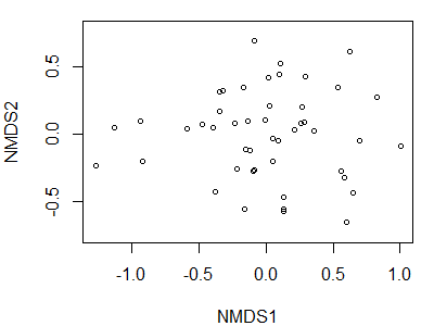
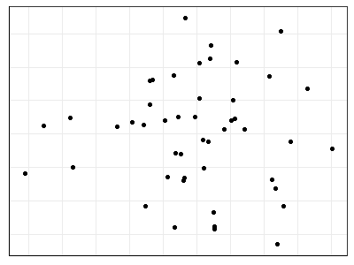
As we’ve seen numerous times, R contains functions whose actions depend on the class of the object being manipulated. For example, the plot() function can be applied to class ‘metaMDS’ objects:
plot(Oak1.z)
We accepted all defaults during this action; one of those defaults is to plot both the site coordinates and species coordinates. We can specify that we only want to display the site coordinates:
plot(Oak1.z,

display = "sites")
Plotting Functions
To customize graphics, it is helpful to break the graphing down into a series of functions. Several commonly used functions are shown in the following table. See the help files for arguments and details.
| Function | Purpose |
plot() |
Plot graph. Can specify whether to plot with points (default; type = "p"), textual labels (type = "t"), or axes only (no data; type = "n"). The latter type gives you control over the points and other elements via subsequent functions. |
points() |
Plot points onto existing graph. |
text() |
Add text to existing graph. |
lines() |
Add line(s) to existing graph. |
legend() |
Add legend to existing graph. |
title() |
Add title(s) to existing graph. |
abline() |
Add reference lines to existing graph. Can specify the intercept (a) and slope (b) of the line, the y-value for a horizontal line (h), and the x-value for a vertical line (v). |
Key Plotting Arguments
Each of the above functions has associated arguments as described in the help files. However, they also have a ‘…’ at the end of the list of arguments. This means that we can also specify additional arguments. In particular, we can draw on the arguments from other graphing functions. The following – and many more – arguments are available; see the help files for functions such as par(), which sets global parameters, for details.
| Argument | Description |
main |
Text to print as main title for the figure. |
sub |
Text to print as a sub-title for the figure. |
cex |
Scaling for symbols and text. Default is 1; 1.5 is 50% larger while 0.5 is 50% smaller. |
pch |
Plotting character – either an integer specifying a symbol or a single character to be used as the default in plotting points. The ‘examples’ section of the help file for the points() function includes code to produce this visual list of options: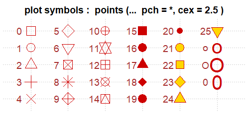
|
col |
Default plotting color. See below for details. |
xaxt |
Axis type for horizontal axis: "n" = none; "s" = standard (default) |
yaxt |
Axis type for vertical axis: "n" = none; "s" = standard (default) |
xlim |
The limits of the horizontal axis. Unless otherwise specified, R automatically sets the limits of x to be slightly larger than the minimum and maximum values of the data being plotted. Specify as xlim = c(x1, x2). Note that x1 > x2 is allowed and leads to a ‘reversed axis’. |
ylim |
The limits of the vertical axis. Unless otherwise specified, R automatically sets the limits of y so that they are slightly larger than the minimum and maximum values of the data being plotted. Specify as ylim = c(y1, y2). Note that y1 > y2 is allowed and leads to a ‘reversed axis’. |
xlab |
Text to print as the label on the horizontal axis. |
ylab |
Text to print as the label on the vertical axis. |
lty |
Line type:
|
lwd |
Line width: default is 1, 2 is twice as thick. |
asp |
Aspect ratio, calculated as y/x. |
pin |
A vector giving the current plot dimensions, (width,height), in inches. |
font |
Font style:
|
family |
Font family. The actual font may differ depending on whether you are running R on Windows or Mac. In windows, the default options are "serif" (Times New Roman), "sans" (Arial), "mono" (Courier New), and "symbol" (Symbol). |
ps |
Font point size. Default is 16. Text size = ps * cex. |
Choosing Colors
Colors are an extremely important aspect of visualizations. They can be identified in multiple ways:
- By integer number, for each named color
- By name, for each named color (see below)
- By hexadecimal string for many more colors. Each hexademical string has the form “#RRGGBB” where each of the pairs RR, GG, BB consists of two hexadecimal digits giving a value in the range 00 to FF for that color (red, green, blue).
For example, ‘chartreuse’ can be specified as colors()[47] or col = "chartreuse" or col = "#7FFF00".
In recent versions of R, the name or code of a specified color is highlighted in that color when it is typed in a script or in the Console.
Named Colors
There are 657 named colors within R. 224 of these are shades of grey and gray (either spelling is accepted). This image identifies the non-grey/gray colors by name:
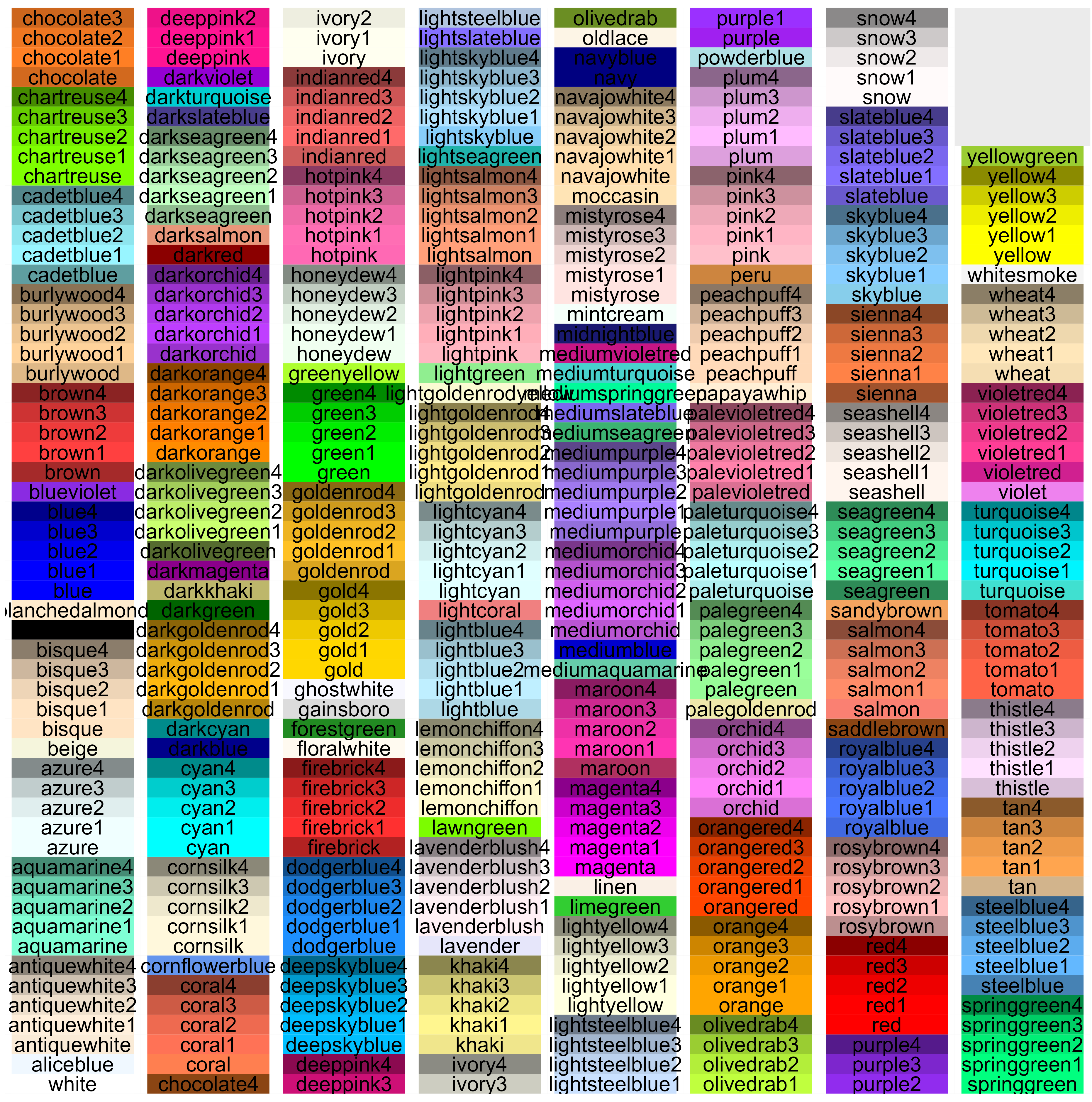
I created the above image using the following code, which is tweaked from that available at http://sape.inf.usi.ch/quick-reference/ggplot2/colour. That website also includes nice graphics showing other aspects of color (hue, saturation, chroma, RGB combinations, etc.).
color.list <- data.frame(color = colors()) %>%
filter(! str_detect(color, "grey|gray"))
d <- data.frame(color = color.list,
y = seq(0, nrow(color.list)-1) %% 55,
x = seq(0, nrow(color.list)-1) %/% 55)
ggplot(data = d) +
scale_x_continuous(name="", breaks=NULL, expand=c(0, 0)) +
scale_y_continuous(name="", breaks=NULL, expand=c(0, 0)) +
scale_fill_identity() +
geom_rect(aes(xmin=x, xmax=x+1, ymin=y, ymax=y+1), fill="white") +
geom_rect(aes(xmin=x+0.05, xmax=x+0.95, ymin=y, ymax=y+1, fill=color)) +
geom_text(aes(x=x+0.5, y=y+0.5, label=color),
colour="black", hjust=0.5, vjust=0.5, size=3)
ggsave("graphics/colors.png", width = 6.5, height = 6.5,
units = "in", dpi = 600)
Color Palettes (ColorBrewer)
It is very common to need multiple colors to distinguish groups in a graphic. The ColorBrewer website (http://colorbrewer2.org/) is a valuable source of information about this.
ColorBrewer provides color palettes for a large number of scenarios, including sequential or diverging or qualitative classes. You simply specify how many classes you want to show. In addition, you can filter palettes based on other criteria such as:
- Colorblind safe
- Print friendly – suitable for color printing
- Photocopy safe – suitable for greyscale printing or photocopying
The colors within the selected palette are identified on the screen by their hexadecimal string.
If using ggplot2, palettes can be called by name using scale_color_brewer() and scale_fill_brewer().
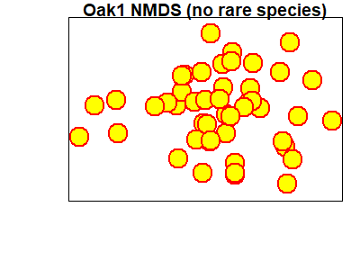
An Example in Base R
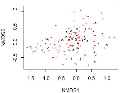
We can use these arguments to build a custom figure. We will do so in stages – first we’ll create an empty plot with no axes – this is important because doing so scales the axes according to the coordinates of the sites even though the units are not displayed on either axis. Once we’ve done that, we’ll add a title and individual points using separate functions:
plot(Oak1.z,

display = "sites",

type = "n",
xlab = "",

xaxt = "n",

ylab = "",

yaxt = "n")
title(main = "Oak1 NMDS (no rare species)")
points(Oak1.z$points,

pch = 21,

cex = 3,

col = "red",
bg = "yellow",

lwd = 2)
Textual Labels
When textual labels are added to an ordination, the graph can easily become difficult to read where points are in close proximity and labels therefore overlap. Several vegan functions help with this problem:
ordilabel()– uses opaque labels; can choose a variable with which to prioritize the order in which labels are assigned.ordipointlabel()– automatically optimizes the location of the labels to improve readability:
ordipointlabel(Oak1.z, display = "sites")orditorp()– adds text only where it does not cover already-present labels, and points otherwise.orditkplot()– produces an ordination in which you can manually select and move labels to improve readability. You can then save the output as an EPS file or dump it into R, where it is saved as an object that you can then plot.
orditkplot(Oak1.z, display = "sites")
(note that this function opens a new graphical window)
Combining Multiple Graphs in a Single Figure
In addition to customizing an individual graph, we can build single figures that contains multiple graphs (or other images).
The mfcol and mfrow arguments within par() are particularly important in this regard. Both arguments require a vector in the form c(nr, nc) specifying the number of rows (nr) and columns (nc) to create; each element in this matrix of figures will be a separate image. The arguments differ in terms of whether graphs are drawn working down the columns (mfcol) or across the rows (mfrow).
To use this capability, you execute par() first and specify either mfcol or mfrow. You can then draw the figures themselves.
par(mfcol = c(1,2))
plot(Oak1.z)
plot(Oak1.z, display = "sites")
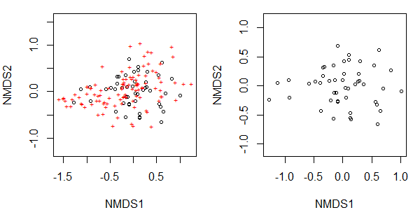
These changes to the graphical window remain in effect until the graphic window is closed or mfrow/mfcol is reset:
par(mfcol = c(1,1))
Graphing with ggplot2
The ggplot2 package is, in my opinion, one of the game-changers within R. It has changed the way many people think about and create graphics. Once you are familiar with its structure, it is much more powerful and versatile than the base R plotting capabilities. I highly recommend it.
Chang (2013) focuses on this package, and the help files for this package are online (https://ggplot2.tidyverse.org/reference/) and include many visual examples. Another source of information is chapter 1 from Wickham & Grolemund (2017). Finally, the package’s cheatsheet (https://rstudio.github.io/cheatsheets/data-visualization.pdf) provides a compact visual summary of its capabilities.
As a measure of its broad appeal, dozens of other packages have been written that organize data for use in ggplot2 or that automate the production of particular types of graphics within the ggplot2 ‘universe’. A few of these are highlighted in the chapter about visualizing and interpreting ordinations.
In ggplot2, graphical objects have a particular ‘grammar’. Each graphic can be described as a series of components. Figures 1 and 2 below (from Wickham 2010) illustrate how a graphical object can be created by combining these elements.

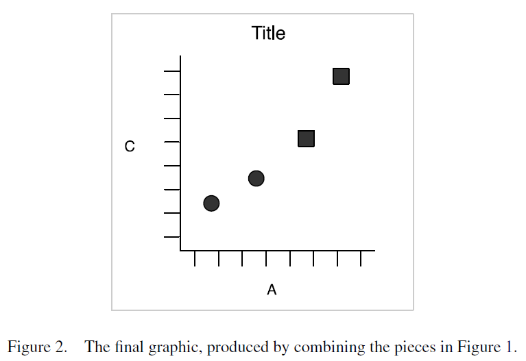 The advantage of this grammar is that each element can be controlled separately. For example, the geometric object can be changed from points to lines without having to change other elements of the graphic. Similarly, a bar chart and a pie chart differ simply in their coordinate system.
The functions that provide other capabilities in ggplot2 are in several classes, including:
- geoms – geometric objects, such as whether to plot the data as points, lines, bars, etc.
- guides – axes and legends
- scales – how to customize appearance of geoms
- facets – multiple panels in same graph
- themes – formatting of axes, panel background, etc.
For example, the ggplot2 cheatsheet provides this template:
ggplot(data = <Data>) +
<Geom_Function>(mapping = aes(<Mappings>),
stat = <Stat>,
position = <Position>) +
<Coordinate_Function> +
<Facet_Function> +
<Scale_Function> +
<Theme_Function>
The elements in bold font are required; all others are optional.
We will create a simple graphic and then use it as a template while covering other aspects of ggplot2 grammar.
ggplot2::ggplot()
The workhorse function is ggplot() – this is where the data are identified and the broad ‘structure’ of the graph (e.g., variables that will define the x and y axes) is established. The elements are then modified or added in other functions. Functions are linked together by adding a trailing ‘+’ after each function – this way, the whole set of functions is executed as a unit. This approach also makes it easy to selectively turn elements off by commenting the relevant line out.
Here is an example, focusing just on the site scores. For convenience, we begin by combining these scores with the Oak_explan dataframe:
Oak_explan <- merge(x = Oak_explan,

y = Oak1.z$points,

by = "row.names")
library(ggplot2)
p <- ggplot(data = Oak_explan,

aes(x = MDS1, y = MDS2)) +
geom_point()
p
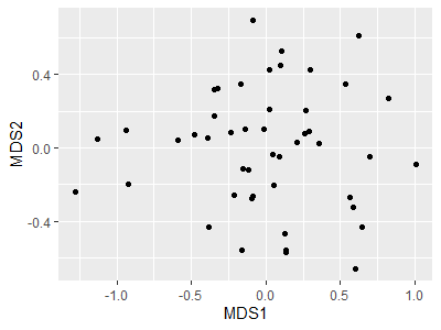
Note that we saved the above graph to an object (p); this allows us to call p and tweak it without having to repeat those lines of code.
Aesthetics
Every element of a graphic can be customized. Elements can be ‘hard-coded’ (applied consistently throughout) or can vary with the data. This distinction can be confusing when learning ggplot2: elements that vary with the data must be referenced within the aes() (aesthetic) function within that element.
For example, we can redraw p with the same color scheme as in the base plotting above:
p +
geom_point(size = 3,
shape = 21,
color = "red",
fill = "yellow")
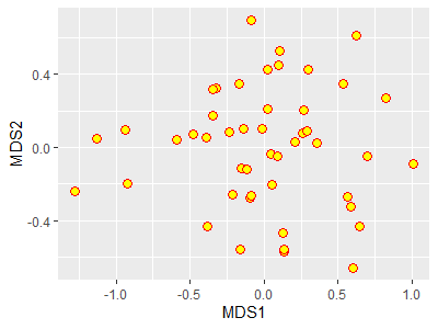
In this case, I changed the symbology in the image printed on the screen but I did not change the object p.
However, if we wanted the symbol color to vary amongst the levels of a grouping variable, we would specify the color within the aes() function and assign it to that grouping variable:
p + geom_point(aes(color = GrazCurr))
Scales
The colors that are assigned to the levels can be specified by including a scale_color_*() function. The * in this function name reflects the fact that there are many options, including:
scale_color_brewer()– use one of the pre-defined ColorBrewer color schemes.scale_color_discrete()– assign a different color to each level, using a default color scheme.scale_color_manual()– manually specify the colors to be used. Assigned to the levels in the order that they are recognized in the data.
For example if we want to manually set the colors for the two levels of our current grazing status variable:
p + geom_point(aes(color = GrazCurr)) +
scale_color_manual(values = c("red", "blue"))
This color scheme is shown in the graphic that is saved to a file near the end of this chapter.
Similar options exist for other aesthetic parameters, including:
scale_fill_*()scale_linetype_*()scale_linewidth_*()scale_shape_*()scale_size_*()
See the help files for more information about these and other scale_*() functions.
Themes
Every element of a ggplot graphic can be controlled. The visual appearance of the graphic is set through the theme, which controls its many elements:
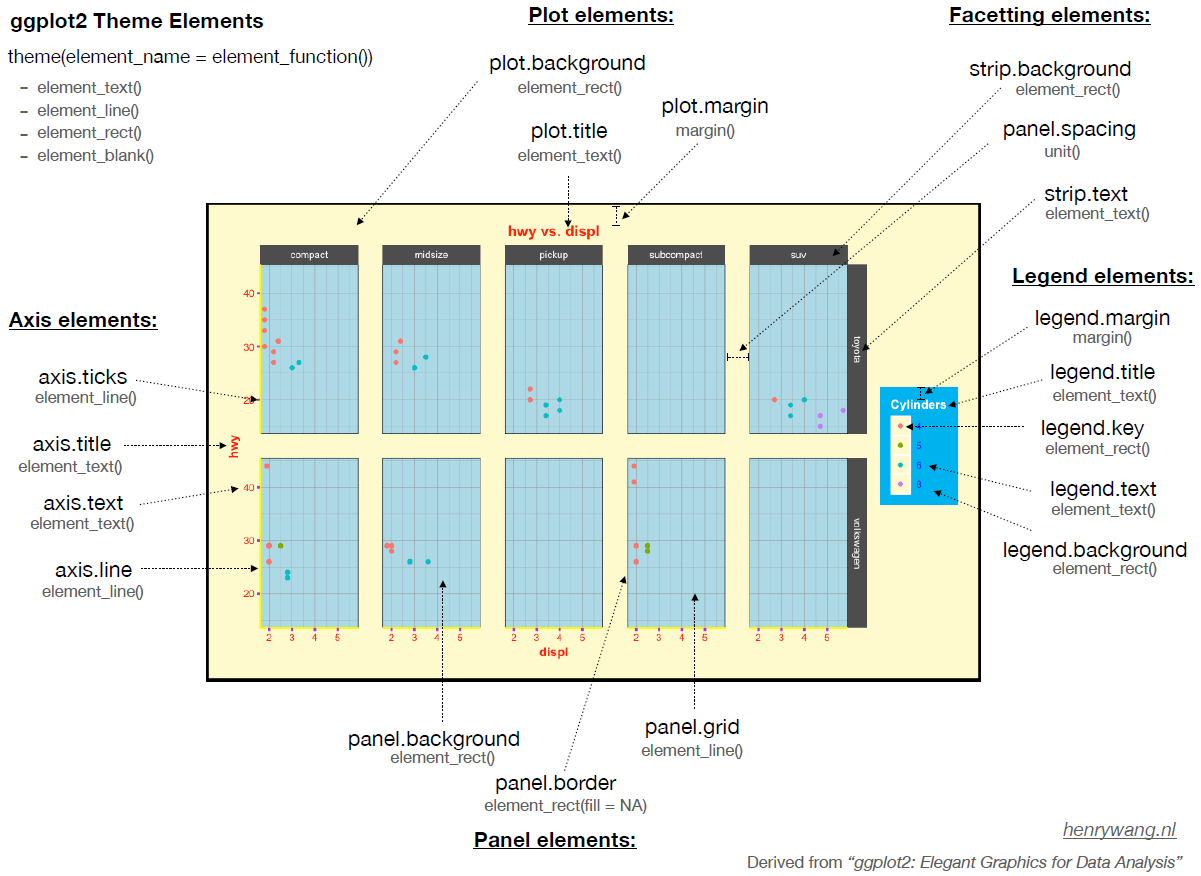
ggplot2. Image from https://henrywang.nl/ggplot2-theme-elements-demonstration/.
Personally, I like graphs that have a white background and dark borders. There is a pre-defined themes, theme_bw(), for this in ggplot2. Pre-defined themes can be used directly or combined with additional customizations. For example, we can omit the axis labels and numerals as is common when drawing a NMDS ordination.
Furthermore, typing out all aspects of the code every time is cumbersome and can easily lead to inconsistencies among graphics. One way to create consistent graphics is to create an object that contains our desired settings for theme():
theme.custom <- theme_bw() +
theme(axis.line = element_line(),
axis.ticks = element_blank(),
axis.text = element_blank(),
axis.title = element_blank())
Note that theme.custom is an object, not a function, and therefore should not have parentheses after it.
Now, we can call this object whenever we want to apply these thematic settings to a graphic:
p +
theme.custom
Another feature of ggplot2 is that there are intelligent default values, and those defaults are hierarchical. For example, we suppressed both axes in theme.custom above. To suppress just the x axis, the arguments within theme() can be changed to ‘*.x’. Try adjusting theme.custom by changing the axis.text argument to axis.text.x. and re-creating the above image – it will now show the vertical axis but not the horizontal axis.
Combining Multiple Graphs in a Single Figure
In ggplot2, multiple graphs are easily combined using faceting. Faceting simply creates a separate graph for each level of the grouping variable. For example, suppose we want to view the current grazing statuses separately:
ggplot(data = Oak_explan, aes(x = MDS1, y = MDS2)) +
geom_point(size = 3, shape = 2) +
facet_grid(cols = vars(GrazCurr)) +
theme.custom
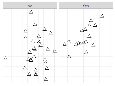
These graphics are based on the same data object and have the same scales for each axis.
We can easily create very different graphics just by choosing whether and how to facet. Faceting can be done by columns (cols; as was done above), or by rows, or both. A single variable with a large number of levels can be shown via the facet_wrap() function.
There are also arguments that allow scales to vary among facets.
The geofacet package allows you to facet in a manner that mimics the original geographic parameters. For example, state-level data could be facetted with the facets approximating the actual arrangement of the states on the earth’s surface.
Other packages build on the ggplot2 platform to provide additional features for creating more complex sets of graphics. Examples include the cowplot and ggarrange packages.
Saving Graphics
There are several ways to save graphics produced in R.
First, you can export images directly from the RStudio Plots window. This opens a pop-up window in which you can choose the file type, image name, and image size (width and height, in pixels). This can work well for a small number of graphs but is laborious if you are creating multiple graphs.
Second, you can zoom in on the graph from the RStudio Plots window, manually resize it if desired, and then right click and choose either ‘Save image as’ or ‘Copy Image’. This is more convenient, but it is hard to ensure that multiple graphs are the same size.
Third, you can directly save the image to a file that you specify, while also hard-coding the dimensions that you want. The file will be saved in the working directory as specified in your R project. The code to do so differs between base R and ggplot.
Saving Graphics in Base R
Different functions exist to save the image in different graphical formats: bmp(), jpeg(), png(), and tiff(). The basic approach is to:
- Create a ‘graphic device’ with the file name and formatting instructions
- Plot the image
- Close the graphic device via
dev.off()
Since the image is plotted directly to the file and not displayed, you have to open and inspect it. You may have to tweak settings and re-run your script to get the graphic to display as desired.
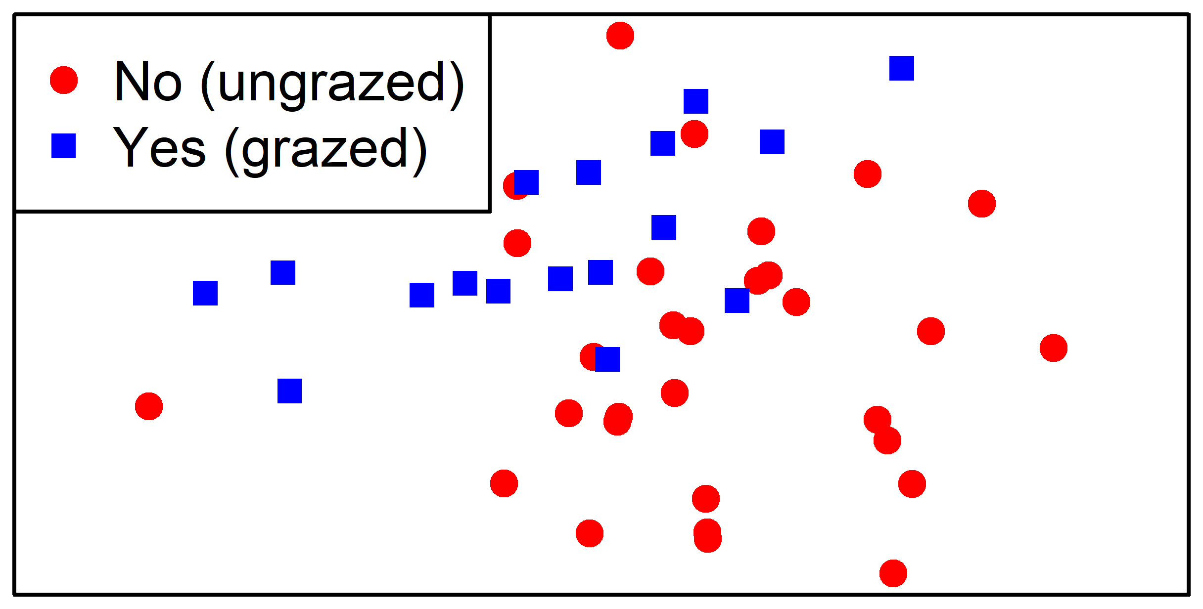
For example, let’s save an ordination in which the stands are color-coded by their current grazing status:
png("graphics/baseR.NMDS5.png",
width = 4,
height = 3,
units = "in",
pointsize = 10,
res = 800)
plot(Oak1.z,
display= "sites",
type = "n",
xaxt = "n",
yaxt = "n",
xlab = "",
ylab = "")
points(Oak1.z$points[Oak$GrazCurr == "No",],
pch = 19,
col = "red")
points(Oak1.z$points[Oak$GrazCurr == "Yes",],
pch = 15,
col = "blue")
legend(x = "topleft",
pch = c(19,15),
col = c("red", "blue"),
legend = c("No (ungrazed)", "Yes (grazed)"))
dev.off()
Saving Graphics in ggplot2 (ggplot2::ggsave())
The ggsave() function:
- Saves the last graph that was displayed to the specified
filename. - Recognizes the desired file format by the suffix provided in
filename; options include .eps, .ps, .tex, .pdf, .jpeg, .tiff, .png, and .bmp. - Allows you to control the:
- Size of the image (
width,height) - Units in which size is specified (
units = c("in", "cm", "mm")) - Resolution of image in dots per inch (
dpi).
- Size of the image (
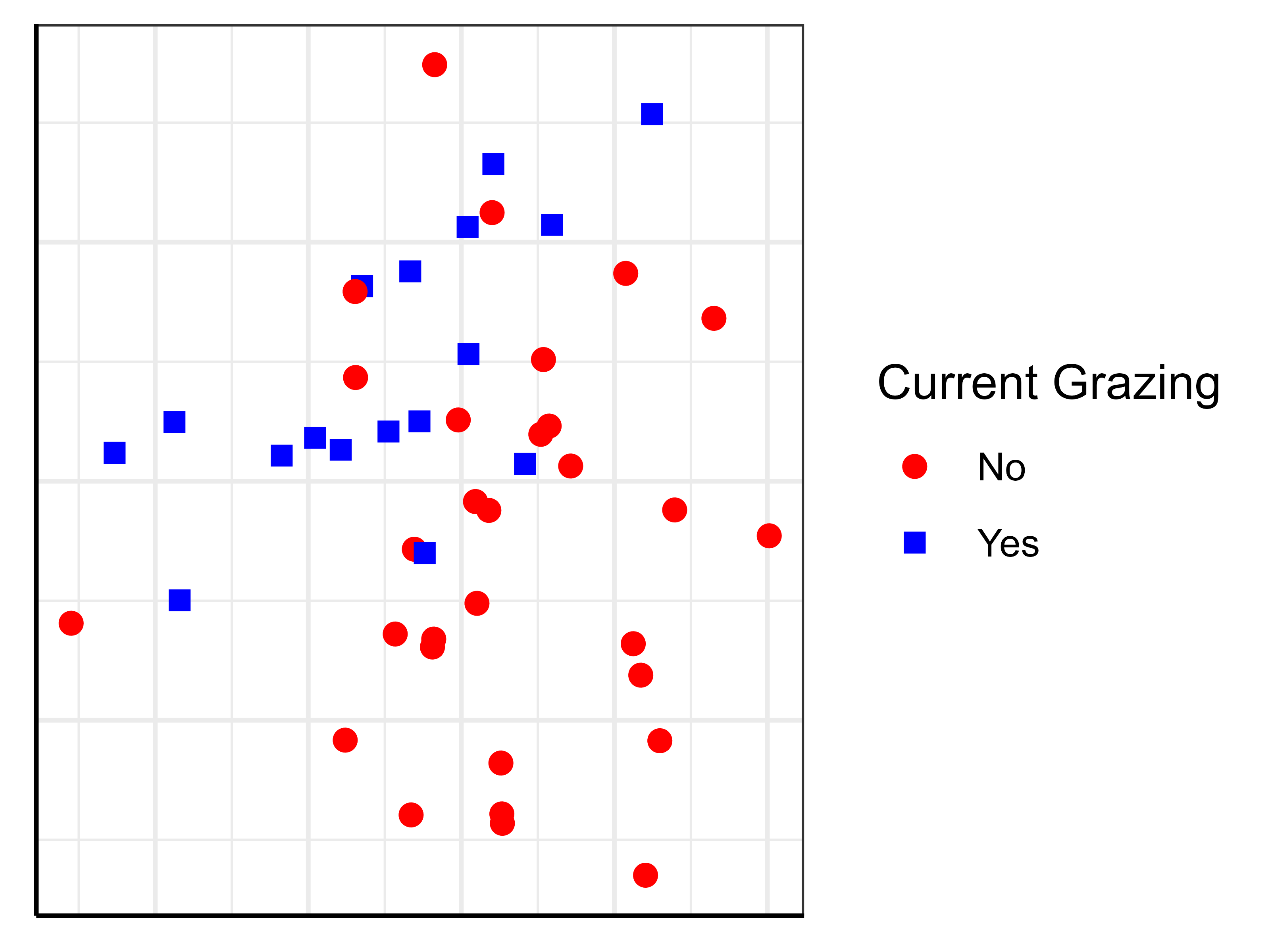
For example, let’s save an ordination in which the stands are color-coded by their current grazing status:
ggplot(data = Oak_explan,
aes(x = MDS1, y = MDS2)) +
geom_point(aes(shape = GrazCurr, color = GrazCurr),

size = 2)+
labs(shape = "Current Grazing",
color = "Current Grazing") +
scale_color_manual(values = c("red", "blue")) +
scale_shape_manual(values = c(19, 15)) +
theme.custom
ggsave(filename = "graphics/ggplot.NMDS6.png",

width = 4,

height = 3,

units = "in",

dpi = 800)
Conclusions
R is an incredibly powerful and flexible software for creating graphics based on the same data objects that are analyzed in it.
The base R plotting capabilities are helpful to know, but even more impressive graphics can be created easily via ggplot2 and associated packages.
References
Dalgaard, P. 2008. Introductory statistics with R. Second edition (First edition, 2002). Springer, New York, NY.
Murrell, P. 2006. R graphics. Chapman & Hall/CRC, Boca Raton, LA.
Sarkar, D. 2008. Lattice: multivariate data visualization with R. Springer, New York, NY.
Venables, W.N., and B.D. Ripley. 2000. Modern applied statistics with S. Springer-Verlag, New York, NY.
Wang, H. 2020. ggplot2 Theme Elements Demonstration. https://henrywang.nl/ggplot2-theme-elements-demonstration/
Wickham, H. 2010. A layered grammar of graphics. Journal of Computational and Graphical Statistics 19(1):3-28. DOI:10.1198/jcgs.2009.07098
Media Attributions
- baseR.NMDS1
- baseR.NMDS2
- pch.symbols
- colors
- baseR.NMDS3
- baseR.NMDS4
- ggplot2.logo
- Wickham.2010_Figure1
- Wickham.2010_Figure2
- ggplot.NMDS1
- ggplot.NMDS2
- Wang_ggplot.themes
- ggplot.NMDS3
- ggplot.NMDS5
- baseR.NMDS5
- ggplot.NMDS6
