
Ordinations (Data Reduction and Visualization)
37 PCA
Learning Objectives
To consider how correlated variables can be combined into uncorrelated principal components.
To demonstrate how to use PCA to rotate and translate data, and to reduce data dimensionality.
To explain how the eigenvalue and eigenvector of a principal component relate to its importance and loadings, respectively.
To introduce the biplot, a common technique for visualizing the results of a PCA.
Key Packages
require(stats, vegan, tidyverse, ggbiplot)
Introduction
Principal Component Analysis (PCA) is an eigenanalysis-based approach. We begin, therefore, by briefly reviewing eigenanalysis. For more details on this topic, refer to the chapter about Matrix Algebra.
Review of Eigenanalysis
Eigenanalysis is a method of identifying a set of linear equations that summarize a symmetric square matrix. It yields a set of eigenvalues (λ), each of which has an associated eigenvector (x). The connection between these terms is expressed in Equation A.16 from Gotelli & Ellison (2004):
Ax = λx
In words, this says that a square matrix A can be multiplied by a vector x and yield the same values as a scalar value λ multiplied by the same vector x. While this may not sound very helpful, it is the basis for ordination techniques such as PCA. It means that data can be rotated, reflected, stretched, or compressed in coordinate-space by multiplying the individual data points by an eigenvector (x). Each combination of an eigenvalue (λ) and its associated eigenvector (x) is a solution for Gotelli & Ellison’s Equation A.16.
The eigenvalues (λ in Equation A.16) represent the variance extracted by each axis. There are as many eigenvalues as there are rows or columns in the matrix (it doesn’t matter which you consider, as the matrix is symmetric), and the eigenvalues are sorted in order of decreasing size. In other words, the first axis always accounts for the most variance, the second axis for the next most variance, etc. They are usually reported as a percentage of the total variance.
The eigenvectors (x in Equation A.16) are associated with the eigenvalue in the same relative position – i.e., the first eigenvector (first column) is associated with the first eigenvalue. The sign of the eigenvector may vary among analyses. For example, an element may be positive in one analysis but negative in another. These analyses are equivalent; they are just mirror images of one another.
Another way to describe eigenanalysis is the process of identifying and computing a new coordinate system for the data. We conventionally represent data graphically such that each axis is a response variable. Eigenanalysis allows us to create new axes that are combinations of the response variables.
An important benefit of eigenanalysis is that the axes of the new coordinate system are uncorrelated with one another. The weights (eigenvectors) are chosen so that the value for a sample unit on one axis is unrelated to the value for that same sample unit on another axis.
Theory
PCA was developed by Karl Pearson (1901), who used it to determine racial assignment of individuals based on multiple biometric measurements (Gotelli & Ellison 2004). Harold Hotelling (1933) developed the mathematics behind PCA, and Goodall (1954) introduced it to the ecological literature under the term ‘factor analysis’ (which is now used to indicate a different analytic technique).
It’s easiest to use an example to illustrate how PCA works. Imagine your data as a cloud of data points. PCA begins by identifying the best-fitting straight line through the cloud. This line is oriented so that it explains as much of the variability in the data cloud as possible, and is called the first principal component (PC). The location of each sample along this axis is calculated by combining its values for the original variables.
Now, imagine rotating the data cloud around the first principal axis until you can identify a second axis that explains as much of the remaining variation as possible. Since you are holding the first axis fixed, the second axis will be perpendicular to (orthogonal to) it. Again, the location of each sample along this axis is calculated by combining its values for the original variables.
Repeat this process for every subsequent axis: rotate the data cloud around the axes that have already been identified and determine the axis that explains as much of the remaining variation as possible while remaining orthogonal to all other axes. Note that although we can perform this mathematically for any number of dimensions, we cannot visualize it in more than three dimensions!
In brief, PCA identifies a series of new ‘synthetic’ variables (principal components; PCs) that are composites or blends of the original variables.
- Each eigenvalue measures the amount of variance explained by that principal component.
- The first eigenvalue accounts for as much variation as possible, the second as much of the remaining variation as possible, etc.
- Each eigenvector is the set of weights assigned to the original variables to produce that principal component.
- Each principal component is uncorrelated with the others.
The effectiveness of PCA is a function of how strongly correlated the original variables are:
- If the variables are highly correlated, PCA can very effectively express them in a smaller number of principal components.
- If all but one variable are highly correlated, one PC will distinguish the uncorrelated variable from the others and the rest of the PCs will largely be combinations of the correlated variables.
- If the variables are uncorrelated, there by definition is no ‘shared’ information between them and each principal component is largely associated with one of the variables.
We can use a PCA in several ways:
- If we keep all of the PCs, we have rotated the data without altering the distances among observations.
- If we focus on the first few PCs, we have reduced the dimensionality of the dataset.
- Since the eigenvalues are in declining order of importance, focusing on them in order means that we are focusing on as much variation as possible to explain in that number of dimensions. For example, it is impossible to explain more variation in one dimension than is explained by PC1, to explain more variation in two dimensions than is explained by PC1 + PC2, etc.
- The principal components are uncorrelated with (orthogonal to) each other. Therefore, the individual components may better meet the assumptions of other analytical techniques (multiple regression, MANOVA, etc.) than the original variables could, and can be analyzed with those techniques.
- Since each principal component is a blend of the original variables, it synthesizes all of those variables simultaneously. It can be more robust to analyze the principal component rather than focusing on one variable. If you chose to analyze one variable, you would have to justify its choice. And, your conclusions might depend on which variable you chose.
PCA is a very important technique to understand. More details about PCA can be found in Borcard et al. (2018; Section 5.3) and Legendre & Legendre (2012; Section 9.1).
PCA is appropriate for many types of data (e.g., LiDAR, morphological data). Summerville et al. (2006) apply this technique to identify suites of correlated traits among moth species, and then analyze each suite of traits (principal component) individually. However, PCA is widely acknowledged to be inappropriate for community-level analyses that involve sample × species data matrices (see ‘Conclusions’ section for details).
Darlingtonia Dataset
We’ll illustrate the steps of a PCA using a dataset containing morphological measurements of Darlingtonia californica (cobra lily, or California pitcherplant) plants. Darlingtonia are carnivorous plants with specialized leaves that function as pitchers which trap insects.
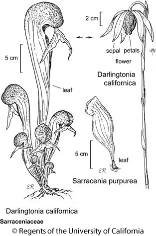
This dataset is taken from Table 12.1 of Gotelli & Ellison (2004). Measurements were made on 87 plants from four sites in southern Oregon. Ten variables were measured on each plant, 7 based on morphology and 3 based on biomass:
| Name | Type | Description | Units |
| height | Morphological | Plant height | mm |
| mouth.diam | Morphological | Diameter of the opening (mouth) of the tube | mm |
| tube.diam | Morphological | Diameter of the tube | mm |
| keel.diam | Morphological | Diameter of the keel | mm |
| wing1.length | Morphological | Length of one of the two wings in the fishtail appendage (in front of the opening to the tube) | mm |
| wing2.length | Morphological | Length of second of the two wings in the fishtail appendage (in front of the opening to the tube) | mm |
| wingsprea | Morphological | Length from tip of one wing to tip of second wing | mm |
| hoodmass.g | Biomass | Dry weight of hood | g |
| tubemass.g | Biomass | Dry weight of tube | g |
| wingmass.g | Biomass | Dry weight of fishtail appendage | g |
The datafile is available through the GitHub repository. Save it to the ‘data’ sub-folder within the folder containing your SEFS 502 project.
Open your course R project and import the data:
darl <- read.csv("data/Darlingtonia_GE_Table12.1.csv",

header = TRUE)
Create an object that contains the response variables (i.e., omitting the columns that code for site and plant number):
darl.data <- darl %>%
select(-c(site, plant))
The Steps of a PCA
Our data are often summarized in a data matrix (n sample units x p response variables). Most of the techniques we’ve considered focus on the n × n distance matrix. With PCA, we focus instead on the p response variables. We will express them as a p × p matrix, but note that this is not a distance matrix – see Step 2 below for details.
We can think of a PCA as a series of 6 steps. The first two steps can be done in two ways (options A and B).
Step 1: Normalize Data (optional)
Option A: Normalize data – subtract the mean and divide by the standard deviation for each column. This expresses all variables on the same units: how many standard deviations each observation is above or below the mean for a variable. The centroid of the normalized dataset is therefore at the origin.
scaled.data <- scale(darl.data)
If variables are not on the same scale, they will contribute unequally to the results: a variable with high variance will contribute much more than a variable with low variance.
Option B: Keep data in raw format.
Step 2: Calculate Variance/Covariance Matrix or Correlation Matrix
Option A: Calculate the variance/covariance matrix (S) based on the scaled data:
S <- cov(scaled.data)
S %>% round(2)
             height mouth.diam tube.diam keel.diam wing1.length
height         1.00       0.61      0.24     -0.03         0.28
mouth.diam     0.61       1.00     -0.05     -0.35         0.57
tube.diam      0.24      -0.05      1.00      0.54        -0.09
keel.diam     -0.03      -0.35      0.54      1.00        -0.33
wing1.length   0.28       0.57     -0.09     -0.33         1.00
wing2.length   0.29       0.44      0.01     -0.26         0.84
wingsprea      0.12       0.25      0.10     -0.21         0.64
hoodmass.g     0.49       0.76     -0.11     -0.30         0.61
tubemass.g     0.84       0.72      0.10     -0.25         0.44
wingmass.g     0.10       0.24      0.03     -0.12         0.47
             wing2.length wingsprea hoodmass.g tubemass.g wingmass.g
height               0.29      0.12       0.49       0.84       0.10
mouth.diam           0.44      0.25       0.76       0.72       0.24
tube.diam            0.01      0.10      -0.11       0.10       0.03
keel.diam           -0.26     -0.21      -0.30      -0.25      -0.12
wing1.length         0.84      0.64       0.61       0.44       0.47
wing2.length         1.00      0.71       0.49       0.36       0.47
wingsprea            0.71      1.00       0.25       0.16       0.34
hoodmass.g           0.49      0.25       1.00       0.76       0.35
tubemass.g           0.36      0.16       0.76       1.00       0.17
wingmass.g           0.47      0.34       0.35       0.17       1.00
Option B: Convert raw data to correlation matrix (P).
P <- cor(darl.data)
P %>% round(2)
             height mouth.diam tube.diam keel.diam wing1.length
height         1.00       0.61      0.24     -0.03         0.28
mouth.diam     0.61       1.00     -0.05     -0.35         0.57
tube.diam      0.24      -0.05      1.00      0.54        -0.09
keel.diam     -0.03      -0.35      0.54      1.00        -0.33
wing1.length   0.28       0.57     -0.09     -0.33         1.00
wing2.length   0.29       0.44      0.01     -0.26         0.84
wingsprea      0.12       0.25      0.10     -0.21         0.64
hoodmass.g     0.49       0.76     -0.11     -0.30         0.61
tubemass.g     0.84       0.72      0.10     -0.25         0.44
wingmass.g     0.10       0.24      0.03     -0.12         0.47
             wing2.length wingsprea hoodmass.g tubemass.g wingmass.g
height               0.29      0.12       0.49       0.84       0.10
mouth.diam           0.44      0.25       0.76       0.72       0.24
tube.diam            0.01      0.10      -0.11       0.10       0.03
keel.diam           -0.26     -0.21      -0.30      -0.25      -0.12
wing1.length         0.84      0.64       0.61       0.44       0.47
wing2.length         1.00      0.71       0.49       0.36       0.47
wingsprea            0.71      1.00       0.25       0.16       0.34
hoodmass.g           0.49      0.25       1.00       0.76       0.35
tubemass.g           0.36      0.16       0.76       1.00       0.17
wingmass.g           0.47      0.34       0.35       0.17       1.00
Look at S and P – they’re identical! This means that we can work with either one in all subsequent steps.
(Note: this is only true if the variables have been normalized in Option A. If you centered but did not rescale them, each variable would be weighted in proportion to its variance. In my experience this is uncommon.)
Step 3: Conduct Eigenanalysis
Conduct eigenanalysis of S (or P; the results will be identical as long as S == P).
S.eigen <- eigen(S)
Step 4: Interpret the Eigenvalues
There will be as many eigenvalues as there are variables.
S.eigen$values %>% round(3) # Eigenvalues
[1] 4.439 1.768 1.531 0.734 0.473 0.362 0.253 0.244 0.143 0.053
The eigenvalues sum to the total of the diagonal of the matrix analyzed. If the data have been normalized (S) or are based on a correlation matrix (P), the diagonal values are all 1 (see above) and hence the eigenvalues sum to the number of variables:
sum(S.eigen$values)
[1] 10
Eigenvalues are generally expressed as a proportion of the total amount of variation:
S.eigen.prop <- S.eigen$values / sum(S.eigen$values)
S.eigen.prop %>% round(3) # rounding for display
[1] 0.444 0.177 0.153 0.073 0.047 0.036 0.025 0.024 0.014 0.005The first eigenvalue always accounts for the most variance, and the proportion of variation declines for each subsequent eigenvalue. The cumulative variance explained is analogous to the R2 value from a regression. Each eigenvalue is associated with a principal component.
One of the important decisions to be made here is how many eigenvalues to retain; see ‘How Many Principal Components?’ section below for details. In this example, we will focus on the first three principal components. Together, these three PCs account for 0.444 + 0.177 + 0.153 = 0.774, or 77% of the variance in the 10 response variables.
Step 5: Interpret the Eigenvectors
Every eigenvalue has an associated eigenvector:
S.eigen$vectors %>% round(2) # 1 vector per eigenvalue
       [,1]  [,2]  [,3]  [,4]  [,5]  [,6]  [,7]  [,8]  [,9] [,10]
 [1,] -0.30 -0.49 -0.03  0.12  0.29  0.53  0.06  0.19  0.03 -0.50
 [2,] -0.39 -0.20  0.18  0.00 -0.14 -0.42  0.24  0.69  0.13  0.19
 [3,]  0.02 -0.35 -0.63  0.07  0.28 -0.54  0.20 -0.24 -0.01 -0.09
 [4,]  0.20 -0.29 -0.53 -0.16 -0.63  0.28 -0.16  0.22 -0.03  0.16
 [5,] -0.40  0.26 -0.11  0.07 -0.30  0.03  0.37 -0.12 -0.70 -0.17
 [6,] -0.37  0.28 -0.24  0.17 -0.14  0.24  0.36 -0.23  0.64  0.16
 [7,] -0.27  0.35 -0.34  0.44  0.17 -0.03 -0.61  0.28 -0.07  0.02
 [8,] -0.40 -0.13  0.16 -0.23 -0.39 -0.29 -0.44 -0.33  0.20 -0.40
 [9,] -0.37 -0.40  0.12  0.02  0.13  0.13 -0.19 -0.33 -0.21  0.68
[10,] -0.23  0.25 -0.24 -0.82  0.34  0.10 -0.05  0.13 -0.02  0.05
In this matrix, the rows correspond to the original variables, in order, and the columns correspond to the principal component identified by each eigenvalue.
The elements of an eigenvector are known as the loadings. The loadings are the coefficients of the linear equation that ‘blend’ the variables together for that principal component. Interpretation is based on these loadings. Since the first three PCs account for most of the variation in this dataset, let’s focus on them. We’ll add row and column names to aid in interpretation.
loadings <- S.eigen$vectors[ , 1:3] %>%
data.frame(row.names = colnames(darl.data)) %>%
rename("PC1" = X1, "PC2" = X2, "PC3" = X3) %>%
round(digits = 3)
loadings
                PC1    PC2    PC3
height       -0.297 -0.494 -0.026
mouth.diam   -0.390 -0.199  0.178
tube.diam     0.016 -0.346 -0.635
keel.diam     0.197 -0.290 -0.527
wing1.length -0.399  0.257 -0.114
wing2.length -0.371  0.284 -0.243
wingsprea    -0.272  0.354 -0.344
hoodmass.g   -0.396 -0.133  0.158
tubemass.g   -0.371 -0.400  0.124
wingmass.g   -0.234  0.249 -0.238
When summarizing a PCA in tabular form, two additional elements are often added as additional rows below the loadings:
- Proportion of variance explained by each PC
- Cumulative proportion of variance explained by this and larger PCs
The proportions of variance explained are helpful to remind us of the relative importance of the PCs, though these proportions obviously should not be interpreted like loadings!
Interpretation of the loadings is subjective, but is based on their magnitude (absolute value) and direction. Summerville et al. (2006) restricted their attention to loadings > | 0.4 | but you can find examples of other thresholds in the literature.
A variable is most important for the principal component where its loading has the largest absolute value. For example, review the above table of loadings and confirm that height is more strongly related to PC2 than to the other PCs and that mouth.diam is more strongly related to PC1 than to the other PCs.
The set of loadings that comprise a PC should also be compared:
- Larger magnitude = more weight
- Similar magnitude and same direction = similar weight (both variables increase at same time)
- Similar magnitude but opposite direction = contrasting weight (one variable increases as the other decreases)
After examining the magnitude and direction of the loadings, here is how we might interpret the results of this PCA:
- PC1 gives roughly equal weight to all variables except tube.diam and keel.diam, and can be interpreted as a measure of pitcher size. This PC accounts for 44% of the variance in the response variables.
- PC2 gives opposing weights to pitcher height and diameter than to the dimensions of the fishtail appendage (wing1.length, wing2.length, wingsprea), and thus can be interpreted as a measure of pitcher shape. This PC accounts for 18% of the variance in the response variables.
- PC3 gives most weight to tube and keel diameters, and might be interpreted as a measure of leaf width. This PC accounts for 15% of the variance in the response variables.
Step 6: Interpret the Scores of Sample Units
The score or location of each sample unit on each axis is determined by matrix-multiplying the data matrix by the eigenvector for that axis.
For example, the scores for all sample units for the first principal component are:
PC1 <- scaled.data %*% S.eigen$vectors[,1]
PC1 %>% head()
           [,1]
[1,] -1.4648658
[2,]  3.2696887
[3,]  1.0026952
[4,] -0.7149071
[5,]  0.9887680
[6,] -1.2136554
The scores for all 87 plants for all PCs are calculated in the same way:
PC.scores <- scaled.data %*% S.eigen$vectors
I haven’t displayed PC.scores here as it is large (87 rows x 10 columns … right?).
The PC scores are orthogonal to (i.e., uncorrelated with) each other:
cor(PC.scores) %>% round(3)
      [,1] [,2] [,3] [,4] [,5] [,6] [,7] [,8] [,9] [,10]
 [1,]    1    0    0    0    0    0    0    0    0     0
 [2,]    0    1    0    0    0    0    0    0    0     0
 [3,]    0    0    1    0    0    0    0    0    0     0
 [4,]    0    0    0    1    0    0    0    0    0     0
 [5,]    0    0    0    0    1    0    0    0    0     0
 [6,]    0    0    0    0    0    1    0    0    0     0
 [7,]    0    0    0    0    0    0    1    0    0     0
 [8,]    0    0    0    0    0    0    0    1    0     0
 [9,]    0    0    0    0    0    0    0    0    1     0
[10,]    0    0    0    0    0    0    0    0    0     1
This is in strong contrast to the correlations among the original variables – see the object P that we created in step 2 above. This is why we can analyze or use each PC independently of the others.
The PC scores can also be graphed (see ‘The Biplot: Visualizing a PCA’ section below).
How Many Principal Components?
By definition, there are as many principal components as there were variables in the dataset. Each principal component is an axis in the ordination space, with an associated eigenvalue and eigenvector.
Depending on our objectives, we might want to use them all or to focus on a subset of them.
Use Them All … (Data Rotation)
If we retain all of the principal components, we have rotated the data by expressing the location of each sampling unit in terms of the new synthetic variables created for each principal component. However, we have not altered the dimensionality of the data or ignored any of the data. The rotated data are in the same relative positions as in the original data; all that has changed is the axes along which the data cloud is arrayed.
By rotating a data cloud like this, we ensure that we are looking at that data cloud from the perspective that shows as much variation as possible. This is commonly done, for example, following a NMDS ordination.
… Or Focus on a Few (Data Reduction) …
When our goal is data reduction, we want to focus on a small number of principal components. However, we also want to account for as much of the variation within the dataset as possible. Since the eigenvalues are arranged in descending order in terms of the amount of variance they account for, the first PCs will often explain most of the variation. Later PCs account for little variation and therefore can be dropped with minimal consequences for interpretation.
There are several ways to determine how many principal components (axes) to consider (Peres-Neto et al. 2005). These ways may give different results.
Visually, we can examine a scree plot. This is simply the proportion of variance explained by each principal component, with the PCs plotted in order. We can examine this in several ways:
- Look for a sharp bend or change in slope in the proportion of variance explained
- Focus on those principal components that explain more variation than average
- Focus on all principal components that explain more variation than expected, where the expectations are random proportions. This is illustrated below.
We can use barplot() to create a scree plot and then superimpose the mean eigenvalue onto that graphic:
barplot(S.eigen.prop)
abline(h = mean(S.eigen.prop),
col = "red")
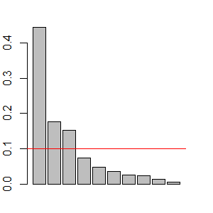
Finally, this decision could be made quantitatively: to focus on as many eigenvalues as necessary to account for 75% (Borcard et al. 2018) or 90% (Crawley 2007) of the total variation.
In our case, it is reasonable to focus on the first three components. There appears to be a break in the scree plot below this, each of these eigenvalues explains more variation than expected, and together they explain 77% of the variance.
… Or Focus on One at a Time
Since the PCs are orthogonal to one another, we can consider them individually. This is helpful when they capture different ‘facets’ of the responses – see the above interpretation of pitcher size (PC1), pitcher shape (PC2), and leaf width (PC3). We can test whether pitcher size (PC1) relates to some predictor, without size being influenced by pitcher shape (PC2) or leaf width (PC3). This is illustrated below.
One advantage of this approach is that we do not have to decide which of our measured variables best represents a facet. For example, rather than having to choose one variable as an index of pitcher size, we can analyze the combined effects of all of the variables on this facet.
PCA Functions in R
While it is helpful to see the steps involved in a PCA, it would be slightly laborious to work through them each time you did a PCA. R, of course, contains several PCA functions. They differ slightly in computational method and in the format and contents of the output.
The PCA functions that we will review here are stats::princomp() and stats::prcomp(). Notably, each of these functions has a default argument that generally needs to be overridden.
Other functions to conduct PCA include vegan::rda() and ade4::dudi.pca().
stats::princomp()
The princomp() function closely parallels what we did above, using the eigen() function to calculate the eigenvalues and eigenvectors. Its usage is:
princomp(x,
cor = FALSE,
scores = TRUE,
covmat = NULL,
subset = rep_len(TRUE, nrow(as.matrix(x))),
fix_sign = TRUE,
...
)
The key arguments are:
x– a matrix or data frame containing the datacor– whether to use the correlation matrix (TRUE) or the covariance matrix (FALSE). Default is the latter. However, we noted above that the variables need to be normalized if using the covariance matrix. This step is not built intoprincomp().scores– whether to return the score for each observation. Default is to do so (TRUE).fix_sign– whether to set the first loading of each PC to be positive (TRUE). This ensures that analyses are more likely to be comparable among runs. IfFALSE, it is possible for the loadings to have opposing signs from one run to another (note that this does not change the correlations among the variables but simply whether large scores are associated with large or small values of each variable (positive and negative signs, respectively).
This function returns an object of class ‘princomp’ which includes numerous components that we calculated in our worked example. These components can each be indexed and called:
sdev– the square roots of the eigenvalues of the variance/covariance matrix. Compare the square of these values toS.eigen$values.loadings– the matrix of loadings (i.e., eigenvectors). This matrix is easier to view than the other loading matrices we’ve seen, but it has a few quirks. For example, the default is to automatically omit elements < 0.1 (a different cutoff can be specified in thesummary()function below). Compare toS.eigen$vectors.center–the mean that was subtracted from each element during normalization.scale– the standard deviation that each element in each column was divided by during normalization.n.obs– the number of observations (sample units)scores– the scores for each observation on each principal component. Compare toPC.scores(or, equivalently,scaled data %*% loadings).call– the function that was run
Applying this to our example dataset:
darl.PCA <- princomp(darl.data, cor = TRUE)
We can use summary() to obtain a summary of the object we created. Behind the scenes, this function recognizes the class of the object (princomp) and applies pre-defined actions based on this class. Knowing this information allows us to find help for it, in the general form function.class(). For example, ?summary.princomp provides arguments to display loadings or not (loadings = FALSE) and, if they are displayed, to restrict attention to those above a specified value (default is cutoff = 0.1). Once we know these arguments, we can of course adjust them:
summary(darl.PCA, loadings = TRUE, cutoff = 0)
Importance of components:
                          Comp.1    Comp.2    Comp.3     Comp.4     Comp.5
Standard deviation     2.1069368 1.3296011 1.2373322 0.85674840 0.68802564
Proportion of Variance 0.4439183 0.1767839 0.1530991 0.07340178 0.04733793
Cumulative Proportion  0.4439183 0.6207022 0.7738013 0.84720307 0.89454100
                           Comp.6     Comp.7     Comp.8     Comp.9
Standard deviation     0.60135218 0.50312405 0.49361594 0.37793991
Proportion of Variance 0.03616244 0.02531338 0.02436567 0.01428386
Cumulative Proportion  0.93070344 0.95601682 0.98038249 0.99466635
                           Comp.10
Standard deviation     0.230946945
Proportion of Variance 0.005333649
Cumulative Proportion  1.000000000

Loadings:
             Comp.1 Comp.2 Comp.3 Comp.4 Comp.5 Comp.6 Comp.7 Comp.8
height        0.297  0.494  0.026  0.122  0.285  0.534  0.062  0.185
mouth.diam    0.390  0.199 -0.178 -0.004 -0.139 -0.418  0.244  0.688
tube.diam    -0.016  0.346  0.635  0.071  0.282 -0.537  0.196 -0.238
keel.diam    -0.197  0.290  0.527 -0.165 -0.626  0.280 -0.157  0.225
wing1.length  0.399 -0.257  0.114  0.072 -0.298  0.034  0.372 -0.121
wing2.length  0.371 -0.284  0.243  0.167 -0.141  0.241  0.357 -0.234
wingsprea     0.272 -0.354  0.344  0.437  0.173 -0.033 -0.614  0.279
hoodmass.g    0.396  0.133 -0.158 -0.232 -0.391 -0.293 -0.439 -0.334
tubemass.g    0.371  0.400 -0.124  0.024  0.132  0.133 -0.189 -0.330
wingmass.g    0.234 -0.249  0.238 -0.821  0.345  0.100 -0.047  0.134
             Comp.9 Comp.10
height        0.028  0.497
mouth.diam    0.126 -0.186
tube.diam    -0.005  0.094
keel.diam    -0.030 -0.162
wing1.length -0.697  0.166
wing2.length  0.638 -0.165
wingsprea    -0.070 -0.024
hoodmass.g    0.201  0.404
tubemass.g   -0.209 -0.680
wingmass.g   -0.022 -0.050
You should be able to match these results to the values obtained in our step-by-step approach above. Focus on one PC at a time and confirm that the magnitude of the loadings is identical but that some PCs have loadings in opposing directions in the two analyses. For example, height has a loading of 0.297 on PC1 in the above table but was -0.297 in our step-by-step analysis. The broad patterns remain the same – variables that increase together in one analysis decrease together in the other – but the interpretation of large or small PC scores will differ. If based on the PCA summarized in the above table, a large value for PC1 would be associated with a larger plant. However, if based on the PCA summarized in the step-by-step analysis, a small value for PC1 would be associated with a larger plant. It is possible for these directions to change from one analysis to another. The current version of princomp() includes a fix_sign argument that minimizes the occurrence of these differences, but I recommend conducting a PCA and summarizing it in the same session.
To obtain a screeplot of the eigenvalues / principal components we can apply plot() or screeplot() to an object of class princomp:
plot(darl.PCA)
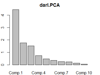
S.eigen$values.
The vegan package includes a similarly named screeplot() function that can be applied to objects of class ‘princomp’ or ‘prcomp’. It includes a ‘broken stick’ argument (bstick) that compares the variation explained by each PC to a set of ‘ordered random proportions’ – the idea is that you would retain as many PCs as explain more variation than expected.
stats::prcomp()
The prcomp() function uses a different approach, singular value decomposition (the svd() function; see Matrix Algebra notes), to obtain the eigenvalues and eigenvectors. Manly & Navarro Alberto (2017) note that this algorithm is considered to be more accurate than that of princomp(), though I have not encountered differences between them.
The usage of prcomp() is:
prcomp(x,
retx = TRUE,
center = TRUE,
scale. = FALSE,
tol = NULL,
rank. = NULL,
...
)
The arguments are:
x– the matrix or data frame containing the dataretx– whether to return the rotated variables. Default is to do so (TRUE).center– whether to center each variable on zero (i.e., subtract the mean value). Default is to do so (TRUE).scale.– whether to scale each variable to unit variance. Default is to not do so (FALSE), though scaling is generally recommended as noted in our worked example (and stated in the help file). Note the ‘.’ in the argument name!tol– tolerance; components will be deleted if their standard deviation is less than this value times the standard deviation of the first component. Default is to include all variables.rank.– number indicating how many principal components to report. Default is to report them all. All principal components are still calculated; this just limits attention to those up to the rank specified.
This function returns many of the same components as from princomp(), but calls them by different names. Again, these components correspond to those calculated in our worked example and can each be indexed and called:
sdev– the standard deviations of the principal components, also known as the square roots of the eigenvalues of the variance/covariance matrix. Compare squared values toS.eigen$values.rotation– the matrix of loadings (i.e., eigenvectors). Compare toS.eigen$vectors.x– the scores for each observation on each principal component. Compare toPC.scores(or, equivalently,scaled data %*% loadings).center– the mean that was subtracted from each element during normalization. Compare toapply(darl.data, 2, mean).scale– the standard deviation that each element in each column was divided by during normalization. Compare toapply(darl.data, 2, sd).
Applying this to our example dataset:
darl.PCA2 <- prcomp(darl.data, scale. = TRUE) # Note scale. argument
The summary(), print(), plot(), and screeplot() functions behave very similarly when applied to an object of class ‘prcomp’ as they do when applied to an object of class ‘princomp’ as shown above. For example, the print() function returns the variance explained by each principal component along with their loadings:
print(darl.PCA2)
Standard deviations (1, .., p=10):
 [1] 2.1069368 1.3296011 1.2373322 0.8567484 0.6880256 0.6013522 0.5031240
 [8] 0.4936159 0.3779399 0.2309469

Rotation (n x k) = (10 x 10):
                     PC1        PC2         PC3          PC4        PC5
height       -0.29725091 -0.4941374  0.02594111 -0.122435477  0.2852089
mouth.diam   -0.38993190 -0.1987772 -0.17804342  0.003956204 -0.1387466
tube.diam     0.01633263 -0.3464781  0.63481575 -0.071324686  0.2822023
keel.diam     0.19728430 -0.2902694  0.52651716  0.164670782 -0.6259843
wing1.length -0.39911683  0.2574223  0.11432171 -0.071529207 -0.2984514
wing2.length -0.37099329  0.2836524  0.24337230 -0.166545660 -0.1412989
wingsprea    -0.27156026  0.3541451  0.34374791 -0.437068261  0.1732058
hoodmass.g   -0.39632173 -0.1326148 -0.15831785  0.231712503 -0.3906018
tubemass.g   -0.37122939 -0.4001026 -0.12442151 -0.024231381  0.1319643
wingmass.g   -0.23420022  0.2493993  0.23750541  0.821358528  0.3448007
                     PC6         PC7        PC8          PC9        PC10
height       -0.53358014 -0.06213397  0.1851593 -0.028165685  0.49680679
mouth.diam    0.41785432 -0.24376093  0.6877145 -0.125773703 -0.18623421
tube.diam     0.53670782 -0.19570472 -0.2384156  0.005035915  0.09352417
keel.diam    -0.28028754  0.15678491  0.2246203  0.030018781 -0.16165211
wing1.length -0.03412138 -0.37171835 -0.1206353  0.696871529  0.16630928
wing2.length -0.24090857 -0.35700239 -0.2344052 -0.638290495 -0.16469409
wingsprea     0.03256432  0.61420874  0.2791219  0.069750311 -0.02361776
hoodmass.g    0.29328788  0.43946368 -0.3340370 -0.200905130  0.40364300
tubemass.g   -0.13345583  0.18870304 -0.3296105  0.209051028 -0.68033777
wingmass.g   -0.09991858  0.04715240  0.1335554  0.022049695 -0.04993778
Using PC Scores
The eigenvalues and loadings (i.e., eigenvectors) are a summary of the PCA. It is important to report these so that the reader knows, for example, which variables were included in the PCA and how important they were for each PC.
Also remember that the meaning assigned to our results may depend on how we interpret those loadings. For example, if someone felt that PC1 more accurately reflected some other aspect of Darlingtonia plants, they might disagree with our characterization of it as a measure of pitcher shape.
The key elements that we want to use are the PC scores of the sample units. We can use the PC scores in several ways.
Analyze Each PC Independently
Although PCs were calculated from a set of correlated variables, the PCs themselves are uncorrelated with one another. It therefore can be appropriate to analyze each PC as a separate response variable. The PCs may better meet the assumptions of separate univariate hypothesis tests even when it would be inappropriate to do so with the original variables.
For example, we can use PERMANOVA to test for a difference in pitcher size (PC1) among sites. To do so, we’ll first combine the scores with the site identity of each plant:
darl.PCA.scores <- data.frame(darl.PCA$scores,
site = darl$site)
adonis2(darl.PCA.scores$Comp.1 ~ site,
data = darl.PCA.scores,
method = "euc")
Permutation test for adonis under reduced model
Terms added sequentially (first to last)
Permutation: free
Number of permutations: 999

adonis2(formula = darl.PCA.scores$Comp.1 ~ site, data = darl.PCA.scores, method = "euc")
         Df SumOfSqs      R2      F Pr(>F)
site      3   100.53 0.26031 9.7362  0.001 ***
Residual 83   285.68 0.73969
Total    86   386.21 1.00000
---
Signif. codes:  0 ‘***’ 0.001 ‘**’ 0.01 ‘*’ 0.05 ‘.’ 0.1 ‘ ’ 1
This test indicates that pitcher size differs among the sites. We could follow this test with pairwise contrasts to determine which sites differ in ‘pitcher size’.
We could also see these differences visually:
ggplot(data = darl.PCA.scores, aes(x = site, y = Comp.1)) +
geom_boxplot() +

geom_jitter(aes(colour = site), width = 0.3, height = 0) +
theme_bw()
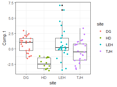
Since PCs are orthogonal, we could conduct identical tests for differences among sites with respect to PC2 (pitcher shape) and PC3 (leaf width). Tests of one PC are always independent of tests of other PCs produced by that PCA.
Reduce Dimensionality of Explanatory Variables
Sometimes we have multiple highly correlated explanatory variables. Rather than having to choose one, we can apply a PCA to this set of variables and thereby summarize them in a much smaller number of uncorrelated variables (ideally, one or two). These uncorrelated PC scores can then be used as explanatory variables in subsequent analyses.
One potential criticism of this approach is that the PCs are more abstract than the set of variables from which they are calculated.
Haugo et al. (2011) provide an example of this approach. The authors examined vegetation dynamics within mountain meadows from 1983 to 2009. One factor influencing the meadows is tree encroachment and associated changes in microenvironment. Tree influence could be quantified in many ways, including tree cover, homogeneity of tree cover, tree density, and basal area. Furthermore, these variables could be considered in terms of both their initial (1983) value and the change in that variable (i.e., 2009 value – 1983 value). A PCA was applied to all of these variables. PC1 explained 37% of the total variation and correlated with initial tree structure (tree cover, homogeneity of tree cover, and basal area). PC2 explained 26% of the total variation and correlated negatively with measures of change in tree structure (change in density, basal area. and cover). PC1 and PC2 were then used as explanatory variables, along with others, to understand changes in the richness and cover of groups of species such as those that are commonly associated with forest and meadow habitats.
The Biplot: Visualizing a PCA
It is common to focus visually on two PCs because we can easily plot them as a scatterplot. When this graphic is overlaid with vectors associated with the variables, it is known as a biplot.
To focus on more than two PCs, we can plot combinations of the PCs. For example, if we wanted to graphically show three PCs, we could plot PC1 vs. PC2, PC1 vs. PC3, and PC2 vs. PC3.
Base R Graphing
When applied to a ‘princomp’ or ‘prcomp’ object, the biplot() function will produce a biplot:
biplot(darl.PCA)
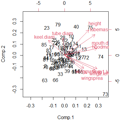
This kind of graphic is common in ordinations. Some comments about interpreting biplots:
- We focus on the first two PCs because, by definition, they explain more of the variation than any other PCs. To create this in our step-by-step introduction to PCA, we simply needed to graph the first two PCs:
plot(PC.scores) - Each individual data point (row in the sample × species matrix) is represented by its row number. We could customize this plot to display them in other ways, such as by having different symbol shapes and colors for different levels of a grouping variable. See below for an example.
- The scores on each PC axis are centered on zero because of the normalizing that occurred during the PCA.
- The axes on the bottom and left-hand side of the graph show the values of the first two PCs. It is common practice to report the amount of variation explained by each axis in the axis title. For example, this code would change the axis labels of the biplot:
biplot(darl.PCA, xlab= "PC1 (44.4%)", ylab= "PC2 (17.7%)") A second coordinate system is shown on the top and right-hand side. According to Everitt & Hothorn (2006, p. 222), this displays the first two loadings associated with these variables – though I haven’t verified this.
The vectors (arrows) are an important aspect of a biplot:
- Each vector corresponds to a variable, and points in the direction in which that variable is most strongly linearly correlated.
- Variables that are perfectly correlated with an axis are parallel to it.
- Variables that are uncorrelated with an axis are perpendicular to it.
- Each vector can be thought of as the hypotenuse of a triangle with sides along the two axes of the graph. The length of these sides is proportional to the loading for that variable with those PCs.
- The angle between vectors shows the strength and direction of the correlation between those variables. You should be able to find examples of each of these cases in the above biplot:
- Vectors that are very close to one another represent variables that are strongly positively correlated
- Vectors that are perpendicular represent variables that are uncorrelated
- Vectors that point in opposite directions represent variables that are strongly negatively correlated
The ggbiplot Package
The ggplot2 package does not have a built-in capability to draw biplots, but the ggbiplot package allows their creation using the ggplot2 approach. It is available from a GitHub repository:
devtools::install_github("vqv/ggbiplot")
library(ggbiplot)
ggbiplot(darl.PCA)
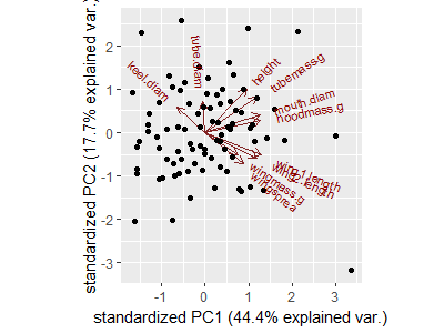
Compare this graphic with the biplot produced above with base R plotting capabilities.
The ggbiplot() function can be combined with other standard ggplot2 functions. For example:
ggbiplot(darl.PCA) +
geom_point(aes(colour = darl$site)) +
labs(colour = "Site", x = "PC1(Size; 44.4%)", y = "PC2 (Shape; 17.7%)") +
theme_bw()
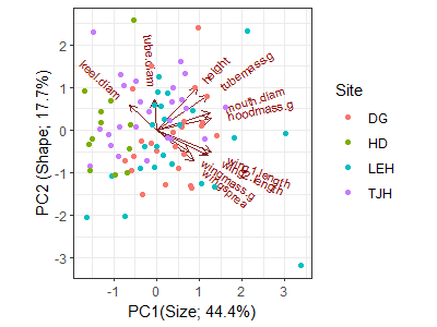
I’ve changed the theme and the axis labels, and color-coded each plant by the site it came from. However, remember that site identity was not part of the PCA.
Conclusions
PCA identifies the best linear fit to a set of variables and therefore is intended for data with linear relationships among variables. It assumes that these variables are continuously distributed and normally distributed (recall the importance of normalization in our step-by-step example). The assumption of multivariate normality is particularly important if you are going to use a PCA to make statistical inferences rather than just to describe a data set.
PCA is appropriate under certain scenarios:
- if the sample units span a short gradient (i.e., beta diversity is low; little turnover among sample units)
- if the data matrix is not sparse (i.e., does not contain many nonzero values)
- when variables are highly (linearly) correlated with one another
Examples where PCA is often appropriate include:
- LiDAR data (multiple highly correlated and continuously distributed variables)
- fuels data
- morphological data
- physiological data
PCA has been used for community-level data (i.e., sample unit × species matrices) in the past, but these applications are considered unsuitable (Beals 1971; Minchin 1987; Legendre & Legendre 2012). Problems when applying PCA to this type of data include:
- PCA works best with highly correlated response variables, but the abundances of many species are only weakly correlated with one another.
- Sensitive to outliers. If data are highly skewed, the first few principal components will separate the extreme values from the rest of the sample units.
- “The quality of ordination by PCA is completely dependent on how well relationships among the variables can be represented by straight lines” (McCune & Grace 2002, p. 116).
- Need more sample units than variables measured (technicality; I’m not sure how important this really is).
- Implicitly uses the Euclidean distance measure
- May yield horseshoe effect (artificial curvature) in second and higher axes if sample units span a long gradient. This occurs because shared zeroes are interpreted as an indicator of a positive relationship, and because two species may be positively related to each other at some points and negatively related at other points. See Fig. 19.2 in McCune & Grace (2002) for an example of this.
- ‘Axis-centric’? (term borrowed from Mike Kearsley at Northern Arizona University) – we tend to assign more meaning to axes than may be warranted.
- Tendency to interpret proximity of apices of variables (vectors) rather than the angles separating them.
Although PCA is inappropriate for analyzing community-level data, there are certain applications in which it is appropriate even with these data. In particular, PCA can be used to rotate the coordinates from another ordinations so that the the ordination solution is expressed in such a way that each axis explains as much of the remaining variation as possible. When doing so, all principal components are retained and thus the dimensionality of the ordination solution is unchanged; the rotated data are in the same relative positions as in the original ordination solution.
Not considered here are alternatives such as Multiple Correspondence Analysis (MCA), which can handle categorical variables (Greenacre & Blasius 2006).
References
Beals, E.W. 1971. Ordination: mathematical elegance and ecological naivete. Journal of Ecology 61:23-35.
Borcard, D., F. Gillet, and P. Legendre. 2018. Numerical ecology with R. 2nd edition. Springer, New York, NY.
Crawley, M.J. 2007. The R book. John Wiley & Sons, Hoboken, NJ.
Everitt, B.S., and T. Hothorn. 2006. A handbook of statistical analyses using R. Chapman & Hall/CRC, Boca Raton, LA.
Goodall, D.W. 1954. Objective methods for the classification of vegetation. III. An essay in the use of factor analysis. Australian Journal of Botany 2:304-324.
Gotelli, N.J., and A.M. Ellison. 2004. A primer of ecological statistics. Sinauer, Sunderland, MA.
Greenacre, M., and J. Blasius. 2006. Multiple correspondence analysis and related methods. Chapman & Hall/CRC, London, UK.
Haugo, R.D., C.B. Halpern, and J.D. Bakker. 2011. Landscape context and tree influences shape the long-term dynamics of forest-meadow ecotones in the central Cascade Range, Oregon. Ecosphere 2:art91.
Hotelling, H. 1933. Analysis of a complex of statistical variables in principal components. Journal of Experimental Psychology 24:417-441, 493-520.
Legendre, P., and L. Legendre. 2012. Numerical ecology. 3rd English edition. Elsevier, Amsterdam, The Netherlands.
Manly, B.F.J., and J.A. Navarro Alberto. 2017. Multivariate statistical methods: a primer. Fourth edition. CRC Press, Boca Raton, FL.
McCune, B., and J.B. Grace. 2002. Analysis of ecological communities. MjM Software Design, Gleneden Beach, OR.
Minchin, P.R. 1987. An evaluation of the relative robustness of techniques for ecological ordination. Vegetatio 69:89-107.
Pearson, K. 1901. On lines and planes of closest fit to systems of points in space. Philosophical Magazine, Sixth Series 2:559-572.
Peres-Neto, P.R., D.A. Jackson, and K.M. Somers. 2005. How many principal components? stopping rules for determining the number of non-trivial axes revisited. Computational Statistics & Data Analysis 49:974-997.
Summerville, K.S., C.J. Conoan, and R.M. Steichen. 2006. Species traits as predictors of lepidopteran composition in restored and remnant tallgrass prairies. Ecological Applications 16:891-900.
Media Attributions
- Darlingtonia.californica_Jepson
- PCA.barplot2
- darl.screeplot
- PCA.pitcher.size.gg
- PCA.biplot
- PCA.biplot.gg
- PCA.biplot.gg2
