
Classification
31 Using Groups
Learning Objectives
To explore ways of using the groups identified from cluster analyses: naming them, using them to summarize data, and overlaying them onto an ordination.
To continue visualizing patterns among sample units.
Key Packages
require(vegan)
Introduction
A hierarchical cluster analysis produces a dendrogram showing the relationships among sample units. Using the criteria discussed in that chapter, the analyst decides which height of the dendrogram to focus on and the associated number of groups. Each sample unit is assigned to one group based on where it was fused within the dendrogram.
A non-hierarchical cluster analysis (e.g., k-means) also assigns each sample unit to a group. The analyst decides how many groups they want and which criterion to use. Each sample unit is assigned to one group so as to minimize the criterion.
In this chapter, we will illustrate several ways to use the groups identified by either approach.
Oak Example, and Naming Groups
The ideas in this chapter are illustrated with hierarchical and k-means cluster analyses of our oak dataset. I’ll use 6 groups for each analysis for simplicity.
source("scripts/load.oak.data.R")
Oak_explan$Stand <- rownames(Oak)
Oak1.hclust <- hclust(d = Oak1.dist, method = "ward.D2")
g6 <- cutree(Oak1.hclust, k = 6)
k6 <- kmeans(x = Oak1, centers = 6, nstart = 100)$cluster
Oak_explan <- data.frame(Oak_explan, g6, k6) #Combine grouping codes with original data
It can be confusing to keep track of the groups from different analyses when they’re named with the same values (here, 1:6). Also, these numbers are subjective – there’s no reason to expect group 1 from the hclust() analysis to have any relation to group 1 from the kmeans() analysis. Instead, let’s give them distinct categorical names.
groups <- data.frame(g6, k6) %>%

rownames_to_column("Stand") %>%
merge(y = data.frame(g6 = 1:6, g6_letter = letters[1:6])) %>%
merge(y = data.frame(k6 = 1:6, k6_LETTER = LETTERS[21:26]))
with(groups, table(g6_letter, k6_LETTER))
         k6_LETTER
g6_letter  U  V  W  X  Y  Z
        a 10  0  1  2  1  0
        b  0  0  9  0  0  0
        c  0  0  0  0  0 10
        d  0  0  2  0  1  0
        e  4  0  0  0  1  2
        f  0  2  0  2  0  0
I’ve highlighted in bold the row and column names – the rows reflect the groups from the hclust() analysis and the columns reflect the groups from the kmeans() analysis. The values within the table are the number of sample units assigned to the same combination of groupings.
The differing criteria for identifying groups have resulted in some differences between these two approaches – for example, sample units that are assigned to group ‘a’ in the hclust() analysis are assigned to four different groups in the kmeans() analysis. Furthermore, the assignment of groups of sample units to particular group codes may vary from run to run of the analysis.
Comparing Dendrogram to Individual Variables
One way to explore a hierarchical cluster analysis is to compare it with the abundances of the species present in each plot.
The vegan::tabasco() function allows this. The following graphic would be very busy if I used all species, so I focus just on those species present in at least half of the stands. I also label each sample unit with the group it is assigned to and its stand number.
tabasco(x = vegtab(Oak1,
minval = nrow(Oak1)/2),
use = Oak1.hclust,
labCol = paste(groups$g6_letter, groups$Stand, sep = "_") )

In this image, sample units are arranged based on their location in the dendrogram shown at the top of the heat map and are coded at the bottom of the image by the numerical code for the group to which they are assigned and their stand number.
Each cell in this image is colored to reflect the abundance of that species (row) in that sample unit (column). Note that we relativized each species by its maximum and therefore every row has at least one dark red cell (relative abundance = 1). If we had not relativized these data, the species with larger absolute abundances would be darker in this heat map. As it is, you can see that Quga.t has mostly red colors because it had relatively high abundance in all plots.
The tabasco() function can also be applied to view species abundances relative to a vector of other data (e.g., values of an explanatory variable).
The vegan::vegemite() function produces a compact tabular summary of the abundances of taxa. It requires specification of a scale for expressing abundance as a set of one-character numbers or symbols.
Summarizing Variables Within Groups
We can treat the groups from a cluster analysis as a factor that is then used to summarize individual variables. These individual variables could be part of the data matrix from which the distance matrix was calculated, or other variables that were collected on the same sample units but were not part of the cluster analysis.
To illustrate this, I use the 6 groups from the hierarchical cluster analysis to summarize a few explanatory variables.
Oak_explan %>%

merge(y = groups) %>%
group_by(g6_letter) %>%
summarize(n = length(g6_letter),

Elev.m = mean(Elev.m),

AHoriz = mean(AHoriz))
# A tibble: 6 × 4
  g6_letter     n Elev.m AHoriz
  <chr>     <int>  <dbl>  <dbl>
1 a            14   133.   13.1
2 b             9   135    25.2
3 c            10   162.   18
4 d             3   157    11.3
5 e             7   145.   16.9
6 f             4   163    16.8
For example, groups ‘c’ and ‘f’ have higher average elevations than the others.
We could also test whether groups differ with regard to elevation and other variables.
We can do the same calculations with response variables. Furthermore, since we relativized each species by its maxima, we can summarize either the raw data or the relativized data. Here’s we’ll just pick out two species.
Looking at the raw abundance data for these species within the 6 groups from the hierarchical cluster analysis:
Oak %>%
rownames_to_column("Stand") %>%

merge(y = groups) %>%

group_by(g6_letter) %>%

summarize(n = length(g6_letter),

Pomu = mean(Pomu),

Syal.s = mean(Syal.s))
# A tibble: 6 × 4
  g6_letter     n  Pomu Syal.s
  <chr>     <int> <dbl>  <dbl>
1 a            14  8.5  21.3
2 b             9  5.58 55.7
3 c            10 48.2  21.2
4 d             3  1.40 57
5 e             7 12.4  14.1
6 f             4  0     0.975
Pomu had much higher cover (48.2%) in group ‘c’ than in the groups, and was absent from plots classified into group ‘f’. Syal.s was abundant in groups ‘b’ and ‘d’.
Looking at the relativized data, as used in the hierarchical cluster analysis:
Oak1 %>%

rownames_to_column("Stand") %>%
merge(y = groups) %>%

group_by(g6_letter) %>%

summarize(n = length(g6),

Pomu = mean(Pomu),

Syal.s = mean(Syal.s))
# A tibble: 6 × 4
  g6_letter     n   Pomu Syal.s
  <chr>     <int>  <dbl>  <dbl>
1 a            14 0.105  0.296
2 b             9 0.0689 0.773
3 c            10 0.594  0.294
4 d             3 0.0173 0.792
5 e             7 0.153  0.195
6 f             4 0      0.0135
For example, the mean abundance of Pomu in group ‘a’ is about a tenth of what it is in the stand where it was most abundant.
Once you understand how groups differ, you could incorporate that information into descriptive group names. These names could be used when group identities are overlaid onto ordinations, summarized in tables, etc. For example, Wainwright et al. (2019) conducted a hierarchical cluster analysis of vegetation data from permanent plots and identified four distinct groups of plots. They then examined characteristics of the species that were dominant in each group:
- Functional group (shrub, grass, forb)
- Nativity (whether native or non-native to area)
- Fire tolerance (whether shrubs were able to resprout or not after fire)
Based on this information, they named their four groups as obligate seeder, grass-forb, invaded sprouter, and pristine sprouter. See their Table 1 for more characteristics of these groups.
Overlaying Onto An Ordination
The multivariate set of responses used to create a distance matrix can also be visualized through an ordination. An ordination is a low-dimensional (often two-dimensional) representation of the dissimilarity matrix: points near one another are similar in composition, and points far from one another are more dissimilar. This graphical summary of the data can then be overlaid with other information, including about the groups generated through a cluster analysis.
Overlaying A Dendrogram (vegan::ordicluster())
The ordicluster() function provides one way to explore the structure within the groups identified from a dendrogram. It simply adds lines to an ordination that connect plots in the order in which they were fused together in the cluster analysis. When a group is being fused, the line intersects the centroid of the group. Recall that a dendrogram can be envisioned as a (one-dimensional) mobile. What we’re doing here is arranging the groups in two dimensions and then looking directly down onto that mobile.
We’ll illustrate this using the oak plant community dataset, and the 6 groups that we identified from its dendrogram. We conduct and plot a NMDS ordination of the data, and then overlay the cluster results onto it:
Oak1.z <- metaMDS(comm = Oak1.dist,

k = 2)
plot(Oak1.z,

display = "sites",

main = "6 groups",
xaxt = "n",

yaxt = "n",

xlab = "",

ylab = "")
ordicluster(ord = Oak1.z,6)
cluster = Oak1.hclust,
prune = 5,
col = g
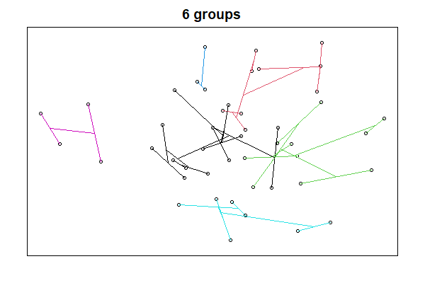
We’ll cover NMDS ordinations soon. For now, please note that each point is a stand. Points that are near to one another are more similar in composition, and those that are far from one another are more different in composition.
A few notes about the ordicluster() function:
- The ‘
prune’ argument specifies how many fusions to omit; since each fusion combines two groups, the number of groups to be displayed is one more than the number of fusions omitted (i.e., prune = 5 shows 6 groups). In other words, the ‘prune’ argument omits the last or upper fusions in the dendrogram so that we can see the patterns within each group. - For clarity, I used a different color for the lines connecting stands in each group.
- I used
g6to index the colours;groups$g6_letterdid not work and I haven’t debugged this.
This approach is not applicable to k-means cluster analysis … do you see why?
Overlaying Group Perimeters (vegan::ordihull())
Groups can also be highlighted in ways that do not require a dendrogram and that therefore can be applied to the groups identified through any type of cluster analysis. In fact, these methods can be applied to groups identified by any categorical variables!
Here, we illustrate how to draw a polygon or hull that encompasses all sample units from the same group.
We plot the ordination again and then add hulls based on the grouping factor of interest. We can repeat this multiple times to explore different groupings.
First, let’s view the six groups from our hierarchical cluster analysis:
plot(Oak1.z,

display = "sites",

main = "6 groups (hier.)",
xaxt = "n",

yaxt = "n",

xlab = "",

ylab = "")
ordihull(ord = Oak1.z,

groups = g6,

col = "blue",

lwd = 2)

Next, let’s view the six groups from our k-means analysis:
plot(Oak1.z,

display = "sites",

main = "6 groups (k-means)",
xaxt = "n",

yaxt = "n",

xlab = "",

ylab = "")
ordihull(ord = Oak1.z,

groups = k6,

col = "red",

lwd= 2)
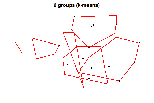
The two types of cluster analyses identified quite different groups, in part because one was hierarchical and the other was not.
Overlaying Group Identities
We can use symbology to distinguish groups in an ordination. Let’s use our k-means analysis to do so.
plot(Oak1.z,

display = "sites",

main = "6 groups (k-means)",
xaxt = "n",

yaxt = "n",

xlab = "",

ylab = "")
points(Oak1.z,

pch = k6,
col = k6,

cex = 2)
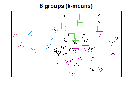
We will see more ways to visualize groups when we discuss ordinations.
Other Uses for Cluster Groups
The groups that we identify can serve as explanatory variables in subsequent analyses. For example:
- A cluster analysis of vegetation groups at one point in time might form a categorical variable in subsequent analyses of how vegetation communities changed over time. Mitchell et al. (2017) provide an example of this.
- Environmental variables might be tested to determine if they differ among groups defined from a cluster analysis of vegetation data, or vice versa.
Another option is to test for differences in the data matrix among groups. For example, if we are using a plant community data matrix as in our oak example dataset, we could test whether composition differs amongst the groups identified in a cluster analysis. This may be somewhat uninteresting, since the clustering was done expressly to identify groups that were as different from one another as possible. It is possible, I think, for these clusters to not differ statistically from one another, but in my experience this is uncommon. One other factor to keep in mind in this regard is the hierarchical structure of the groups: two groups from the same branch of the dendrogram are necessarily going to be more similar to each other than to a group from another branch of the dendrogram.
Although a cluster analysis identifies groups, that does not mean that all of the variables in the response matrix are equally different among those groups. Variables can be tested individually (or in subsets) to determine which group(s) they differ among. The ways that this is done need to reflect the characteristics of the data.
- Regular, continuously distributed variables can be analyzed using ANOVA or PERMANOVA.
- Community data are often represented by sparse matrices (lots of absences). One way to test for differences in this type of data is with Indicator Species Analysis (ISA). ISA considers both species presence/absence and species abundance, and identifies species that are more strongly associated with the groups than expected by chance. We’ll consider this separately.
Conclusions
The groups identified through cluster analysis are based on the multivariate data collected on the sample units. Other information such as explanatory variables was not used in this classification.
The groups can be used to summarize variables collected on the same sample units, both variables that were included in the calculation of the distance matrix and those that were independent of it. This information can be used to assign more meaningful names to the groups.
Groups can be illustrated graphically by overlaying them onto an ordination based on the same data.
References
Mitchell, R.M., J.D. Bakker, J.B. Vincent, and G.M. Davies. 2017. Relative importance of abiotic, biotic, and disturbance drivers of plant community structure in the sagebrush steppe. Ecological Applications 27:756-768.
Wainwright, C.E., G.M. Davies, E. Dettweiler-Robinson, P.W. Dunwiddie, D. Wilderman, and J.D. Bakker. 2019. Methods for tracking sagebrush-steppe community trajectories and quantifying resilience in relation to disturbance and restoration. Restoration Ecology 28:115-126.
Media Attributions
- oak.tabasco
- ordicluster
- ordihull.g6
- ordihull.k6
- oak.kmeans
