
18 Sommer Ullrich on Johannes Itten
Sommer Ullrich is a student at University of Washington studying design and psychology. She is interested in researching emotion, color, and form. A few art forms she is interested in are textiles, digital art, and motion.
Johannes Itten (1888-1967) was a Swiss Expressionist painter and important figure at the Bauhaus in Weimar. He developed color theories that drew on science and emotion, establishing many important concepts used in art and design.
Dear Mr. Itten,
I chose to write to you because there are similarities in our artistic process, and my classes feature many of the principles you taught at the Bauhaus. Through my first making project this quarter, I noticed that we share thoughts about the process of releasing emotion through art and experimenting with shape and color. This first project, making pillows that represented my feelings during Covid, was a subjective exploration of color and shape. My second making project was not as personal, as I was focused more on improving a universal problem with a design solution. For this project I made a moving time capsule that encouraged people to take action on climate change. This project did not relate to your work as much as my first, but brought up some questions for me about what your opinion would be on the digital making space. I would love to tell you about these projects and share how they compare and contrast to your work. I also chose to write to you because I am interested in your perspectives on the challenges of balance between the objective principles of design and the more subjective side of artistic style. Lastly, although I admire you as an artistic figure, I would like to challenge some of your choices and ideas.
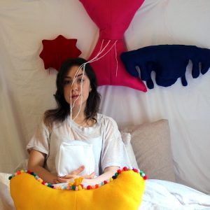
Self-finding and emotional expression played a large role in creating the pillows for my first making project. The pillows represented feelings related to the Covid pandemic and quarantine. I used colors and shapes to represent feelings, which draws a parallel with your work. After sewing the pillows, I filled them with the things that made me feel a certain emotion. This part of the process required emotional awareness and vulnerability. You encouraged students to be real by putting themselves into their art, which felt important to me during this process. I had to really think about how I felt and experience uncomfortable emotions, which can be hard to do during a class project that people will be viewing. You once said, “The kingdom of colors has within it multidimensional possibilities only partly to be reduced to simple order. Each individual color is a universe in itself.” [1] You seem to be saying that colors contain more than just the responsibility of the system they are assigned to. Colors can hold completely different meanings, depending on the person. Through my design courses, I have been taught an order that can be followed but I still feel like there is more to color. There is something that can not be reduced to a systematic approach. I used this perspective when I was making the pillows, using purely what I felt the color to represent.
The colors I chose to represent the feelings were:
Blue: sadness
Red: anger
Yellow: happiness
White: hope
Pink: anxiety
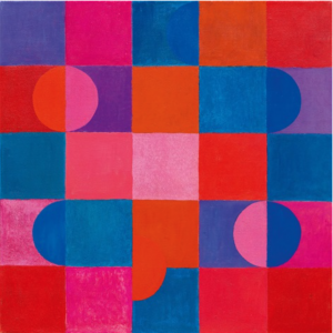
I differed the shape for each feeling, into a form that made sense for each one. This would interest you and your colleague Kandinsky because you both worked with interactions between shape and color. You liked to paint geometric abstractions exemplifying your research into color. Through these geometric abstractions you played with dynamic contrasts of color, as well as rhythms between dark and light. Most of your works consisted of primary shapes and colors, which became a consistent theme of the Bauhaus. A lot of your works were inspired by your colleague Kandinsky. Kandinsky had a synesthetic relationship with color, associating colors with musical notes. He also saw lots of associations between color and form. For example, he saw squares as being red, triangles as yellow, and circles as blue. You both explored shapes and color, finding what meaning they could convey through their properties. Your paintings were very exciting to see because they connected to my project, but through a different medium. One painting I particularly enjoyed was, Zweiklang, which you painted in 1964. This one stood out to me because it mixes warm and cool colors, as well as circles and squares. Through Zweiklang, you also experimented with the Gestalt principle of closure by only including parts of the circles, which makes it interesting to look at. The result is a radiant composition that reminds me of the end of a sunset.Painting is a very different making process than sewing, and it made me curious about whether painting my feelings during Covid would achieve a different effect. I think you would agree that different mediums achieve different effects because you encouraged students to find a medium that was best for their personal style in your Bauhaus course. I read that one of your goals was to, “open the world of the objective to students.” [2]and to intermingle objective and subjective form and color problems. Although I did consider how the colors would look together objectively in my project, I let my own personal perspective lead the way when choosing shape and color. It would have been interesting to try to intermingle more objective rules into this project. I think you would have critiqued my shapes because some were more curvilinear rather than the clean cut geometrical shapes that the Bauhaus used. You might have used geometric shapes but only changed the color or texture to express the emotion. Although I believe there would have been some differences between our design, I think you would have enjoyed my process because it involved a lot of color choices, individual artistic growth, and connection between the brain and the hand.
I appreciate your interest in connecting the brain to art, because I am a design and psychology major. I enjoy finding ways that these fields relate, one way being the Gestalt principles of design. The Gestalt principles use the way humans perceive to make design more visually captivating. Studying human perception and also studying design has been interesting for me because I have realized that design involves a lot of rationale and systematic thinking, rather than just being artistic. Even though design is different than art in this way, I have also found that connecting my work to the brain in a more emotional way gives it a personal edge that makes it more compelling. Connecting to my work in this way also makes me feel more invested in it. I like the idea of depicting emotions visually, like in my first project. It seems like you enjoyed connecting art to mental activity, through things like breathing exercises and meditation. You said, “He who wants to become a master of color must see, feel, and experience each individual color in its many endless combinations with all other colors. Colors must have a mystical capacity for spiritual expression, without being tied to objects.” [3] This quote stood out to me because it made me think about color differently, more as an experience than as a tool. I want to carry this idea into my projects to come because I think that would make my color choices more important and intentional. I appreciate this outlook on mastering color because I think mindfulness and intentional awareness are essential when creating. It is easy to be passive and just follow trends, so I think it is a good reminder to be deeply invested in your work.
One challenge I have as a design student is finding the balance between design rules and my own artistic style and personality. Sometimes I get very personally invested in a piece and do not pay enough attention to the design principles that could help it be more clean and clearly convey a message. This is a problem I thought you would be interested in and could possibly relate to, because you worked in the design world but experimented a lot artistically. You taught a lot of principles about color and form, but also wanted students to make their work their own. It seemed like you were able to achieve this balance of working with design rules and solutions while also pushing the boundaries of your own personal artistic style. As I noted before, intermingling the objective and subjective was one of your goals. One thing that I think showcased these themes within your design thinking was your theorizing and development of the color wheel.
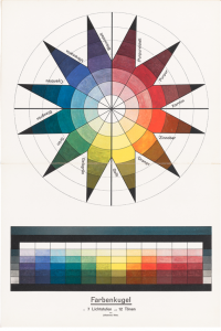
To further develop the color wheel you made a star shaped diagram that explained the seven categories of color, hue, light-dark, cold-warm, complementary, analogous, saturation, and extension. This used objective knowledge to make concepts about color easier to understand. A piece that shows your artistic style is Space Composition II. This piece uses design principles of color and form, but this time mixed that with personal style, to achieve a futuristic and eerie effect. I admire how you balance your personal artistic methods with design principles, and that inspires me to try that more in my work.


My second making project was less personal and focused on a design answer to the large problem of climate change. We were assigned the task of making a time capsule that represented our current times and was relevant to future society. To do this we used Rhino, a 3D modeling platform. I made a vase-like structure that would tip back and forth to remind viewers of the “tipping point” of climate change. The capsule would include pictures of animals, environmental features, and places we might lose as well as physical items such as coffee, chocolate, and sand (to represent shoreline loss). If I could re-do this project I would have made its appearance more complex, but it was interesting to experiment with speculative design and help improve a problem that I was passionate about. Even though the vase was simple, it’s message was effective. The most challenging part of this assignment was using the software needed to build the time capsule, Rhino. It was very different making something digitally because it was harder for me to understand how the object was moving through space. It also held less options for texture. Feeling the pillows was a large aspect of my first making project and the lack of texture for something that was 3D made it feel less personal. This made me think of your sculpture lessons with students and how you really emphasized texture. It would be interesting to hear about how you would change your lessons if they were online or through a program such as Rhino. How do you make the digital space a personal atmosphere for creating things like sculptures and 3D models? I think as our society evolves we might find answers to this question, such as finding a way to feel texture through screens. Although it was challenging learning a new program, I learned a lot about making a 3D model and I want to experiment with that in the future. I hold a great appreciation for both the physical and digital making space, because I think they can achieve different goals.
For the last part of my letter I would like to challenge you on your belief systems. You experimented with mindfulness and breathing exercises and were involved with the Mazdaznan cult. You experimented with Mazdaznan while at the Stuttgart Academy of Art and then used these teachings at the Viennese school of art and the Bauhaus. Reading about Mazdaznan, a fire cult, was surprising to me given your intellectual background. The word “cult” was a little off putting, but it was interesting to read about it and see how it inspired your artistic practice. The goals of the cult actually connect to some of my own personal values, which I was not expecting! Followers of the cult maintained vegetarian diets, and I also do not eat meat. A big part of the cult was conscious breathing exercises. I try to do a lot of mindfulness exercises, which is pretty similar. That said, I can not very well understand your choice to be involved in a cult, because I am not religious. This cult in particular also had very questionable values. I would like to challenge your involvement of Mazdaznan in your teaching, because in my opinion, teaching should not involve the teacher’s personal religion. This method was problematic not just because it was involving your students in a religious practice, but also because Mazdaznan is well known to be a racist ideological system. Your choice to associate with and spread a racist belief system could have a large impact on your students. Did you ever consider the negative impact your Mazdaznan teachings could have on the Bauhaus? Would you ever consider detaching from Mazdaznan and instead focus on mindfulness teachings? Perhaps there are positive teachings you could isolate from Mazdaznan. You used a lot of these positive teachings in your classes by having students form mind-body connections with physical exercises, connecting to their art mentally and physically. I also understand that your intention was to stabilize the Bauhaus through life-reform practices. I really appreciate this aspect of Mazdaznan and can see why you included it in your teaching practice, but I would hope that looking back you would see the harmful practices you were spreading.
It was so interesting to learn about you this quarter, and to consider the connections and differences between us. Reading about your exploration of color was very inspiring and made me realize there is so much more I could be doing to experiment with it. I am very curious about what you would think of digital processes and whether you would be able to find the same level of interaction as you did with the physical making process. After researching you and completing my two making projects this quarter, I am much more interested in the history of color and how making processes have evolved over time. Looking at your teaching lessons and work made me also want to look further into balancing objectivity and subjectivity.
Sincerely,
Sommer Ullrich
Media Attributions
- Pillows © Sommer Ullrich is licensed under a CC BY (Attribution) license
- “Zweiklang” © Johannes Itten adapted by Art Net is licensed under a CC BY (Attribution) license
- Color Star © The Getty Research Institute is licensed under a CC BY (Attribution) license
- Space Composition II © Johannes Itten is licensed under a CC BY (Attribution) license
- “Tipping Point” © Sommer Ullrich is licensed under a CC BY (Attribution) license
- “Color.” The Getty Research Institute. Accessed 2021-02-20. https://www.getty.edu/research/exhibitions_events/exhibitions/bauhaus/new_artist/form_color/color/ ↵
- Siebenbrodt, Michael. Bauhaus 1919-1933: Weimer, Dessau, Berlin. New York: Parkstone International, 2009-10-01. ↵
- Archino, Sarah. “Johannes Itten Artist Overview and Analysis.” TheArtStory.org, published 2017-01-25. https://www.theartstory.org/artist/itten-johannes/ ↵
