19 Kristina Yang on Robert Rauschenberg
Kristina Yang is a Junior at the University of Washington majoring in International Studies. Through this major, she is specializing in International Political Economy and International Communications. She is a part of the Interdisciplinary Honors Program at the UW and has found the Arts & Humanities curriculum within Honors to be a great outlet to explore her creativity.
Robert Rauschenberg (1925-2008) was an American painter and graphic artist whose work served as pivotal pieces that played essential roles in the development of postmodern art. He attended The Black Mountain College in 1948, and is most well known for his Combines that blurred the distinctions between painting and sculpture and his silkscreen paintings.
Letter #1: Robert’s Lens on the World
“’When you walk down the street, what you see are the things that you have in my art. If you feel like they’re dirty and not worth seeing,’ he said, ‘how miserable are you when you walk down the street?” (Clark 6)
-Robert Rauschenberg
Dear Robert,
I feel that we see the world in a similar way.
One time, you had told somebody… a person who was sort of shaming you for painting things that were like the streets of New York. They were arguing, saying, “We have so many beautiful things here. You just put all the dirty things, the broken things, into your art. We have beautiful things. Why don’t you put that in there?” And so you told him, “When you walk down the street, what you see are the things that you have in my art. If you feel like they’re dirty and not worth seeing, how miserable are you when you walk down the street? It’s not like you’re walking in Central Park. You’re walking down the street. You have to learn to appreciate what you see.”
I have found myself drawn to your work that embraces the imperfect. I remember the first time I opened my eyes and started looking at things like that, “ugly” things like that in a different light. It was during high school in an Intro to Photography class. I was with a friend, helping her shoot for our upcoming project. We were at the beach and her subject was climbing some sharp, jagged rocks along the shore. It was a beautiful scenery, but there was something missing… It seemed almost too picture perfect in my mind. It was only until the subject had fallen and endured some minor scratches when my friend started getting really into her shots. When I saw the final images, I found myself drawn to the imperfect pictures depicting his injuries and the leftover sand stuck to his shoulder from the fall. It was very real, raw, and visceral and I liked that. I’ve included one of my favorite images from the shoot below.
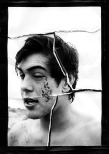
Just as this moment had taught me to see differently, your own work seems to teach people to see the world in a different light as well. I had read an interview of your sister’s explaining how you viewed the world. She explained that “We’d go photographing a lot of times when he’d come home, we’d ride and go photographing. And he [Robert] wasn’t interested in the oak trees with the dripping moss. He would rather see the broken light post with the old bicycle leaning against it or something (Clark 6). To me, your work is intriguing, since it captures daily life in a way that highlights the “unremarkable” (like an old bicycle) but still maintains the reality and authenticity of the scene. Your time at The Black Mountain College developed your interest in integrating daily life into art, and this theme continued throughout the rest of your career (Rauschenberg Foundation). In future letters, I hope to explore your early, experimental years and how those years led to your later style of silk-screen paintings rooted in mass media; Yet within it all, your artwork somehow consistently evokes raw and visceral feelings.
Letter #2: More Than Just Self-Expression
“I suppose, like most people, I’d always thought of art as a form of self-expression. And Bob had no interest in expressing himself in art. In fact, he said, ‘I think art should be a lot more interesting than that, than just my personality.’” (Clark 12).
– Calvin Tomkins
Dear Robert,
I, like your colleague Calvin Tomkins, have always felt that art is a form of self-expression. You, however, seemed to possess this clear perspective that art is more than just self-expression, and you’ve thought this way from very early on, even as a student at The Black Mountain College. One of your earliest photographs, Quiet House, was taken at Black Mountain College in 1949.
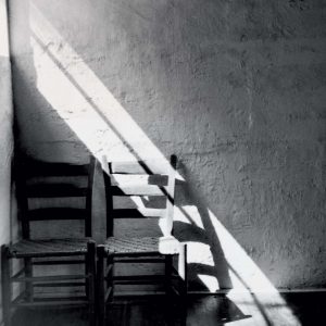
This photograph was taken in The Quiet House, a small stone building on campus that was revered as a space for meditation and ceremonial use (SF MOMA). This photo is more than just self-expression; It is a representation of a beloved space that highlights the sacred energy and influence this space had on people during this time. The composition of the photo emphasizes the arrangement of lines, light, and darkness on an otherwise mundane scene of two wooden chairs in the corner of a room. Because of your careful composition of this photo, the everyday objects possess a sort of drama about them that signals a sense of significance. As seen throughout your future art pieces, you continued this theme of examining the tension between the characteristics of an actual object versus its photographic representation (SF MOMA). Something interesting to note is that this photo reappears in your later Combines and silkscreen works.
Another one of your early, experimental works developed at Black Mountain College was your series of photograms, commonly known as the Blueprints. Using photosensitive paper, you were able to create images without a camera by exposing the paper to light and using objects (like human subjects and household objects) to make impressions.
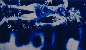
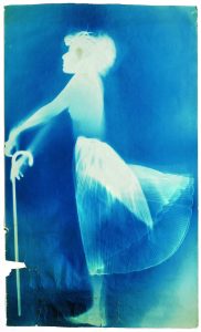
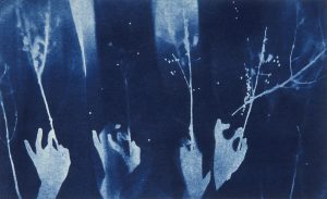
What is most fascinating to me is the one-to-one scale of the bodies and objects silhouetted against the blue backgrounds. The proportional size of the objects gives the images an eerie feeling due to their close similarities to reality. Whether it be the contorting human figures or twisted series of hands, the line between reality and illusion is blurred— garnering a sense of wary interest. These photograms are certainly more than just self-expression. These camera-less photographs seem to be a statement against past artistic movements that are characterized by non-objective imagery, like Abstract Expressionism. Furthermore, these blueprints signal the beginning of your innovative use of everyday objects and mixed media which would later characterize your most known Combines and silkscreen works.
When making my Waiting midterm project, I found myself using recognizable images, similar to the imagery in your photograms. For this project, we were instructed to create a piece using textiles that represented our own experience with waiting. I embroidered images from pop culture onto a white sweatsuit to directly represent what I have done to pass time while waiting for our current pandemic to pass. I chose to use imagery from pop culture, because I wanted people to immediately recognize what they were looking at. Some of the images I included were characters from current TV shows like Rick & Morty and Bart Simpson from The Simpsons. I also added images from contemporary album covers like the pink guitar from Machine Gun Kelly’s Tickets to My Downfall and the crying lady from a Saint Motel album cover.
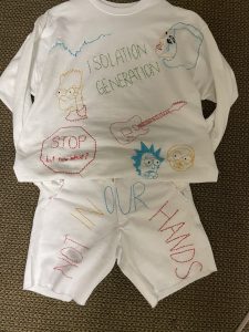
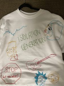
Just as the hands clutching twigs and human figures are easily discernible in your photograms, so are the images embroidered onto this sweatsuit. I like the idea of not having to guess about what you are looking at. Perhaps this stems from my constant need to be in the know and in control of my daily life. A major difference between my Waiting piece and your Blueprints, however, is the fact that Waiting is entirely a piece of self-expression. The embroidery on the sweatsuit stems completely from my personal experience during our current global pandemic. The images from pop culture are representations of how I’ve passed the extra time on my hands during quarantine. The embroidered text is a combination of my thoughts and how I have labeled this pandemic.
I wonder if, in your mind, one type of art is objectively “better” than the other. When art is more than just self-expression, is there more value to it compared to a purely self-expressive piece? Part of me wants to say that self-expression pieces are more shallow than non-self-expression pieces; But this opinion may just stem from the fact that I look up to your work and see myself as a beginner artist. I hope one day that I can step outside of my own experiences and create art that is more than just self-expression. Perhaps something that is a rejection of past art movements, like your Blueprint photograms.
Letter #3: Revolutionary Experimentation
“He worked in a kind of effortless way. There was no stress. It seemed like he didn’t do much stopping and thinking and stepping back to look. He would just put down a screen and squeegee the color over it. Then pick it up and look at it for a minute or so. Then he’d take another screen, not waiting for the first one to dry (Clark 28).
– Calvin Tomkins
Dear Robert,
Quiet House and Blueprints demonstrate your early fascination with photography while attending Black Mountain College. I’ve heard that your work with photography made you unsure of whether to pursue painting or photography as a career; But alas, you were able to combine both methods into your future career through your well-known combines and silkscreen paintings. Nonetheless, it seems that your time at Black Mountain College was a time of experimentation for you. Clearly, you experimented with different mediums for your artwork, but as described by your colleague Calvin Tomkins, your actual process of making was quite experimental as well.
Some of your most well-known experimental artworks are your Combines, a term coined by yourself. These pieces merged painting and sculpture to create an entirely new artistic category. The orientation of your Combines challenged the traditional concept of the two-dimensional picture plane, giving viewers a window into another reality.
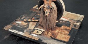
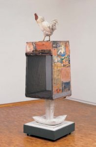
You have stated that a Combine is like a tabletop or bulletin board— a sort of “receptor surface on which objects are scattered, on which data is entered” (54). This revolutionary description reminded me of the CAD software I used to make my Time Capsule project.
This computer software is meant for the creation of 3-D printable objects; And just how you described your Combines, Rhino is a “receptor” software “on which data is entered.” For this assignment, we were instructed to create a time capsule that would represent something about our current times for a future society to find. My Time Capsule project used Rhino to create a 12-inch by 12-inch dice. I chose dice, because the unpredictable game that dice are used for reminded me of the unpredictable nature of this pandemic that I am currently living in. This time capsule would hold a deck of cards, scattered within the box as a further metaphor for the uncertain, messy times we are living in. Furthermore, the cards added a personal touch, since I have spent numerous hours playing cards with family and friends during quarantine.
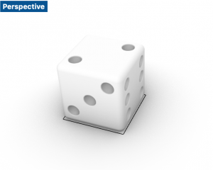
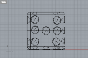
I find it quite incredible that what you envisioned for your Combines, as a Rhino-like “receptor surface,” was not yet invented while you created this concept. What I prefer about your Combines over Rhino is the higher degree of freedom that comes with hands on making. With Rhino, the creation of objects all boils down to mathematics; And if the math doesn’t perfectly add up, the object will not hold up or be structurally sound once 3-D printed. I found these specific parameters to be a bit stifling, creatively speaking. What I appreciate about your Combines is the room for creativity and mistakes. While I shouldn’t identify your brushstrokes and figure placement as “mistakes,” there is a sense of intentional carelessness to the elements of your Combines that creates interest. Furthermore, the mixed media nature of your Combines allows for the experimentation with textures that makes the pieces feel more real and raw. With 3-D printing, it would be extremely difficult to mimic the hair like texture of the goat or the distressed nature of the wood pictured in Monogram.
Another well-known example of your experimental artwork is your silkscreen paintings made between 1962 and 1964. These pieces were revolutionary for their time, because of the commercial means of reproduction that silkscreen printing was associated with. These mechanically produced screens allowed you to transcribe your own photographs and images taken from the media onto a larger scale. This method of production also led the public to identify you with the Pop Art movement.
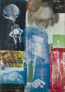
Retroactive I is a silkscreen painting that consists of numerous images and scenes taken from magazines and television. Each image was chosen with a specific meaning in mind. For example, the picture of John F. Kennedy was added to reflect a sense of encouraging promise for America’s future. The American astronaut was added to symbolize the wealth and confidence of the US during the 1960s.
I find close similarities between your silkscreen paintings and my own Waiting project. Both of our uses of mass media imagery (taken from television or album covers) gives the viewer a clear idea of the events that are happening in the world during that time period. While it originally was not my intention for Waiting to be a piece that memorializes our current pandemic, peer feedback and your own silkscreen paintings have revealed that my piece has the potential to symbolize an entire time period. You have explained that “I don’t want a picture to look like something it isn’t. I want it to look like something it is. And I think a picture is more like the real world when it’s made out of the real world” (63). And I would agree. There is a great amount of power that comes with real-world imagery within art.
There is, however, a key difference between our processes of making. As mentioned earlier by you colleague Calvin Tomkins, you worked in “a kind of effortless way. There was no stress” you wouldn’t “do much stopping or thinking and stepping back to look” (Clark 28). It seems that your process of making centers around experimentation and in-the-moment impulses. I, on the other hand, am often constrained by my constant attention to details; And it shows in the tight stitching and precise lined nature of my embroidery on Waiting. For me, when looking at art, I am most drawn to your process of making, the more casual and free methods of design that make a piece feel more visceral and raw; But when I’m tasked to create my own art, my perfectionist mentality prevents me from creating that kind of art.
To conclude our conversation, I will continue with this thought: Something about your process of making and the final outcome of your art is captivating to me. Perhaps this is because of we both appreciate the imperfect within everyday life. While I feel most connected to art like yours that displays reality and intentional mistakes, my own work does not achieve the same goal. In my opinion, this stems from my meticulous, rather “Bauhaus-like” process of making. In contrast, your work and career in general, centers around experimentation. I assume this was taught to you during your time at Black Mountain College. I hope, one day, my own art can be less constrained by my attention to detail as I open my mind to the occurrences of mistakes. Furthermore, learning about your experimentation has shown me that I do not need to go into the process of making knowing everything. Hopefully, I can begin embracing the mindset of creating moment by moment, reacting to spur-of-the-moment impulses as I create my art.
Best,
Kristina Yang
Media Attributions
- Bloody Eye ©Trinity Ace Gardner is licensed under a CC BY (Attribution) license
- Quiet House ©Robert Rauschenberg Foundation is licensed under a CC BY (Attribution) license
- Untitled ©Robert Rauschenberg Foundation is licensed under a CC BY (Attribution) license
- Sue ©Robert Rauschenberg Foundation is licensed under a CC BY (Attribution) license
- Light Borne In Darkness ©Robert Rauschenberg Foundation is licensed under a CC BY (Attribution) license
- Waiting ©Kristina Yang is licensed under a CC BY (Attribution) license
- Monogram ©Robert Rauschenberg Foundation is licensed under a CC BY (Attribution) license
- Odalisk ©Robert Rauschenberg Foundation is licensed under a CC BY (Attribution) license
- Time Capsule ©Kristina Yang is licensed under a CC BY (Attribution) license
- Retroactive I ©Robert Rauschenberg Foundation is licensed under a CC BY (Attribution) license
Citations
- Clark, Mary. ROBERT RAUSCHENBERG: an Oral History. COLUMBIA UNIV Press, 2020.
- Davidson, Susan. “Remembering Robert Rauschenberg (1928–2008).” American Art 23, no. 1 (2009): 116–19. https://doi.org/10.1086/599067.
- “Quiet House-Black Mountain.” SFMOMA, March 12, 2021. https://www.sfmoma.org/artwork/98.301/.
- Robert Rauschenberg Foundation. Accessed March 15, 2021. https://www.rauschenbergfoundation.org/.
Media Attributions
- IMG_0991
- Quiet House
- blueprint 1
- R49E03
- blueprint 3
- tempImagego5Yd0
- tempImagej5dxuJ
- combine – monogram
- combine – odalisk
- dice-perspective-rendered
- dice-front
- retro

