Lesson 5 Instructional Environments and Multimedia
5-3 More on the Contiguity Principle
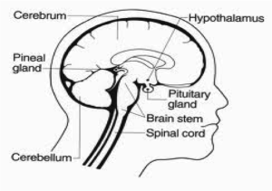
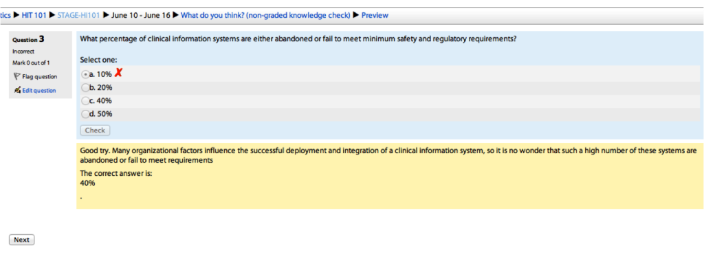
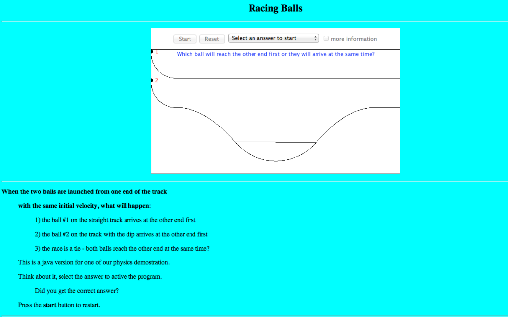
When you do have images, you’ll want to align any explainer text to the corresponding graphic according to the Contiguity Principle (Clark & Mayer, Chapter 5, page 89). The key is provide continuous flow of information from the image to the words by having them next to each other.
Example 1:

Example 2:

Example 3:

Other possibilities
- Directions that appear on the same screen in which the steps are to be applied.
- Linked information does not appear in windows that obscure related information on the primary screen.
- Text place next to or within graphics rather than below them.
- Legend callouts that are embedded with the graphic rather than separated from it.
- Narrated graphics in which corresponding word and graphics are present at the same time.
⭐Shar’s Note: We are already conditioned to expect “explainer text” next to content that we are trying to learn. When employed correctly it is easy to forget the text is there, but when the text missing or away from the content we have a difficult time understanding the graphic.
