Lesson 6 Learning Platforms: LMSs, MOOCs, & Mobile
6-6 More on the Coherence and Personalization Principles
Coherence Principle
Sometimes too much is really too much; in the coherence principle adding extra material can hurt learning (Clark & Mayer, Chapter 8, p. 151).
What to look for:
- Lessons that do not contain extraneous sounds or background music
- Lessons that do not use illustrations, photos, and video clips that may be interesting but are not essential to the knowledge and skills to be learned
- Lessons that do not contain ‘interesting’ stories or details that are not essential to the instructional goal
- Lessons that use similar visual illustrations such as line drawings when the goal is to help learners build understanding.
- Lessons that present the core content with the minimal amount of words and graphics needed to help the learner understand the main points.
Coherence Example
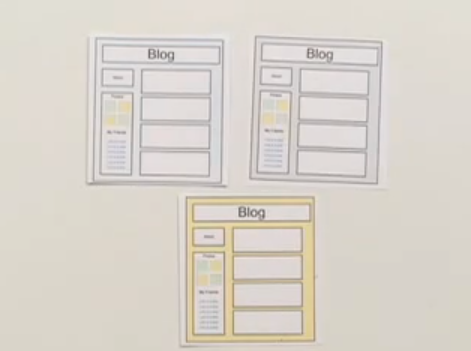
Mike Tyler. (2020). Coherence Principle | 12 Multimedia Principles (2:20)

Personalization Principle
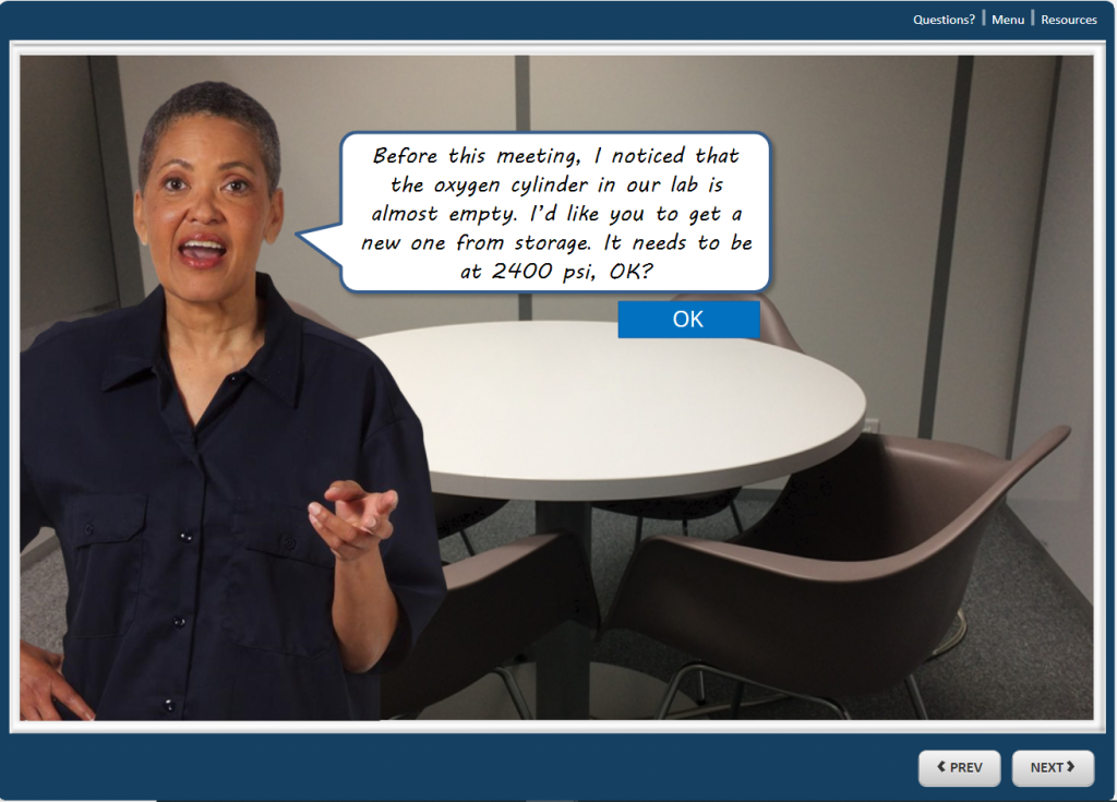
Which do you respond to more? Formal text similar to a legal form or an informal tone like a note from your favorite cousin? The personalization principle (Clark & Mayer, Chapter 9, p. 179) indicates that we learn better with polite and friendly style of writing or speaking. And the embodiment principle (ibid) shows that using a human-like on-screen avatar is also better for learning.
What to look for:
- Instructional content is presented in conversational language using “you,” “your,” “I” “our” and “we”.
- Coaching is provided via conversational narration from on-screen characters – pedagogical agents.
- Agents do not need to look realistic but should exhibit human behaviors
- Agent serves a valid instructional purpose
- The course author expresses his or her own point of view or experience in ways that are relevant to the instructional goals
- Agent dialogue is presented via audio narration
- Voice quality and script are natural and conversational
Personalization Example


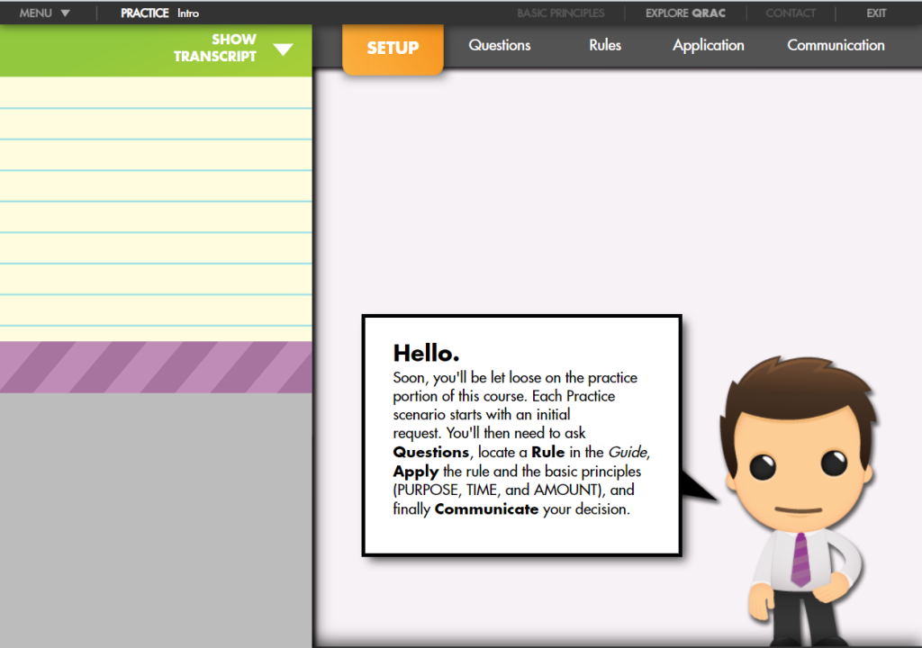
Click through to the Appropriations Law Demo – QRAC Practice. The Start button is in the lower-right corner and obscured by a grey bar, but it’s there!
In what ways does this example adhere to the coherence and personalization principles and in what ways does it violate them?
