Production and Product Development
PowerPoint Guidelines
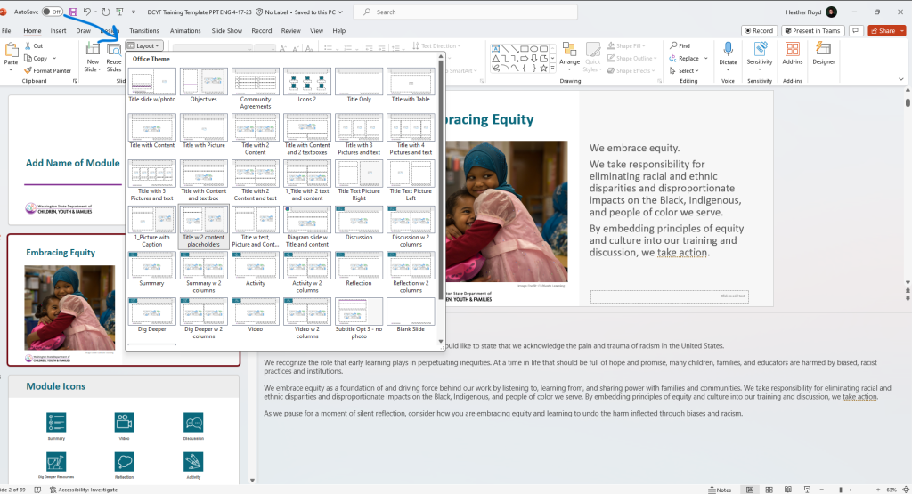
Using a Template
Use the designed template when available. Templates are created to meet our guidelines and comply with accessibility standards. The templates will include the format for the title, text/images/videos and image/video credits. Adding additional text boxes should be avoided, whenever possible. Work with the template designer if additional slide formats are needed.
Finding Templates in Webdam
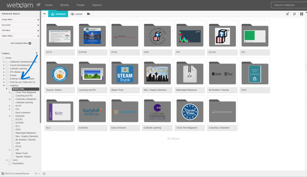
Note: Specific project templates may be available on Webdam. Search in the Graphics > Brand Lines folders. Refer also to the Partnering for Product Development chapter.
Template Layout
Templates are designed with various spaces to add text, media, and graphics. When created, these spaces are titled in the reading order as textboxes, content placeholders, titles, etc. Using the template and the spaces as they are designed, ensures that PowerPoints are accessible. Add text, media, and/or graphics as needed.
Templates are created with many options for use. Review the layout choices when determining how you would like content to appear in the PowerPoint. Work with the project’s graphic designer to add additional layout choices, if needed.
Quick Tips for Text in Powerpoints
Using a template is the best way to ensure PowerPoints meet our writing guidelines. In addition to following a template, these tips can help too!
Bullet Points
- Bullet points are preferable to full sentences or paragraphs to allow the presenter to speak more spontaneously.
- Secondary bullets should be no smaller than 24-point.
- In PowerPoints, the title can often act as the topic lead-in, or stem. When this is the case, there is no need to write a stem sentence before using bullets on PowerPoint slides.
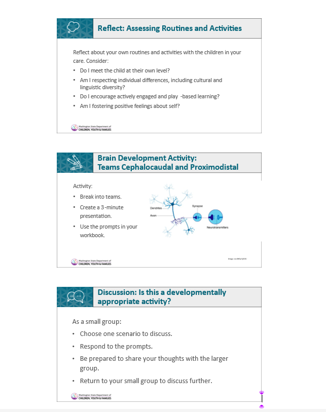
Engagement Activities, Discussions, and Reflection
When adding activities to a presentation, the directions should be included on the slide.
Text on Slides
- Text on the slide should be as brief and succinct as possible.
- Text should be Arial or Calibri, black or dark gray, and at least 28 points.
- Text should be left-aligned when there are two or more lines. Do not center-justify longer blocks of text. Text boxes in PowerPoint are NOT accessible
- Use the text boxes in the template.
Titles
- All slides need a unique title. If needed, add “Continued” or “Part 2” to titles for multiple slides (a series) covering one topic.
- Example A:
- Slide 1 – Implicit Bias in Early Learning Settings
- Slide 2 – Implicit Bias in Early Learning Settings Continued
- Example B:
- Slide 1 – Reflection: Implicit Bias in Early Learning Settings Part 1
- Slide 2 – Reflection: Implicit Bias in Early Learning Settings Part 2
- Side 3 – Reflection: Implicit Bias in Early Learning Settings Part 3
- Example A:
- Begin the first word in slide titles with a capital letter, even if it is an article or preposition.
- Titles on slides should be at least 32 point font.
Written Sources, Reference, and Quotes
Citations
Citations in the body of a PowerPoint slide should follow in-text style. Example: (Shakespeare and DiCaprio, 2011, p. x)
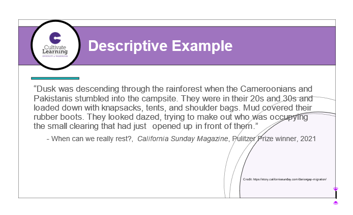
Quotes on the Slide
There is not a specific standard for adding a quote to a slide. A few tips to consider:
- When adding quotes, follow the guidance for citations. Authors can be written in italics. Avoid using too many italics as these can be hard to read.
- Ensure however quotes appear, it is consistent throughout the product.
- Consider using the same template slide for every quote. This ensures a similar look throughout. Reach out to the graphic design team if a new slide template is needed.
- Consider the text from the quote being a larger font than the citation. For example – the quote is 28 point font and the citation is 24 points.
Presenter Notes
- Notes should be at least 12 point, Calibri or Arial font. Avoid italics except as indicated below as they are difficult to read for many.
- Presenter notes should be consistent throughout the presentation. Keep in mind that when you add a new slide, the presenter note format needs to be copied into that slide.
- Notes for a presenter should be written as briefly and clearly as possible.
- Scaffold notes starting with key points and when applicable, provide background with additional information. The content developer’s job is to give enough information for a person to use the material even if they are not very familiar with the topic.
- When using content and information from previously developed material, provide credit and attribution at the beginning of the notes. For example, if NCQTL materials are used in the new product, provide two–three sentences about NCQTL using footer information from NCQTL.
- In general, these notes should be written in the second person.
- For activities, provide the following information:
- Materials: List everything participants will need for the activity (e.g. pens, paper, activity handout).
- Instructions: Use second person or imperative sentences. (e.g. Please form small groups while I pass out your instructions.)
- Information: Use the third person to provide context for the activity. (When educators observe children closely, they can learn.)
- Timing estimates for videos should be in this format: 1 min., 22 sec.
- When referring to activities or handouts, italicize the document’s title (e.g., Distribute the Our Schedule: Infants activity handout).
- Funding partners may have specific guidance for how they would like the presenter notes to appear. Follow funding partner guidance and maintain accessibility/readability features whenever possible.
Keeping Your PowerPoint Accessible
In additon to the information found in the Accessibility chapter, this section outlines guidance specific to PowerPoint products.
Microsoft also provides instructions for the different platforms that you may be using for PPT that are not included in the instructions above (Mac, iOS, Android, and online). MS Office Support: Creating Accessible PowerPoint Presentations
WebAIM PowerPoint Accessibility :This lesson on PowerPoint covers the basics noted here, but also tips on converting to other formats.
A PUPA IS RAD
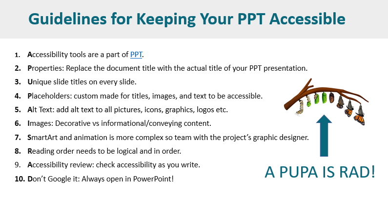
Accessibility Tools
PowerPoint has built-in accessibility tools that are easy to use. Take a look at the various tools and guidance from PPT
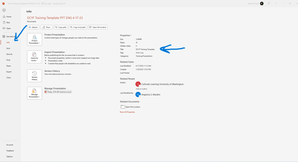
Properties
Replace the document title with the actual title of your PowerPoint presentation. Access by selecting File > Info > Properties/Title
Unique Slide Titles
Every slide needs to have a unigue title so screen readers can scan slides accurately.
Placeholders.
In a designed template, placeholders have been custom made for titles, images, and text. A template is designed to be accessible. Using the proper slide layout for your content ensures the accessibility features of the placeholders are maintained. When you are finished creating yur PowerPoint, if there are place holders you did not need/use, delete them.
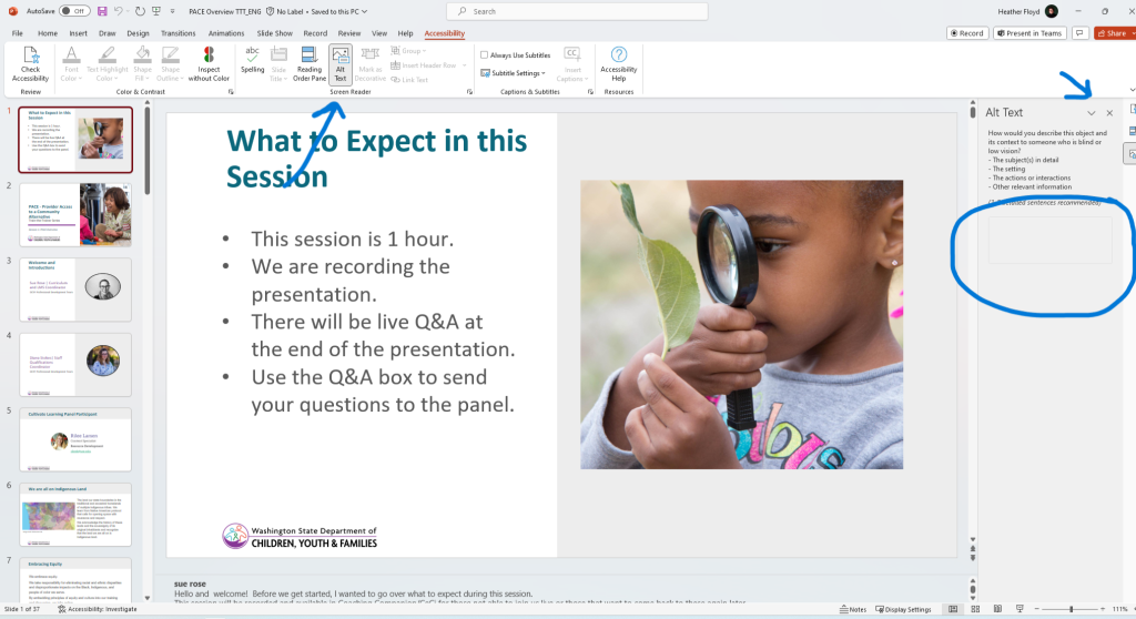
Alt Text
Alt Text is the text a screen reader will read when there is an image, icon, graphic, logo, etc. Add Alt Text to all pictures, icons, graphics, logos etc. Use the PowerPoint Alt Text feature to move through images easily and add Alt Text.
Images
Decorative vs Informational. Consider what people who can’t see the image need to know about this image? At times, it is appropriate to mark an image as decorative when it is not reflective of content. Avoid too many decorative images as it can distract from the main topic.
SmartArt and Animation
Remember that SmartArt and animation requires more complex accessibility features. Partnering with the design team can help to ensure graphics are accessible for all.
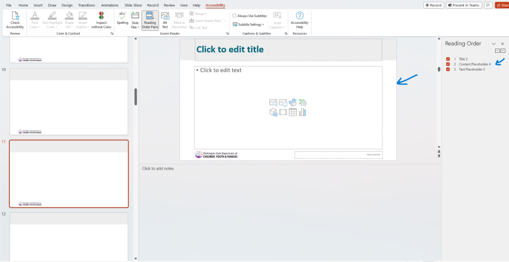
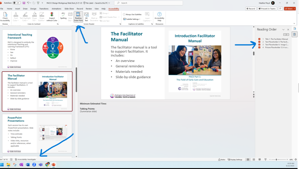
Reading Order
Ensure the reading/tab order is logical. Check both the reading order and the arrangement order. (https://www.youtube.com/watch?v=IcHbFm0dbIk). For reading order, tabbing through the slide can help you understand how a screen reader will read the text. Typically, we want the title at the top and then a left-to-right reading order. Check reading order by selecting Review > Check Accessibility > Reading Order. The reading order pane will appear on the right side of your slide/screen.
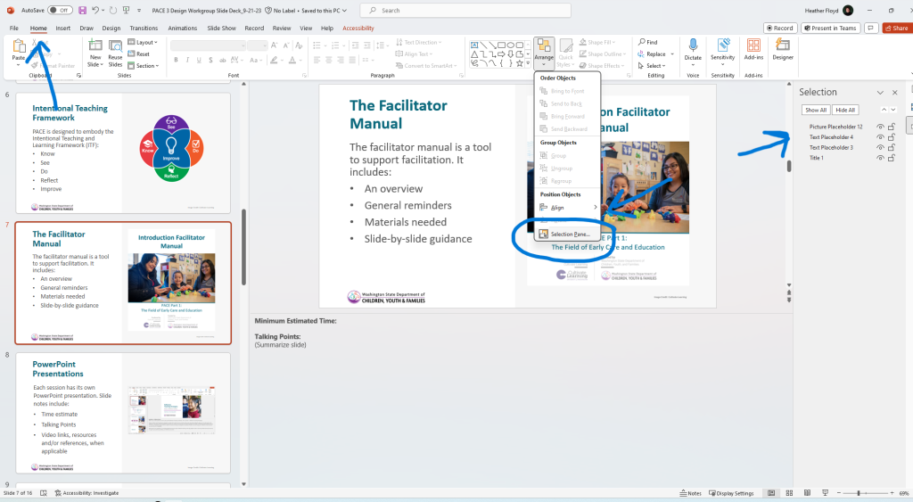
Arrangement Order and Selection Pane
Arrangement order is another way to understand how a screenreader might read the text. Arrangement order appears opposite of reading order. Check arrangement order by selecting Home > Arrange > Selection Pane. The selection pane will open on the left side of your slide/screen. The image below is of a slide in correct arrangement order.
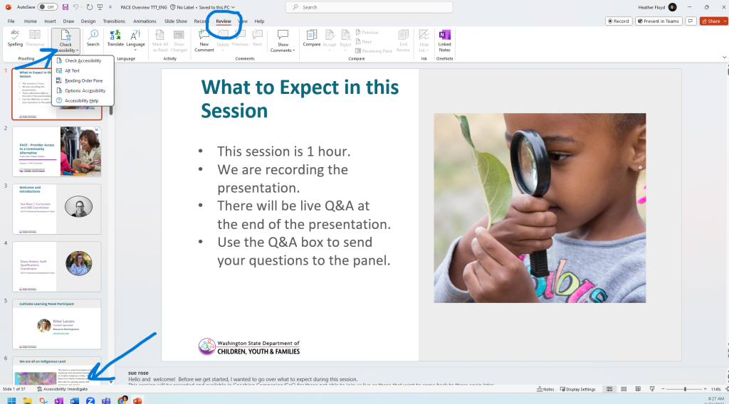
Accessibility Review
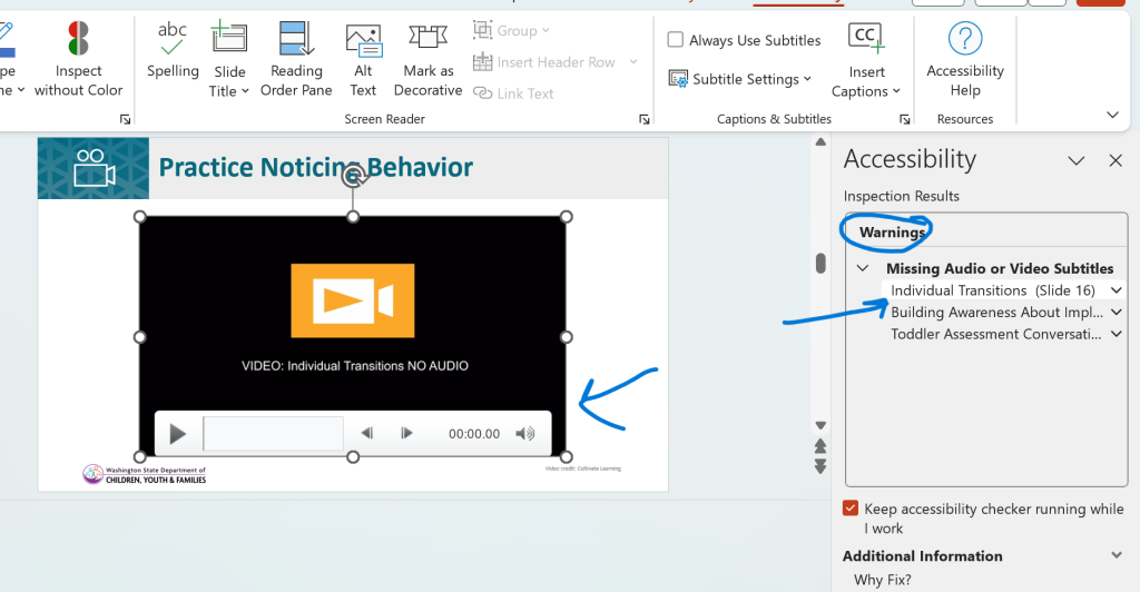
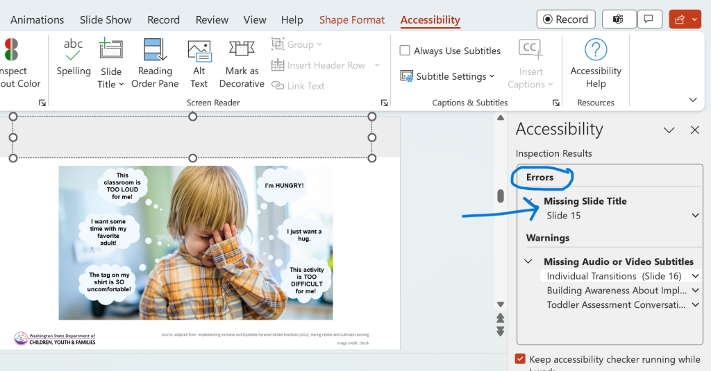
Review for accessibility early and often. As you write, a shortcut to see accesibility is available on the bottom of slide screen. In addition, select Review > Check Accessibility. The image below demonstrates how to check accessibility. You can also see the shortcut at the bottom of the slide indicating accessibility needs to be reviewed. Typically, “errors” need to be corrected. “Warnings” are corrected on a case-by-case basis depending on the warning. For example, captions on videos may not be read by the accessibility check and so this will result in a warning – check that the video includes captions, and you are good to go. (See examples below)
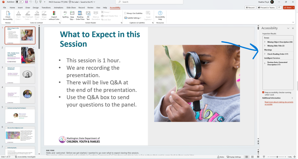
Accessibility Review Results
After you check for accessibility, a list of items will appear in a reading pane on the left side of the presentation. Accessibility Inspection Results:
- Errors
- Includes alt text, slide titles, and other items necessary to ensure minimim accessibility.
- Correct the items indicated in this section.
- Warnings
- Review and edit/correct if needed.
- Includes reading order, captions and subtitles, color contrast, etc.
- At times, partnering with the the resource development team team might be needed for these items. (Captions – Media, Color contrast – Design)
- Intelligence Services
- Review and correct, if needed.
- These are items that have been computer auto-generated on the slide.
Examples of warnings:
Example of an error:
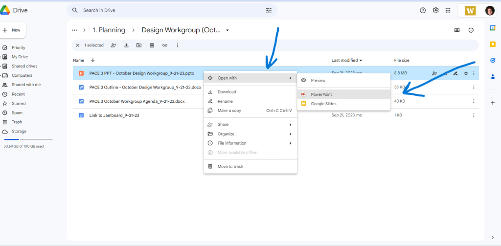
Don’t Google It: Always Open in PowerPoint!
Since PowerPoint has unigue accessibility features, it is important to always open in the PowerPoint platform. Since materials might be stored on Google, remember: Don’t Google It!