Product Guidelines
PowerPoint Guidelines
Using a Template
Use the designed template when available. Templates are created to meet our guidelines and comply with accessibility standards. The templates will include the format for the title, text/images/videos and image/video credits. Work with the template designer if additional slide formats are needed.
Things to avoid:
- Adding additional text boxes since this can impact the accessibility of the template.
- Adding slides from other PowerPoints that are not the same template. This can create a lack of uniformity and different templates may have outdated accessibility features. Instead, move the content over to the template you are using for your PowerPoint or project.
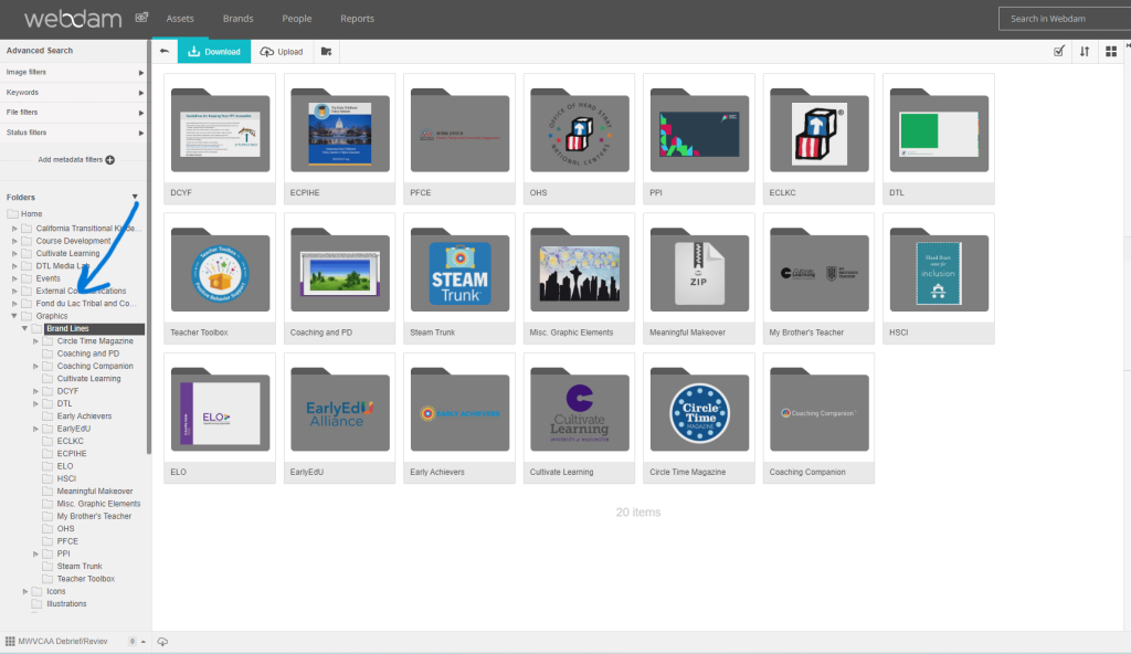
Finding Templates in Webdam
Note: Specific project templates may be available on Webdam. Search in the Graphics > Brand Lines folders. Refer also to the Partnering for Product Development chapter.
Template Layout
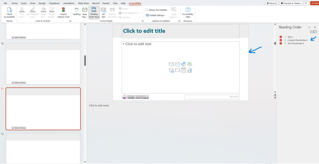
Templates are designed with various spaces to add text, media, and graphics. When created, these spaces are titled in the reading order as textboxes, content placeholders, titles, etc. Using the template and the spaces as they are designed, ensures that PowerPoints are accessible. Add text, media, and/or graphics as needed.
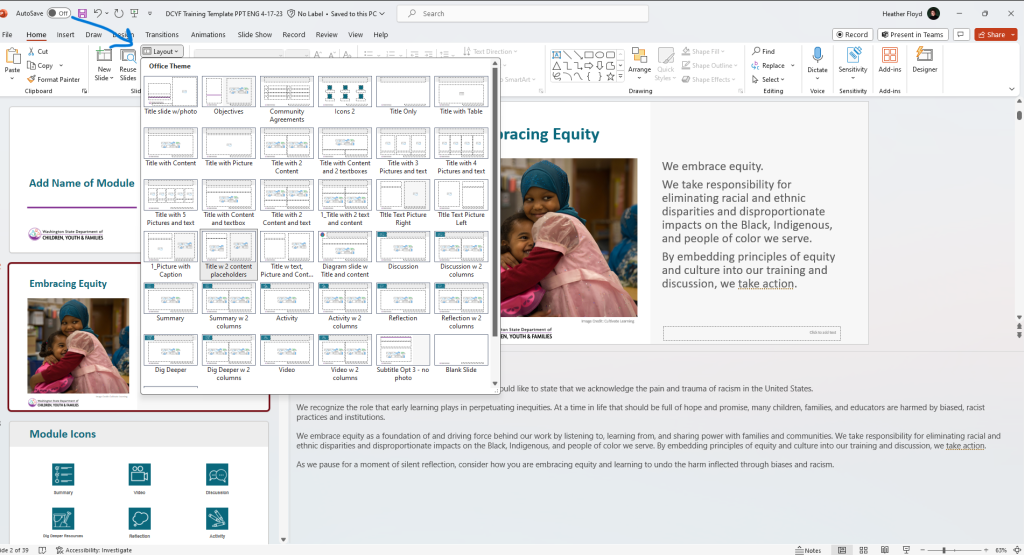
Templates are created with many options for use. Review the layout choices when determining how you would like content to appear in the PowerPoint. Work with the project’s graphic designer to add additional layout choices, if needed.
Quick Tips for Text in Powerpoints
Using a template is the best way to ensure PowerPoints meet our writing guidelines. In addition to following a template, these tips can help too!
Agendas and Transition Slides
Consider including a slide with the basic plan (an agenda) for the session. This can help participants know what to expect. Include the main topics that will be covered throughout the session. Keep it concise and in a list format.
Consider using transition slides to help participants realize when the topic or content is changing focus. These will align to the main ideas in your agenda. The slide can be very simple and include a transition statement in the presenter notes for the facilitator , “Next, let’s discuss…..”. Keep it consistent and use the same format for all the transition slides, when possible.
Bullet Points
- Bullet points are preferable to full sentences or paragraphs to allow the presenter to speak more spontaneously.
- Secondary bullets should be no smaller than 24-point.
- In PowerPoints, the title can often act as the topic lead-in, or stem. When this is the case, there is no need to write a stem sentence before using bullets on PowerPoint slides.
Engagement Activities, Discussions, and Reflection
When adding activities to a presentation, the directions should be included on the slide.
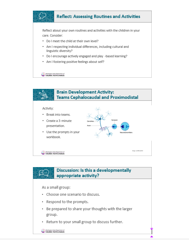
Text on Slides
- Text on the slide should be as brief and succinct as possible.
- Text should be Arial or Calibri, black or dark gray, and at least 24-point font.
- Text should be left-aligned when there are two or more lines. Do not center-justify longer blocks of text.
- Use the placeholders (text boxes) in the template. Adding text boxes to PowerPoint templates may not be accessible
Titles
- All slides need a unique title. If needed, add “Continued” or “Part 2” to titles for multiple slides (a series) covering one topic.
- Example A:
- Slide 1 – Implicit Bias in Early Learning Settings
- Slide 2 – Implicit Bias in Early Learning Settings Continued
- Example B:
- Slide 1 – Reflection: Implicit Bias in Early Learning Settings Part 1
- Slide 2 – Reflection: Implicit Bias in Early Learning Settings Part 2
- Side 3 – Reflection: Implicit Bias in Early Learning Settings Part 3
- Example A:
- Begin the first word in slide titles with a capital letter, even if it is an article or preposition.
- Titles on slides should be at least 32-point font.
Written Sources, Reference, and Quotes
Citations
Citations in the body of a PowerPoint slide should follow in-text style. Example: (Shakespeare and DiCaprio, 2011, p. x)
Refer to the Presenter Notes section for how to cite and use quotes in the talking points.
Quotes on the Slide
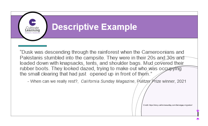
There is not a specific standard for adding a quote to a slide. A few tips to consider:
- When adding quotes, follow the guidance for citations. Authors can be written in italics. Avoid using too many italics as these can be hard to read.
- Ensure however quotes appear, it is consistent throughout the product.
- Consider using the same template slide for every quote. This ensures a similar look throughout. Reach out to the graphic design team if a new slide template is needed.
- Consider the text from the quote being a larger font than the citation. For example – the quote is 28 point font and the citation is 24 points.
Presenter Notes
- Notes should be at least 12 point, Calibri or Arial font. Avoid italics except as indicated below as they are difficult to read for many.
- Presenter notes should be consistent throughout the presentation.
- Keep in mind that when you add a new slide, the presenter note format needs to be copied into that slide.
- If the product includes a faciltator manual, the presenter notes will likely follow the same pattern as what is in the manual. (Time estimate, materials needed, trainer notes, talking points, reference, and video link)
- Video links: Links can be found on the Multimedia Tracking Sheet. We often share the 550 px direct link when sharing links in PowerPoints. Check with the project manager to determine if video links are needed for your project.
- Identifying people in videos: Refer to the Video Use Guidelines chapter.
- Notes for a presenter should be written as briefly and clearly as possible. In general, presenter notes should be written in the second person.
- Scaffold notes starting with key points and when applicable, provide background with additional information. The content developer’s job is to give enough information for a person to use the material even if they are not very familiar with the topic.
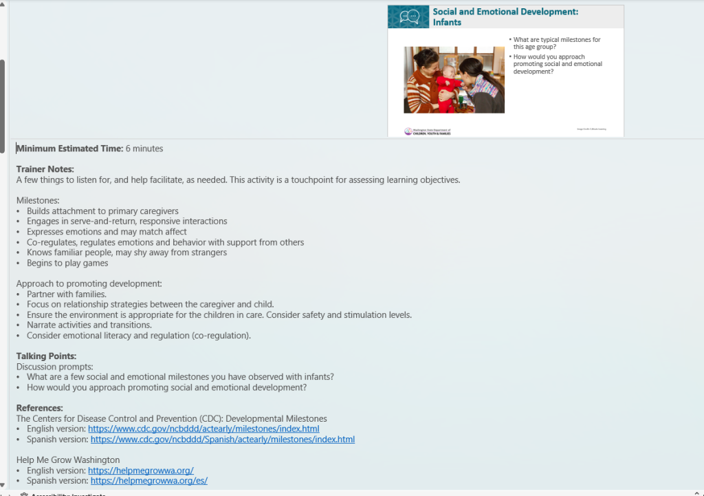
- The Trainer Notes section in the presenter notes should include any instructions for the trainer. It also includes content to support facilitation of the talking points, activities, or other discussions. Examples:
- A discussion asking participants what they noticed in a video would include key points form that video in the trainer notes.
- A discussion asking participants how children build friendship skills, would include some key things to listen for and steer participants toward in the trainer notes.
- Any assessment activity should also include what to listen for in the trainer notes.
- Credit and attribution: Refer to the Responsibility to Cite chapter.
- Direct quotes: Use a lead-in statement and reference the source. Partner with your copy editor for more guidance. A few examples:
- In the article “Our Proud Heritage. Can We Change Early Care and Education?” on NAEYC.org , Dr. Edna Ranck writes that John Amos Comenius “is often cited as a major figure from Western Europe who….”
- According the Merriam-Webster dictionary, pragmatism is “a practical approach to problems and affairs.”
- The following is from the article “Child Care” on law.jrank.org: “During World War II, millions of women…”
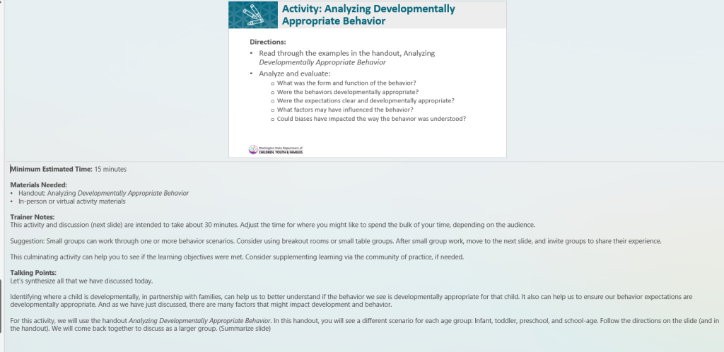
- For activities, provide the following information:
- Materials: List everything participants will need for the activity (e.g. pens, paper, activity handout).
- Instructions: Use second person or imperative sentences. (e.g. Please form small groups while I pass out your instructions.)
- Information: Use the third person to provide context for the activity. (When educators observe children closely, they can learn.)
- Time estimates format: 1 min., 22 sec.
- When referring to activities or handouts, italicize the document’s title (e.g., Distribute the Our Schedule: Infants activity handout).
- Funding partners may have specific guidance for how they would like the presenter notes to appear. Follow funding partner guidance and maintain accessibility/readability features whenever possible.
Example of an Activity
Example of Supporting Facilitation in the Trainer Notes
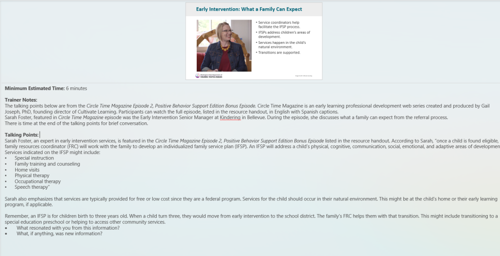
Example of Presenter Notes with a Direct Quote
This example also illustrates a multilingual video strategy. A video interview was used in the target language for one version of the training. The content was converted into talking points for other language versions of the same training. The talking points reflect the content and the trainer/facilitator will convey the information. A captioned video is included in the resource handout for participants, as well.
Keeping Your PowerPoint Accessible
Please be sure to check out the PowerPoint ADA Compliance Guide in the Accessibility chapter of this guide. In the module, you will find step-by-step guides, best practices, and practical tips to ensure that our materials are inclusive and meet ADA compliance standards. Many of these tips are outlined in this section too!
Microsoft also provides instructions for the different platforms that you may be using for PPT that are not included in the instructions above (Mac, iOS, Android, and online). MS Office Support: Creating Accessible PowerPoint Presentations
WebAIM PowerPoint Accessibility :This lesson on PowerPoint covers the basics noted here, but also tips on converting to other formats.
Accessibility Checklist for PowerPoint
The Accessibility Checklist for PowerPoint slide, included in some of our PowerPoint templates as a “read first” slide, summarizes the basic accessibility guidelines for PowerPoints.
Content developers are expected to follow the guidelines in the Accessibility Checklist for PowerPoint slide. These guidelines are outlined throughout this section. Documentation that the accessibilty guidelines have been followed is part of the Content Production Quality Check.
The Content Production Quality Check is required for any outward public facing materials or products we create as part of the quality assurance process. Read more about the Content Production Quality Check in the Reviewing Our Work section of the Review, Editing, and Quality Assurance chapter.
Run the Accessibility Checker and Use Built-in Accessibility Tools
PowerPoint has built-in accessibility tools that are easy to use. Take a look at the various tools and guidance from PPT
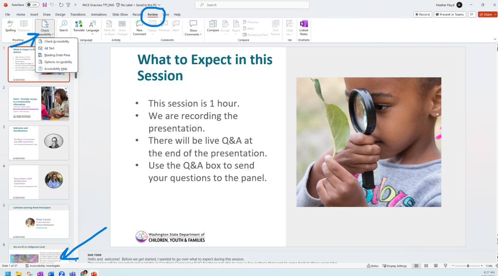
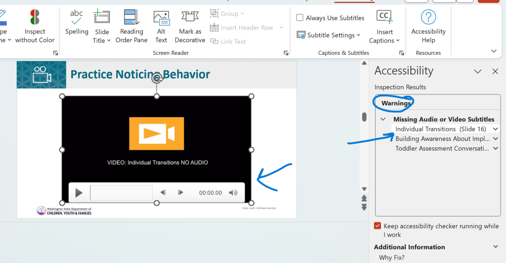
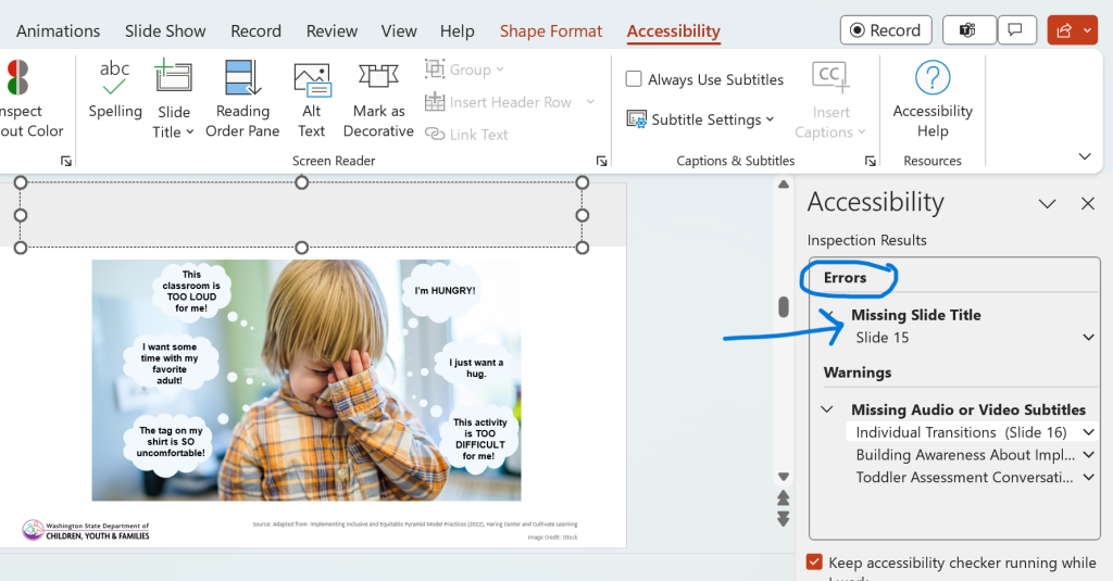
Review for accessibility early and often. As you write, a shortcut to see accesibility is available on the bottom of slide screen. In addition, select Review > Check Accessibility. The image below demonstrates how to check accessibility. You can also see the shortcut at the bottom of the slide indicating accessibility needs to be reviewed. Typically, “errors” need to be corrected. “Warnings” are corrected on a case-by-case basis depending on the warning. For example, captions on videos may not be read by the accessibility check and so this will result in a warning – check that the video includes captions, and you are good to go. (See examples below)
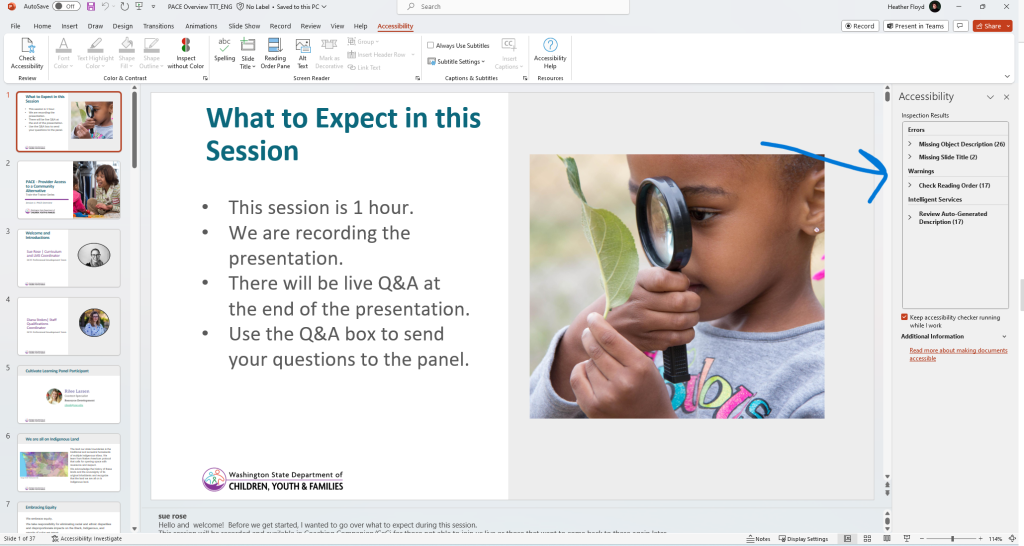
After you check for accessibility, a list of items will appear in a reading pane on the left side of the presentation. Accessibility Inspection Results:
- Errors
- Includes alt text, slide titles, and other items necessary to ensure minimim accessibility.
- Correct the items indicated in this section.
- Warnings
- Review and edit/correct if needed.
- Includes reading order, captions and subtitles, color contrast, etc.
- At times, partnering with the the resource development team team might be needed for these items. (Captions – Media, Color contrast – Design)
- Intelligence Services
- Review and correct, if needed.
- These are items that have been computer auto-generated on the slide.
Examples of warnings:
Example of an error:
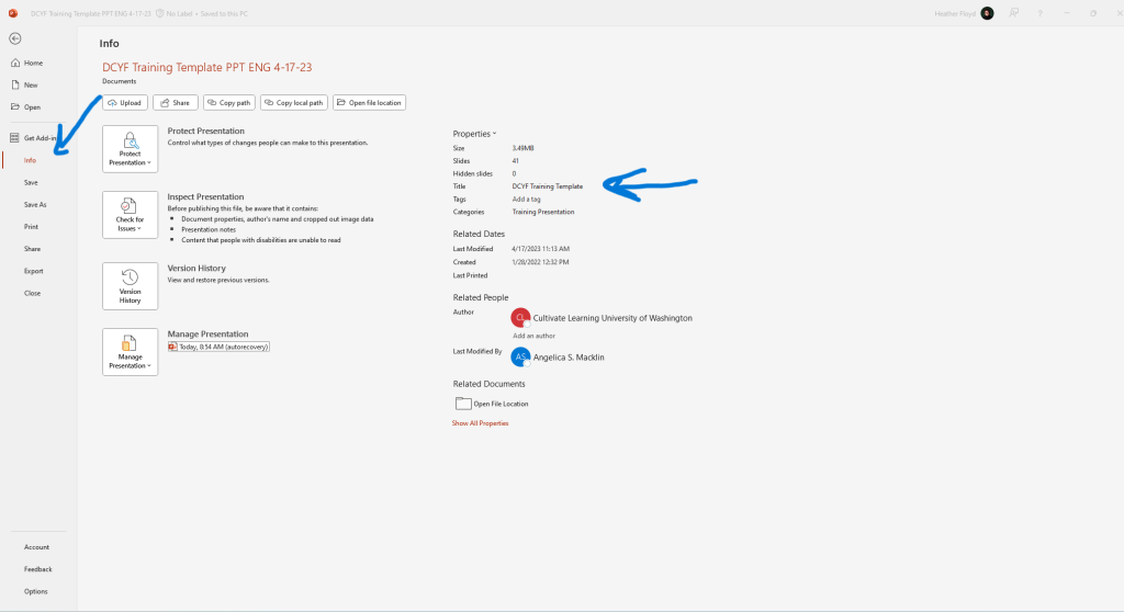
Update Document Properties
Replace the document title with the actual title of your PowerPoint presentation. Access by selecting File > Info > Properties/Title
Use Built-in Slide Layouts
Always use the default slide layouts when creating new slides for better accessibility. Refer to the Using a Template section in this chapter. Templates ensure we are using accesible slide layout.
Provide Unique Slide Titles
Ensure every slide has a unique title so screen readers can identify them properly.
Use Placeholders.
In a designed template, placeholders have been custom made for titles, images, and text. A template is designed to be accessible. Using the proper slide layout for your content ensures the accessibility features of the placeholders are maintained. When you are finished creating your PowerPoint, if there are place holders you did not need/use, delete them.
Limit Text on Slides
Review the Quick Tips for Text in PowerPoints section in this chapter. Use at least 24-point Calibri font for text. (Larger size is needed for heaings and titles)
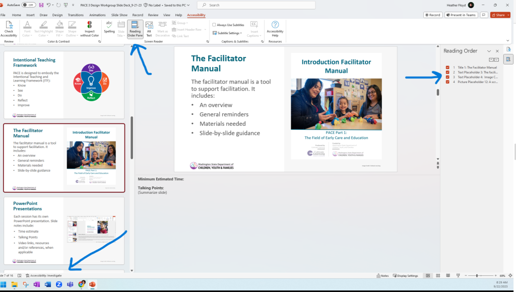
Check Reading Order
Ensure the reading/tab order is logical. Check both the reading order and the arrangement order. (https://www.youtube.com/watch?v=IcHbFm0dbIk). For reading order, tabbing through the slide can help you understand how a screen reader will read the text. Typically, we want the title at the top and then a left-to-right reading order. Check reading order by selecting Review > Check Accessibility > Reading Order. The reading order pane will appear on the right side of your slide/screen.
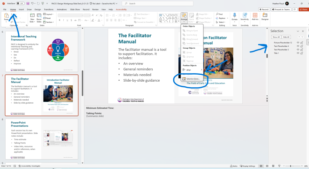
Arrangement Order and Selection Pane
Arrangement order is another way to understand how a screenreader might read the text. Arrangement order appears opposite of reading order. Check arrangement order by selecting Home > Arrange > Selection Pane. The selection pane will open on the left side of your slide/screen. The image below is of a slide in correct arrangement order.
Add Alt Text
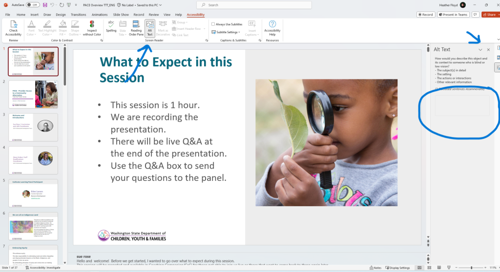
Alt Text is the text a screen reader will read when there is an image, icon, graphic, logo, etc. Add Alt Text to all pictures, icons, graphics, logos etc. Use the PowerPoint Alt Text feature to move through images easily and add Alt Text.
Decorative vs Informational. Consider what people who can’t see the image need to know about this image? At times, it is appropriate to mark an image as decorative when it is not reflective of content. Avoid too many decorative images as it can distract from the main topic.
Keep in mind that Alt Text may be more limited if the talking points describe the media. A screen reader may not need to describe as thoroughly when it is being described as part of the facilitation.
Describe Links Meaningfully
Use descriptive phrases for links. Review the Accessibility section of this guide for more information.
Simplify Table Structure
Use simple, clear table layouts to make them easuer to navigate for screen readers. Use the template if there is a slide layout with tables already created. Review the Accessibility section of this guide for more information.
Consistent Text Formatting
Ensure fonts and text colors are uniform across all slides. Use the template. Review the Accessibility section of this guide for more information.
Avoid Text Effects
Keep text free of effects like shadows, outlines, or glows.
Captions and Transcripts
Ensure videos include captions and audio content has a written transcript. Read more about this in the Video Use Guidelines chapter.
Save Appropriately
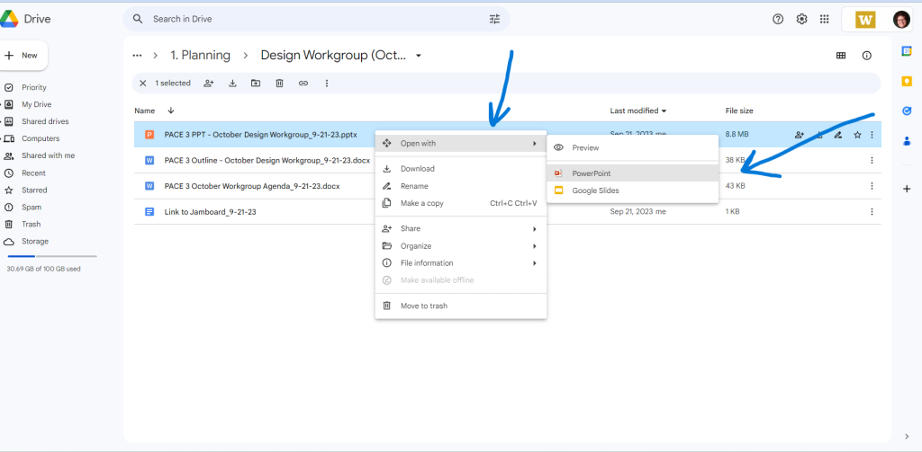
Save your PowerPoint file in SharePoint (not Google drive) to maintain accessibility features.
Typically, we will be saving products in SharePoint. However, some products may still be in Google as we transition fully to SharePoint. If you are working with a product in Google, remember: Don’t Google It: Always Open in PowerPoint!
Since PowerPoint has unigue accessibility features, it is important to always open in the PowerPoint platform. Since materials might be stored on Google, remember: Don’t Google It!
Downloading and Embedding Videos in PowerPoint Presentations
We often want to embed videos in our products. This is especially useful for in-person or synchronous presentations so that presenters do not need to rely on internet access. Videos might be from our own media database (Webdam) or an online source. Be sure to read through the entire chapter about citing our work when using online videos.
Downloading Produced Videos from Webdam
When including videos in PowerPoint presentation, we embed them into the PowerPoint. This means we typically need to download the video initially.
Be sure to only download videos that have been produced for presentations. These videos will often have a title slide. You may find produced videos in the following folders on Webdam: Interviews, Lectures, Videos, Web Series, and Webinars. If you are unsure if a video is a produced version, you can check with the Digital Asset Specialist or the project’s Media Producer.
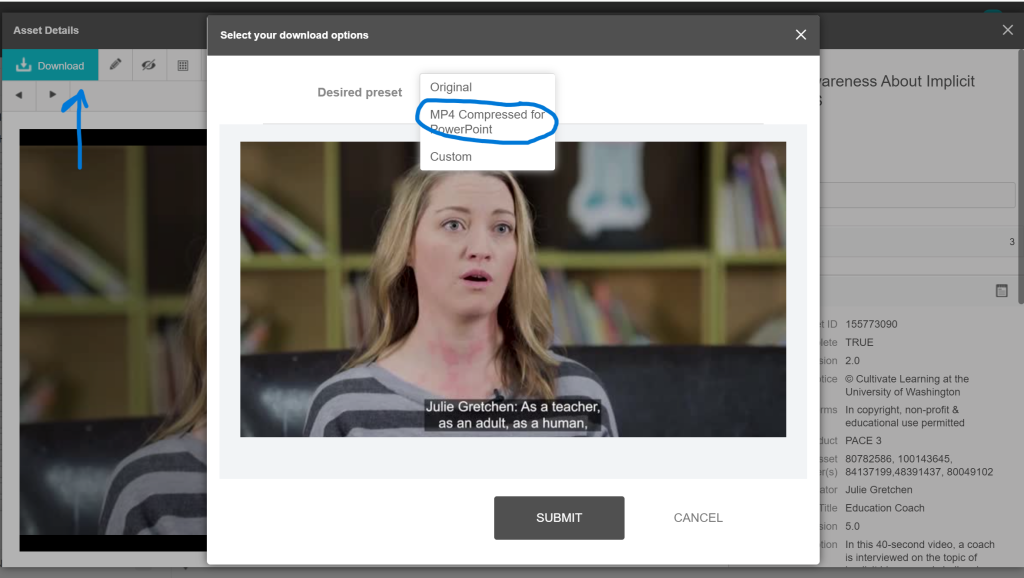
It is important to download the proper size video from Webdam. After selecting the video to be downloaded, you can choose the proper size in the settings. This helps to ensure our products, especially PowerPoints, are more manageable when accessing.
When downloading produced videos from Webdam, select the “MP4 Compressed for PowerPoint” setting.
Embedding Videos into PowerPoint
When including videos in PowerPoint presentation, we embed them into the PowerPoint rather than just sharing a link. This helps ensure the videos are accessible even if a trainer does not have access to WiFi. We may also share links as part of the presenter notes but this in addition to embedding the video.
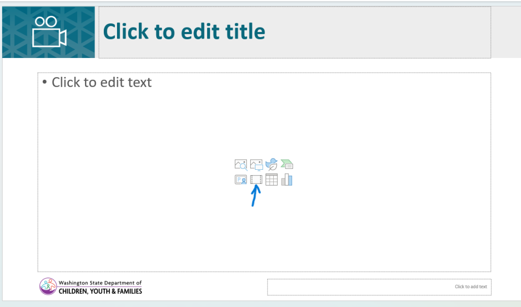
You can insert a video downloaded to your device, using the template. Select the proper icon and upload from your device.
Or you can use the “Insert Video From…” feature to insert from your device. Read more about this feature at Microsoft Support: Insert a video from YouTube or another site
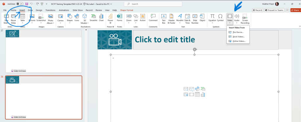
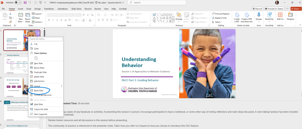
At times, the video you embedded may shift within the template. If you want to return the slide to its original format, right-click on the slide and select “Reset Slide” from the drop-down menu.

Downloading and Embedding Photos in PowerPoint Presentations
We often want to insert pictures into our products from our own media database (Webdam). Read more about this feature, and see examples for different types of devices, at Microsoft Support: Insert a picture in PowerPoint.
Downloading Photos from Webdam
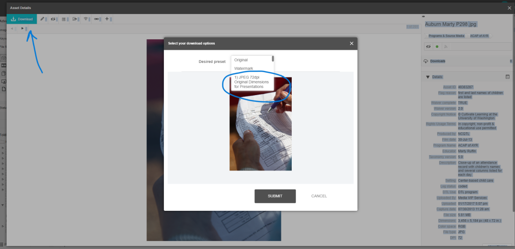
It is important to download the proper size from Webdam. After selecting the photo to be downloaded, you can choose the proper size in the settings. This helps to ensure our products, especially PowerPoints, are more manageable when accessing.
When downloading photos from Webdam, select the “1) JPEG 721dpi Original Dimensions for Presentations” setting.
Embedding Photos into PowerPoint
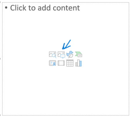
You can insert a photo downloaded to your device, using the template. Select the proper icon and upload from your device. The icon in the image on the right is for inserting photos downloaded to your device.
Or you can use the “Insert Picture From…” feature to insert from your device. Read more about this feature, and see examples for different types of devices, at Microsoft Support: Insert a picture in PowerPoint
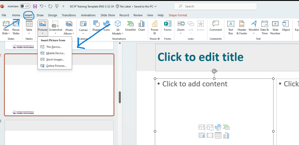
At times, the image you embedded may shift within the template. If you want to return the slide to its original format, right-click on the slide and select “Reset Slide” from the drop-down menu.

Cropping Images in PowerPoint Presentations
At times, an image you embed may need to be adjusted. You may want to focus on some specific action in the image. Cropping allows you to use the photo as you prefer. In the PowerPoint, select the photo. Then, select “Picture Format” and the “Crop” feature. Now you can adjust the photo, move it around within the template space, or crop traditionally. Read more about this feature, and see examples for different types of devices, at Microsoft Support: Crop a picture in Office
Need more support beyond simple cropping? Consider teaming with the project’s graphic designer or submitting a support request form.
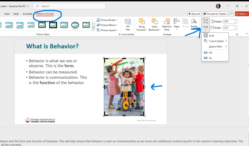
At times, the image you embedded may shift within the template. If you want to return the slide to its original format, right-click on the slide and select “Reset Slide” from the drop-down menu.
