
8 The Subtle Politics of Jacob Lawrence
Thomas Star
Jacob Lawrence spent his career depicting the working class Americans that surrounded him. In a shift away from the long serial projects like the Migration series that shaped his early career, he made a number of murals later in his life that are on display in public institutions across the United States. These larger works exhibit a clearer statement from the artist about his worldview. Where later in life some artists’ themes may deviate from their earlier work, Lawrence’s themes became clarified. Absent from his murals are the senses of pain and struggle seen in his earlier paintings, evident of a younger man still evolving as an artist and a person.
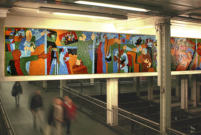
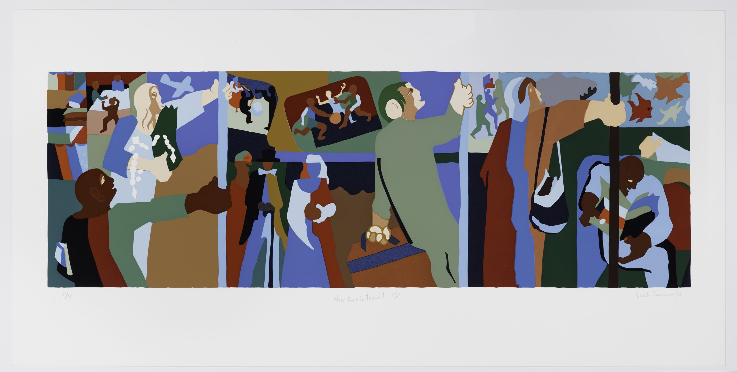
This essay looks closely at Lawrence’s large-scale murals, considering both why they were created and how they were publicly received (including potential criticisms). At the center of my analysis are statements from Lawrence himself, which provide insight into the artist’s inclination to take on these projects. Whether he consciously or subconsciously chose to, it is my belief that these later works, culminating with New York in Transit (hereafter, NYIT) serve as a fitting bookend to a long and remarkably consistent career of painting subjects he knew intimately and saw pieces of himself in (fig. 1). Though at times during his career Lawrence was accused of political agnosticism, he would maintain that his political statements could be found clearly in the content of his work. I find these to be weak criticisms. The politics in NYIT, not only seen in its content but in its medium, scale, and location, are not the type that you debate, but are subtler, gentler, and only wish to draw appreciation to the people and institutions that mattered to Lawrence.
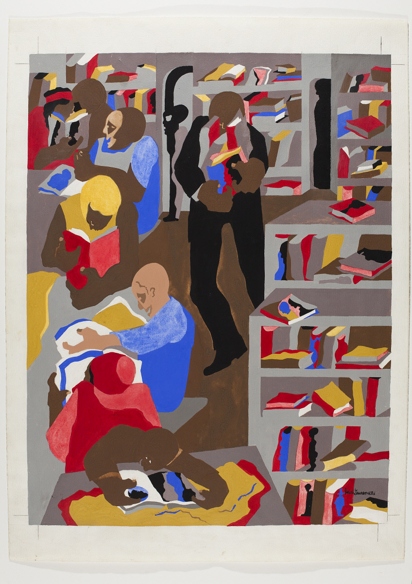
In speaking about his early life and education, Lawrence never glossed over the immense impact that public institutions like libraries, theaters, schools, community centers, and train stations had on his development as a painter. His work brought those institutions to life. A vital force in Lawrence’s early life was the Schomburg Center for Research in Black Culture, where he spent countless hours in his youth, and which he honored in a painting years later in 1986 (fig. 2). It was in these spaces that Lawrence received some of his first forms of validation as an artist. As he commented in a 1993 interview, “the teachers who purchased some of my works, the librarians, for very, very little, you’d think in terms of almost giving it away. But that five or ten dollars that they would pay for a small work meant more than the five or ten dollars. It was the idea of you’re doing something of worth, that somebody else wants.”[1] In spaces like the Schomburg, Lawrence was introduced to a wide diversity of ideas, people, and cultures, and found that his own ideas and potential could be recognized and nurtured. With this in mind, Lawrence’s penchant for depicting these places, as well as his decision to teach at a public university for several decades later in his life, begins to make sense.
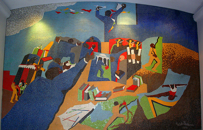
Knowing the importance public institutions held for Lawrence changes the way NYIT and other projects like it should be viewed. The mural is not an objective portrait, and it’s certainly not an example of a city commissioning a big name artist with no relationship to the subject matter. Lawrence understood the unlimited possibilities that libraries, schools, and trains could provide a citizenry, and that feeling of potential comes through in works like NYIT and Events in the Life of Harold Washington, a 1991 mosaic mural by Lawrence for the Harold Washington Library in Chicago (fig. 3). The murals feel like related parts of an unofficial series, both bursting with similar bright reds and blues, and both working in a two dimensional plane that flattens and unites the actions of every individual subject. Books feature heavily in Chicago’s Events, unsurprising since it was commissioned for a library, yet they’re also seen in the hands of many subway riders in NYIT. Additionally, in Events, subjects participate in various aspects of higher education, and out of a pseudo-window in NYIT, tucked away in the lower panel a dark shape resembles a distorted graduation cap, speaking to the connectedness of all aspects of public life. While Events celebrates one man’s life, NYIT celebrates life itself, pointedly honoring an aspect of life few would think to.
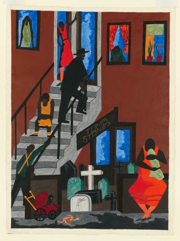
NYIT inspires a different response than Lawrence’s other works – especially earlier paintings like Tombstones from 1942 and Fulton and Nostrand from 1958 (fig. 4, fig. 5). To me, those evoke a feeling of dread, of sadness, of struggle, but NYIT has less visual nuance. Literally, the colors are solid, with no visible hurried brushstrokes – because it’s not a painting, yet despite being a glass-mosaic mural, its lack of brushstrokes and shading make it feel even more two dimensional than a traditional painting. Its visual, physical elements make it immediately understandable. Lawrence said of his work, “I want the idea to strike right away,” a goal which he achieved partially through never abandoning the human form in his work, and also through simplifying his process of depicting the human form.[2] Lawrence would often credit German artist Josef Albers for influencing him to think about economizing color and lines, posing to Lawrence when he spent the summer as a guest professor at Black Mountain College in 1946, “ ‘Why use three colors when you can use two?’ or ‘Why use five lines when you can use four?’, an idea Lawrence used extensively as he developed his own artistic identity.[3] By the time he created NYIT, Lawrence was a true master of making more out of less. The spareness in his style allowed him to create a chaotic scene that feels totally relaxed.
How often have you gone into a subway station not in a hurry? Public transit does not give us time to look through every inch of the artwork in its stations. We look at it as we rush to get to our trains. Maybe if you pass it for a few seconds every day you’ll piece together different bits over time, but I’d guess most people see it only once and for only a moment. And because Lawrence made it the way that he did, they can understand it too. In Lawrence’s teaching philosophy statement, he expands upon this idea of how experience can change one’s perception of an object or work of art. “I emphasize that–living, seeing,” he wrote. “You may walk across campus day in and day out, and then all at once you begin to notice a certain tree that you have been passing all the time; that is the nature of experience. In drawing there is more than just the skill itself, there is also the experience behind it, the feeling, the interpretation.”[4] Here, he’s speaking to his students about the value of building a relationship with their subjects, but I think he’s speaking to viewers of his work as well. Because it lives in a place where people can see it everyday – whether that place is a lecture hall on a Seattle campus or a subway station in New York City’s Times Square – it has the potential to be viewed more deeply than a work held in a museum, something that most viewers will only see once.
Public murals shouldn’t need 500 word artist statements, nor should they require viewers to know even so much as the name of the artist. It might add context, but they don’t need to. Deeper context may serve the art fans, but the viewing experience of everyday passersby shouldn’t be weakened by a lack of it. Lawrence took on a project that I assume the MTA wanted to be an inch deep and a mile wide, both in message and form. Literally, the mural is very wide and since it lacks shading, lacks the feeling of three dimensionality, yet he created something dimensional without dimension, and deep without visual depth.
A glass-mosaic mural, New York in Transit runs 6 feet tall and 36 feet wide and is displayed permanently in New York’s Times Square/42nd Street subway station. NYIT is the realized version of the second of two maquettes Lawrence painted in the late 1990s as proposals for the large project. This was Lawrence’s last commissioned work. He died in 2000, a year before the piece was finished and installed. As Lawrence was unable to supervise the installation himself, his widow, the artist Gwendolyn Knight, oversaw the creation of the mosaic to ensure it stayed true to Lawrence’s vision.
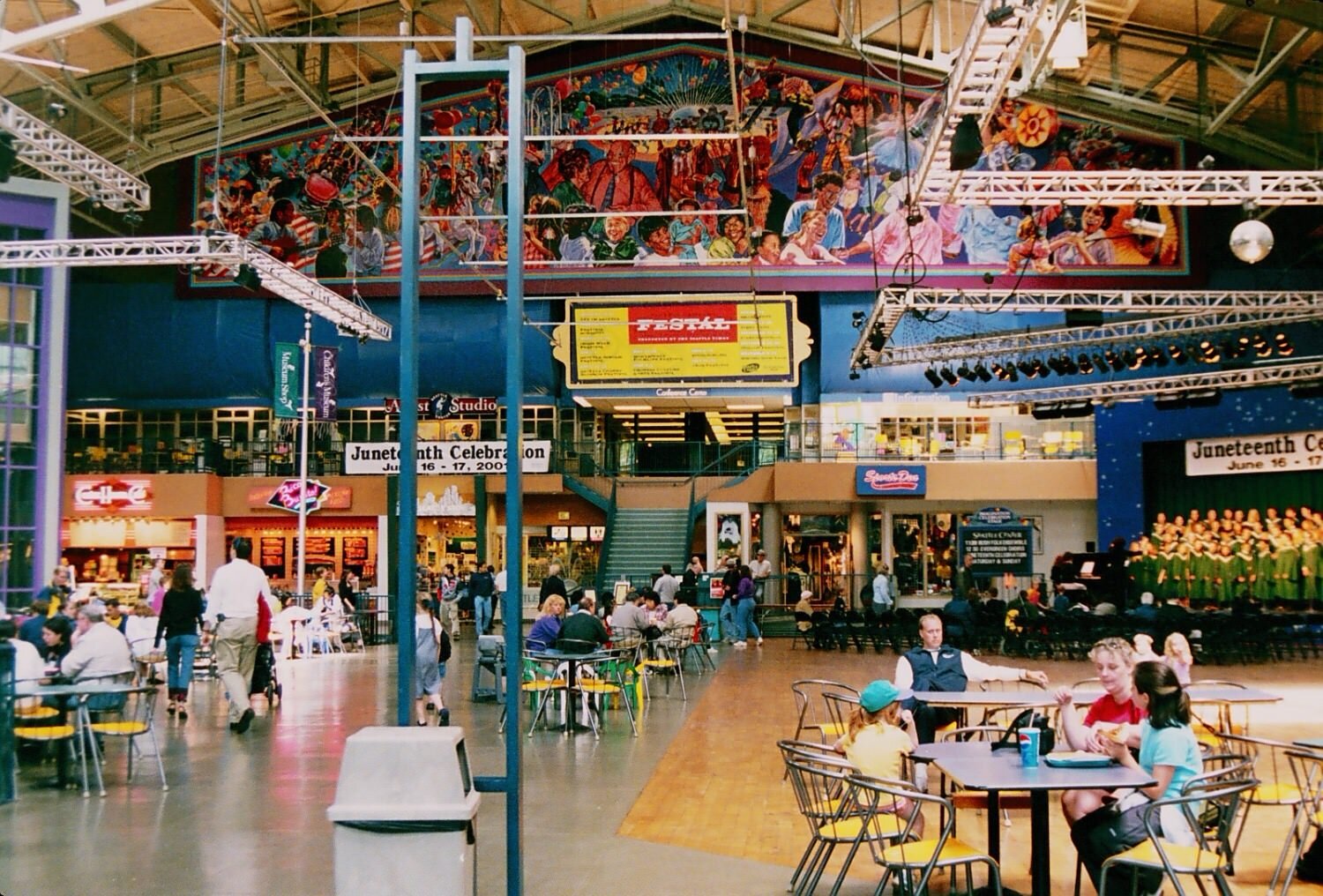
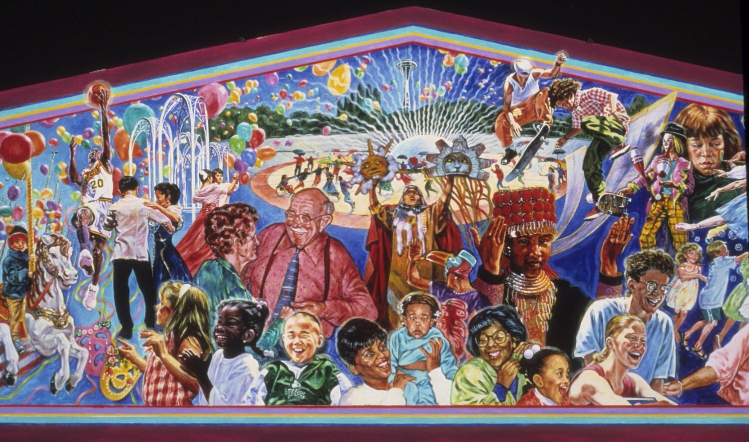
The non-Lawrence artwork that NYIT reminds me of most is a magnificent, gigantic mural by Seattle artist Terry Furchgott that used to be displayed in the Seattle Center House (now known as The Armory) (figs. 6-7). Simply titled Seattle Center Mural 1, it featured a smorgasbord of people, activities, and events happening all at once. It highlighted the beauty of what the Seattle Center had to offer, but it wasn’t an ad – it was a celebration. It was imposing in its size and its indulgence of color and action, yet completely humble, presenting its subjects as they were. I began noticing it as a child in the early 2000s when my Dad would take my sister and me to the Seattle Center on his days off to have lunch and visit the Children’s Museum. In 2012 the mural came down. Its subjects and style looked too dated to fit into the Seattle Center’s plan to revamp the campus for its 50th anniversary. I never looked at the mural for more than a few seconds at a time, but when I think of it I feel a deep sense of nostalgia and familiarity. What the Seattle Center Mural has in common with NYIT, aside from their similar visual qualities – brightness and overlapping subjects – is that both depict regular people, and more importantly, both are displayed publicly, with regular people in mind.
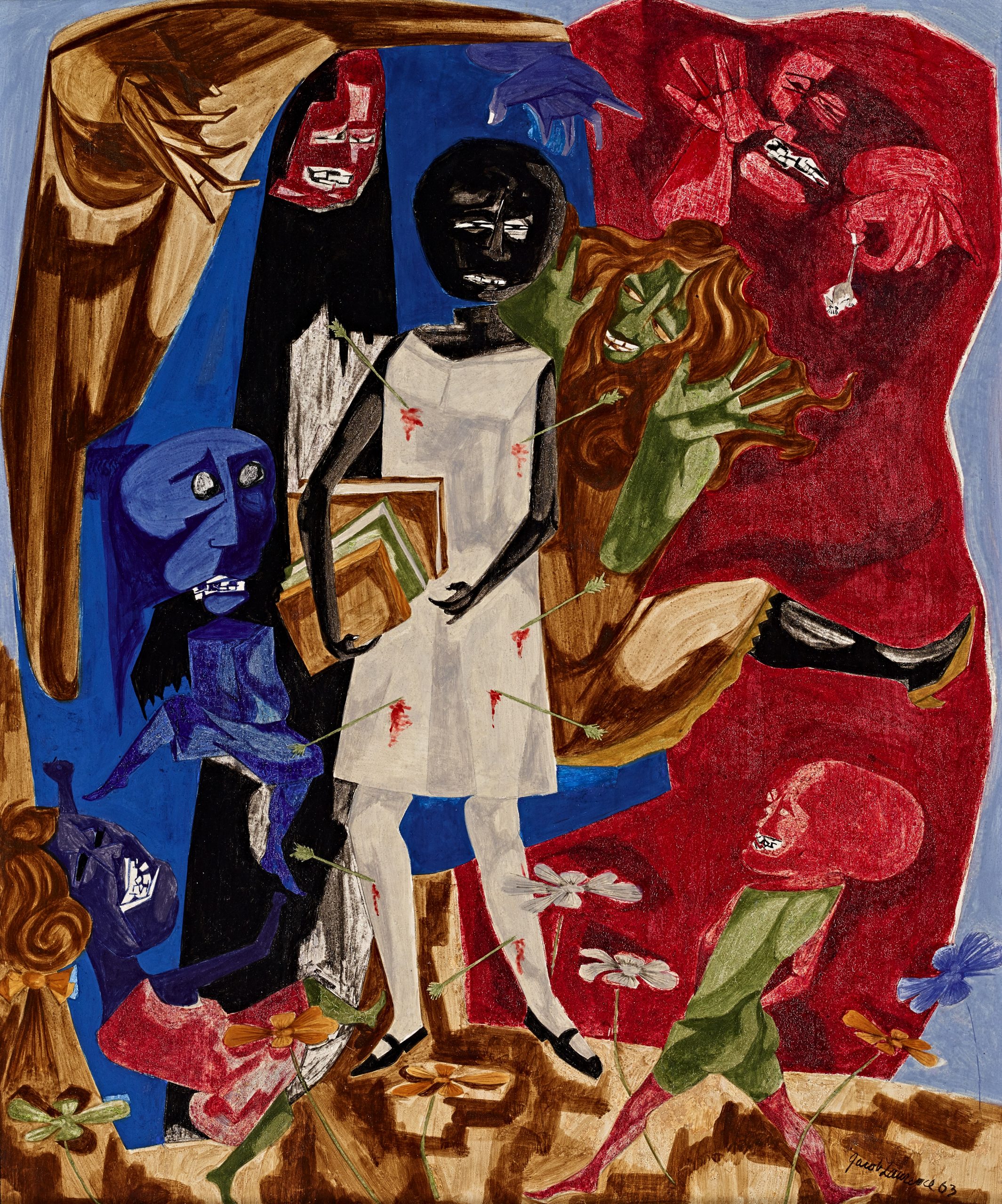
At its worst, NYIT could be viewed as sterile of political meaning, a mere advertisement for the MTA that the city coaxed out of him. I, however, am fairly certain Lawrence didn’t phone this in. Why, at age 80, after a 60 year career devoted to painting American working people, when given the opportunity to create a mural for one of the most iconic subway stops in the entire NYC transit system, would Lawrence suddenly make an artwork without deeper political meaning? Especially when depicting a quintessential American institution, subject matter he knew intimately and returned to over and over again in his career? Of course, Lawrence’s political statements, if you can even classify them as such, are not the fiery kind. At their most overt they feel somber and haunting, like in The Ordeal of Alice from 1963, where Lawrence paints a Black child struck by arrows, surrounded by distorted human figures, depicting the first wave of children to desegregate schools in the South (fig. 8). Though Lawrence took flak from others in the Black community throughout his career for his reticence to make overt political statements, he never accepted this criticism as legitimate, claiming “ ‘Everything I have to say is in my paintings” , succinctly referring to the fact that one need look no further than his art to get a glimpse of his worldview.[5] Being a fan of Lawrence’s work doesn’t make me qualified to describe his political ideologies, but having combed through a number of his interviews with and articles about him I feel strongly that these words serve as an invitation to look at the form and content of his work as reflections of who he was as a person.
As Lawrence rose to prominence during the 1930s and ‘40s he became acutely aware of the way critics pigeonholed Black artists into the realm of “Black art”. This marginalization, this “othering”, effectively worked to limit who would see the work and how they might view it. With this in mind as well as an awareness of the economic consequences of being an outspoken Black artist, Lawrence’s approach to embedding his politics into his work softened. However, as his assertion that “‘Everything I have to say is in my paintings” reminds us, Lawrence would never concede that his work lacked political meaning. His politics, however, are subtle and expansive rather than militant and targeted. Scholar Paul J. Karlstrom compared the painter to fellow Rosenwald fellowship recipient and writer Zora Neale Hurston, observing that both “chose to celebrate the spirit rather than the politics of Black America as the battle for civil rights and dignity was joined in the public arena. The question for these and other black artists is to what extent they were engaged in the struggle through their work.”[6] Lawrence was essentially engaged in two struggles, first, in finding sustained success as a Black artist in a white-centric art world, and second, in finding a balance between prioritizing individual goals with serving his community. His solution to this second struggle was to continue to paint working class people of color his entire career, serving them by representing them.
Lawrence’s mural was commissioned during the 1990s, when former District Attorney Rudy Giuliani was elected mayor of NYC. During his administration, Giuliani unleashed a wave of exorbitantly harsh policing, with ‘tough on crime’ tactics like stop-and-frisk terrorizing Black and Brown communities. Given the racist impact of these policies, it’s fair to wonder about the rationale for the Giuliani administration’s choice to commission a prominent Black artist like Lawrence for such a publicly visible piece. Did the selection of Lawrence betray the city’s cluelessness about the underlying political commentary of much of his work? Or was choosing Lawrence a disingenuous attempt to win approval from New York’s BIPOC community? It’s almost ironic that the city would commission an artist like Lawrence to do such a publicly visible piece. Perhaps his old age made him seem harmless to the Giuliani regime, but I believe this mural can be seen as a wolf in sheep’s clothing – a quiet protest against an authoritarian political movement in the city Lawrence spent most of his life in. Writer Sewell Chan wrote “public art is populist by definition,” and NYIT is as populist as can be.[7] Just to make art publicly viewable is a form of protest against the elitism of art as something reserved for rarified, white spaces, as is the choice to paint regular, everyday Black and Brown people. Simply by creating populist art in New York during a time when illiberal politics ran rampant is a form of protest.
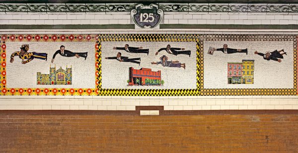
In 1996, the MTA commissioned murals by another Harlem native, Faith Ringgold. Ringgold’s work, Flying Home Harlem Heroes and Heroines, lives in Harlem’s 125th Street station and depicts notable Black figures such as Hurston and Malcolm X flying above the neighborhood (fig. 9). Though aesthetically different, these public works by Ringgold and Lawrence share a similar spirit and vision of politics. In both, the feeling of potential, of the possibilities that come from strong community and freedom of movement, come through clearly. Yellow and black tiles bordering one section of Flying Home resemble the pattern seen on classic taxicabs, alluding to the theme of transportation even in a piece where subjects soar from point A to point B unassisted by machines.
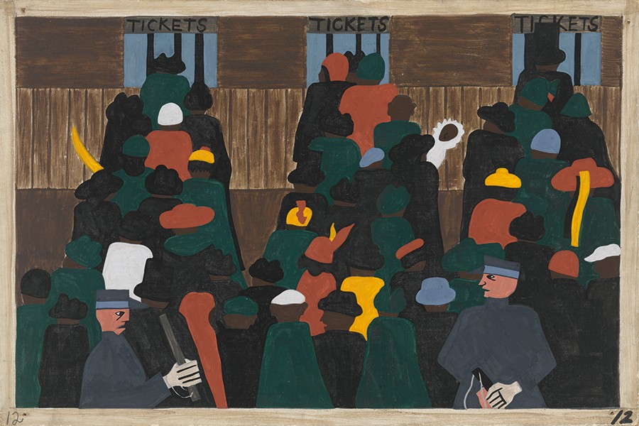
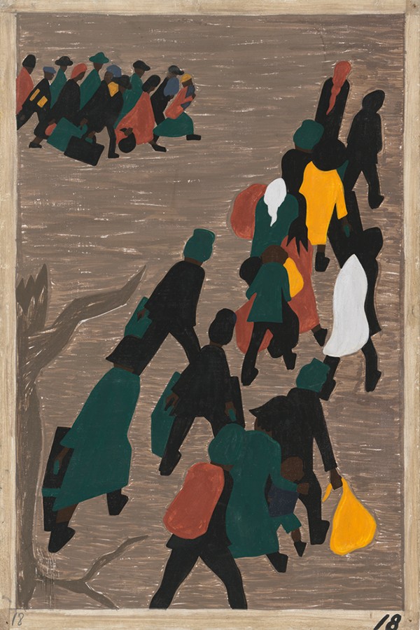
Transit was a common theme throughout Lawrence’s career, most notably in his iconic Migration series of 1940-41, in which the theme was literally the transit of Black people from the rural South to Northern cities in the early 20th century. In panels portraying movement, you see migrants traveling North due to economic and social factors largely out of their control. In Panel 12 of the series, white guards holding batons corral the travelers onto their trains (fig. 10). In panel 18, migrants are shown in crowds simply walking to their Northern destinations. In these, color and line are used sparingly, bringing the focus onto the content and ideas behind the panels (fig. 11).
Movement and transit as amorphous themes can be seen in both Ringgold and Lawrence’s work – bodies move, and their ideas, cultures, and histories are brought along and left behind. Even though his immediate family was based in New York because of the Great Migration, Lawrence felt a deep connection to his family’s Southern roots, saying of the South in an interview “I was far removed from the culture I knew, but yet I was very close to it through my mother, through her friends. So there’s a paradox here; being close, and yet far away… urban Northern is Southern, because my background, my family’s background, the friends of my family, were all Southern in culture.”[8] To Lawrence, people could in essence occupy two places at once, and transit is what allowed them to do so.
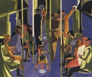
In 1959, Lawrence returned to the transit motif with Subway Acrobats (fig. 12). This time, everyday life is the setting, but unlike in Migration, the subjects have no destination. The dark blue background and faceless characters give it a brooding atmosphere, almost resembling a scene out of a noir film. In the center of the composition, two small figures engage in an elaborate performance and are paid little mind by the other riders.
Nearly 40 years later comes NYIT. In the last era of Lawrence’s life and career the artist returned to this familiar subject, yet this time the message is gentler. In Subway Acrobats, the mundanity of everyday life weighs on the train riders – in NYIT that mundanity is honored, the daily routine of taking the subway to work or school is to be relished, not commiserated over. In one of the few analyses of this mural, scholar Michele Elam describes Lawrence as an artist who “captured the rhythms and poignancy of the everyday”- and that he was.[9]
“The people in the cars who are hurtling through space have not yet arrived; they are forever journeying in the perpetual presence of this image, hurtling from unknown origin to unknown destination.”[10] By the time he created NYIT Lawrence had arrived at his destination. He was an accomplished illustrator of everyday life, a subtle social critic, a chronicler of the dignity of unsung working people, and a master of creating more using less. His subject and unmistakable iconography make him one of the great American artists of the 20th century.
- Jacob Lawrence and the Making of the Migration Series. YouTube. United States: The Phillips Collection, 1993. https://www.youtube.com/watch?v=62dlyfIRg5E. ↵
- Nesbett, Peter T., Michelle DuBois, and Elizabeth Hutton Turner. “The Education of Jacob Lawrence.” Essay. In Over the Line: The Art and Life of Jacob Lawrence, 97–120. Seattle, WA: University of Washington Press in association with Jacob and Gwendolyn Lawrence Foundation, 2001. ↵
- Caro, Julie Levin. Jacob Lawrence: Lines of Influence. Zurich, Switzerland: Verlag Scheidegger & Spiess, 2020. ↵
- Jacob Lawrence et. al., "Faculty Notes," in Drawing, at the Henry : an Exhibition of Contemporary Drawings by Eighteen West Coast Artists, April 5-May 25, 1980, Henry Art Gallery, University of Washington. Seattle: The Gallery. 1980. ↵
- Turner, Elizabeth Hutton, Austen Barron Bailly, and Barbara Earl Thomas. “Tender Beauty, Wounded Hope.” Preface. In Jacob Lawrence: the American Struggle, 13. Salem, MA: Peabody Essex Museum, 2020. ↵
- Nesbett, Peter T., Michelle DuBois, and Paul J. Karlstrom. “Jacob Lawrence: Modernism, Race, and Community.” Essay. In Over the Line: The Art and Life of Jacob Lawrence, 229–46. Seattle, WA: University of Washington Press in association with Jacob and Gwendolyn Lawrence Foundation, 2001. ↵
- Chan, Sewell. “Access to Art With a MetroCard Swipe.” The New York Times. The New York Times, June 30, 2005. https://www.nytimes.com/2005/06/30/arts/design/access-to-art-with-a-metrocard-swipe.html. ↵
- Jacob Lawrence and the Making of the Migration Series. YouTube. United States: The Phillips Collection, 1993. https://www.youtube.com/watch?v=62dlyfIRg5E. ↵
- Elam, Michele. “Moving Forward Together: New York in Transit.” Essay. In Promised Land: the Art of Jacob Lawrence: a Gift of the Kayden Family, 50–55. Stanford, CA: Iris & B. Gerald Cantor Center for Visual Arts, Stanford University, 2015. ↵
- Ibid. ↵
