
11 Chapter 1 Appendix Problems
Problems
-
Panel (a) shows a graph of a positive relationship; Panel (b) shows a graph of a negative relationship. Decide whether each proposition below demonstrates a positive or negative relationship, and decide which graph you would expect to illustrate each proposition. In each statement, identify which variable is the independent variable and thus goes on the horizontal axis, and which variable is the dependent variable and goes on the vertical axis.
Figure D8

-
- An increase in national income in any one year increases the number of people killed in highway accidents.
- An increase in the poverty rate causes an increase in the crime rate.
- As the income received by households rises, they purchase fewer beans.
- As the income received by households rises, they spend more on home entertainment equipment.
- The warmer the day, the less soup people consume.
-
-
Suppose you have a graph showing the results of a survey asking people how many left and right shoes they owned. The results suggest that people with one left shoe had, on average, one right shoe. People with seven left shoes had, on average, seven right shoes. Put left shoes on the vertical axis and right shoes on the horizontal axis; plot the following observations:
Left shoes 1 2 3 4 5 6 7 Right shoes 1 2 3 4 5 6 7 Is this relationship positive or negative? What is the slope of the curve?
-
Suppose your assistant inadvertently reversed the order of numbers for right shoe ownership in the survey above. You thus have the following table of observations:
Left shoes 1 2 3 4 5 6 7 Right shoes 7 6 5 4 3 2 1 Is the relationship between these numbers positive or negative? What’s implausible about that?
-
Suppose some of Ms. Alvarez’s kitchen equipment breaks down. The following table gives the values of bread output that were shown in Figure C1 “A Nonlinear Curve” It also gives the new levels of bread output that Ms. Alvarez’s bakers produce following the breakdown. Plot the two curves. What has happened?
A B C D E F G Bakers/day 0 1 2 3 4 5 6 Loaves/day 0 400 700 900 1,000 1,050 1,075 Loaves/day after breakdown 0 380 670 860 950 990 1,005 -
Steven Magee has suggested that there is a relationship between the number of lawyers per capita in a country and the country’s rate of economic growth. The relationship is described with the following Magee curve.
Figure 35.26
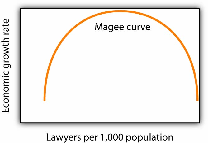
What do you think is the argument made by the curve? What kinds of countries do you think are on the upward- sloping region of the curve? Where would you guess the United States is? Japan? Does the Magee curve seem plausible to you?
-
Draw graphs showing the likely relationship between each of the following pairs of variables. In each case, put the first variable mentioned on the horizontal axis and the second on the vertical axis.
- The amount of time a student spends studying economics and the grade he or she receives in the course
- Per capita income and total expenditures on health care
- Alcohol consumption by teenagers and academic performance
- Household income and the likelihood of being the victim of a violent crime


