
12 Simple Linear Regression and Correlation
Barbara Illowsky; Susan Dean; and Margo Bergman
Linear Regression and Correlation
Student Learning Outcomes
By the end of this chapter, the student should be able to:
- Discuss basic ideas of linear regression and correlation.
- Create and interpret a line of best fit.
- Calculate and interpret the correlation coefficient.
- Calculate and interpret outliers.
Introduction
Professionals often want to know how two or more numeric variables are related. For example, is there a relationship between the grade on the second math exam a student takes and the grade on the final exam? If there is a relationship, what is it and how strong is the relationship?
In another example, your income may be determined by your education, your profession, your years of experience, and your ability. The amount you pay a repair person for labor is often determined by an initial amount plus an hourly fee. These are all examples in which regression can be used.
The type of data described in the examples is bivariate data – “bi” for two variables. In reality, statisticians use multivariate data, meaning many variables.
In this chapter, you will be studying the simplest form of regression, “linear regression” with one independent variable (x). This involves data that fits a line in two dimensions. You will also study correlation which measures how strong the relationship is.
Linear Equations
Linear regression for two variables is based on a linear equation with one independent variable. It has the form:

where m and b are constant numbers.
x is the independent variable, and y is the dependent variable. Typically, you choose a value to substitute for the independent variable and then solve for the dependent variable.
Example 1
The following examples are linear equations.


The graph of a linear equation of the form  is a straight line. Any line that is not vertical can be described by this equation.
Example 2
Graph  .
.

Figure 1
Figure 1 is the graph of the equation .
Linear equations of this form occur in applications of life sciences, social sciences, psychology, business, economics, physical sciences, mathematics, and other areas.
Example 3
Aaron’s Word Processing Service (AWPS) does word processing. Its rate is $32 per hour plus a $31.50 one-time charge. The total cost to a customer depends on the number of hours it takes to do the word processing job.
Problem
Find the equation that expresses the total cost in terms of the number of hours required to finish the word processing job.
Solution
Let x = the number of hours it takes to get the job done.
Let y = the total cost to the customer.
The $31.50 is a fixed cost. If it takes x hours to complete the job, then (32) (x) is the cost of the word processing only. The total cost is:

Slope and Y-Intercept of a Linear Equation
For the linear equation , m = slope and b = y-intercept.
From algebra recall that the slope is a number that describes the steepness of a line and the y-intercept is the y coordinate of the point (0, b) where the line crosses the y-axis.
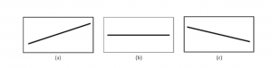
Figure 2
Figure 2 shows the three possible graphs of . (a) If m> 0, the line slopes upward to the right. (b) If
m = 0, the line is horizontal. (c) If m< 0, the line slopes downward to the right.
Example 4
Svetlana tutors to make extra money for college. For each tutoring session, she charges a one time fee of $25 plus $15 per hour of tutoring. A linear equation that expresses the total amount of money Svetlana earns for each session she tutors is  .
.
Problem
What are the independent and dependent variables? What is the y-intercept and what is the slope? Interpret them using complete sentences.
Solution
The independent variable (x) is the number of hours Svetlana tutors each session. The dependent variable (y) is the amount, in dollars, Svetlana earns for each session.
The y-intercept is 25 (b = 25). At the start of the tutoring session, Svetlana charges a one-time fee of $25 (this is when x = 0). The slope is 15 (m = 15). For each session, Svetlana earns $15 for each hour she tutors.
Scatter Plots
Before we take up the discussion of linear regression and correlation, we need to examine a way to display the relation between two variables x and y. The most common and easiest way is a scatter plot. The following example illustrates a scatter plot.
Example 5
From an article in the Wall Street Journal : In Europe and Asia, m-commerce is popular. M- commerce users have special mobile phones that work like electronic wallets as well as provide phone and Internet services. Users can do everything from paying for parking to buying a TV set or soda from a machine to banking to checking sports scores on the Internet. For the years 2000 through 2004, was there a relationship between the year and the number of m-commerce users? Construct a scatter plot. Let x = the year and let y = the number of m-commerce users, in millions (Table 1).
| x (year) | y (# of users) |
| 2000 | 0.5 |
| 2002 | 20.0 |
| 2003 | 33.0 |
| 2004 | 47.0 |
Table 1
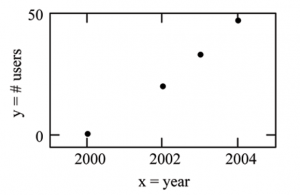
Figure 3
Table 1 shows the number of m-commerce users (in millions) by year. Figure 3 is a scatter plot showing the number of m-commerce users (in millions) by year.
A scatter plot shows the direction and strength of a relationship between the variables. A clear direction happens when there is either:
- High values of one variable occurring with high values of the other variable or low values of one variable occurring with low values of the other variable.
- High values of one variable occurring with low values of the other variable.
You can determine the strength of the relationship by looking at the scatter plot and seeing how close the points are to a line, a power function, an exponential function, or to some other type of function.
When you look at a scatterplot, you want to notice the overall pattern and any deviations from the pattern. The following scatterplot examples illustrate these concepts:
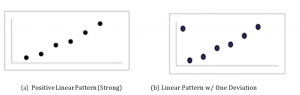
Figure 4

Figure 5
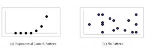
Figure 6
In this chapter, we are interested in scatter plots that show a linear pattern. Linear patterns are quite common. The linear relationship is strong if the points are close to a straight line. If we think that the points show a linear relationship, we would like to draw a line on the scatter plot. This line can be calculated through a process called linear regression. However, we only calculate a regression line if one of the variables helps to explain or predict the other variable. If x is the independent variable and y the dependent variable, then we can use a regression line to predict y for a given value of x.
The Regression Equation
Data rarely fit a straight line exactly. Usually, you must be satisfied with rough predictions. Typically, you have a set of data whose scatter plot appears to “fit” a straight line. This is called a Line of Best Fit or Least Squares Line.
Example 6
A random sample of 11 statistics students produced the following data (Table 2) where x is the third exam score, out of 80, and y is the final exam score, out of 200. Can you predict the final exam score of a random student if you know the third exam score?
| x (third exam score) | y (final exam score) |
| 65 | 175 |
| 67 | 133 |
| 71 | 185 |
| 71 | 163 |
| 66 | 126 |
| 75 | 198 |
| 67 | 153 |
| 70 | 163 |
| 71 | 159 |
| 69 | 151 |
| 69 | 159 |
Table 2
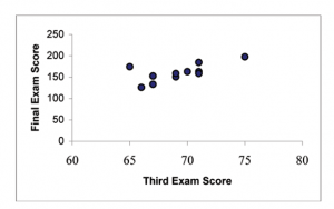
Figure 7
Table 2 shows the scores on the final exam based on scores from the third exam. Figure 7 shows the scatter plot of the scores on the final exam based on scores from the third exam.
The third exam score, x, is the independent variable and the final exam score, y, is the dependent variable. We will plot a regression line that best “fits” the data. If each of you were to fit a line “by eye”, you would draw different lines. We can use what is called a least-squares regression line to obtain the best fit line. Consider the following diagram. Each point of data is of the the form (x, y)and each point of the line of best fit using least-squares linear regression has the form  .
.
The  is read “y hat” and is the estimated value of y. It is the value of y obtained using the regression line. It is not generally equal to y from data.

Figure 8
The term  is called the “error” or residual. It is not an error in the sense of a mistake. The absolute value of a residual measures the vertical distance between the actual value of y and the estimated value of y. In other words, it measures the vertical distance between the actual data point and the predicted point on the line.
If the observed data point lies above the line, the residual is positive, and the line underestimates the actual data value for y. If the observed data point lies below the line, the residual is negative, and the line overestimates that actual data value for y.
In the diagram above, is the residual for the point shown. Here the point lies above the line and the residual is positive.
 = the Greek letter epsilon
For each data point, you can calculate the residuals or errors,  for i = 1, 2, 3, …, 11.
Each  is a vertical distance.
For the example about the third exam scores and the final exam scores for the 11 statistics students, there are 11 data points. Therefore, there are 11 values. If you square each and add, you get

This is called the Sum of Squared Errors (SSE).
Using calculus, you can determine the values of b and m that make the SSE a minimum. When you make the SSE a minimum, you have determined the points that are on the line of best fit. It turns out that the line of best fit has the equation:
where  and
and 
where  and
and  are the sample means of the x values and the y values, respectively. The best fit line always passes through the point (x, y).
The slope m can be written as  where sy = the standard deviation of the y values and sx = the standard deviation of the x values. r is the correlation coefficient which is discussed in the next section.
Least Squares Criteria for Best Fit
The process of fitting the best fit line is called linear regression. The idea behind finding the best fit line is based on the assumption that the data are scattered about a straight line. The criteria for the best fit line is that the sum of the squared errors (SSE) is minimized, that is made as small as possible. Any other line you might choose would have a higher SSE than the best fit line. This best fit line is called the least squares regression line.
THIRD EXAM vs FINAL EXAM EXAMPLE:
The graph of the line of best fit for the third exam/final exam example is shown below:
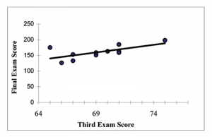
Figure 9
The least squares regression line (best fit line) for the third exam/final exam example has the equation:

NOTE:
Remember, it is always important to plot a scatter diagram first. If the scatter plot indicates that there is a linear relationship between the variables, then it is reasonable to use a best fit line to make predictions for y given x within the domain of x-values in the sample data, but not necessarily for x-values outside that domain.
You could use the line to predict the final exam score for a student who earned a grade of 73 on the third exam.
You should NOT use the line to predict the final exam score for a student who earned a grade of 50 on the third exam, because 50 is not within the domain of the x-values in the sample data, which are between 65 and 75.
UNDERSTANDING SLOPE
The slope of the line, m, describes how changes in the variables are related. It is important to interpret the slope of the line in the context of the situation represented by the data. You should be able to write a sentence interpreting the slope in plain English.
INTERPRETATION OF THE SLOPE: The slope of the best fit line tells us how the dependent variable (y) changes for every one unit increase in the independent (x) variable, on average.
THIRD EXAM vs FINAL EXAM EXAMPLE
Slope: The slope of the line is m = 4.83.
Interpretation: For a one point increase in the score on the third exam, the final exam score increases by 4.83 points, on average.
Correlation Coefficient and Coefficient of Determination
The Correlation Coefficient r
Besides looking at the scatter plot and seeing that a line seems reasonable, how can you tell if the line is a good predictor? Use the correlation coefficient as another indicator (besides the scatterplot) of the strength of the relationship between x and y.
The correlation coefficient, r, developed by Karl Pearson in the early 1900s, is a numerical measure of the strength of association between the independent variable x and the dependent variable y.
The correlation coefficient is calculated as:
where n = the number of data points.
If you suspect a linear relationship between x and y, then r can measure how strong the linear relationship is.
What the VALUE of r tells us:
- The value of r is always between -1 and +1:

- The size of the correlation r indicates the strength of the linear relationship between x and y. Values of r close to -1 or to +1 indicate a stronger linear relationship between x and y.
- If r = 0 there is absolutely no linear relationship between x and y (no linear correlation).
- If r = 1, there is perfect positive correlation. If r = 1, there is perfect negative correlation. In both these cases, all of the original data points lie on a straight line. Of course, in the real world, this will not generally happen.
What the SIGN of r tells us:
- A positive value of r means that when x increases, y tends to increase and when x decreases, y tends to decrease (positive correlation).
- A negative value of r means that when x increases, y tends to decrease and when x decreases, y tends to increase (negative correlation).
- The sign of r is the same as the sign of the slope, m, of the best fit line.
We can see this in Figure 10.
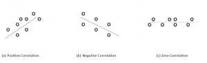
Figure 10
NOTE: Strong correlation does not suggest that x causes y or y causes x. We say “correlation does not imply causation.” For example, every person who learned math in the 17th century is dead. However, learning math does not necessarily cause death!
The Coefficient of Determination
 is called the coefficient of determination. is the square of the correlation coefficient , but is usually stated as a percent, rather than in decimal form. has an interpretation in the context of the data:
- , when expressed as a percent, represents the percent of variation in the dependent variable y that can be explained by variation in the independent variable x using the regression (best fit) line.
- 1–, when expressed as a percent, represents the percent of variation in y that is NOT explained by variation in x using the regression line. This can be seen as the scattering of the observed data points about the regression line.
Consider the third exam/final exam example introduced in the previous section:
The line of best fit is: y= 173.51 + 4.83x The correlation coefficient is r = 0.6631
The coefficient of determination is = 0.66312 = 0.4397
Interpretation of r2 in the context of this example:
Approximately 44% of the variation (0.4397 is approximately 0.44) in the final exam grades can be explained by the variation in the grades on the third exam, using the best fit regression line.
Therefore approximately 56% of the variation (1 – 0.44 = 0.56) in the final exam grades can NOT be explained by the variation in the grades on the third exam, using the best fit regression line. (This is seen as the scattering of the points about the line.)
Prediction
THIRD EXAM vs FINAL EXAM EXAMPLE
We examined the scatterplot and showed that the correlation coefficient is significant. We found the equation of the best fit line for the final exam grade as a function of the grade on the third exam. We can now use the least squares regression line for prediction.
Suppose you want to estimate, or predict, the final exam score of statistics students who received 73 on the third exam. The exam scores (x-values) range from 65 to 75. Since 73 is between the x-values 65 and 75, substitute x = 73 into the equation. Then:
= −173.51 + 4.83 (73) = 179.08
We predict that statistic students who earn a grade of 73 on the third exam will earn a grade of 179.08 on the final exam, on average.
Example 7
THIRD EXAM vs FINAL EXAM EXAMPLE
Problem
What would you predict the final exam score to be for a student who scored a 66 on the third exam?
Solution
145.27
Outliers
In some data sets, there are values (observed data points) called outliers. Outliers are observed data points that are far from the least squares line. They have large “errors”, where the “error” or residual is the vertical distance from the line to the point.
Outliers need to be examined closely. Sometimes, for some reason or another, they should not be included in the analysis of the data. It is possible that an outlier is a result of erroneous data. Other times, an outlier may hold valuable information about the population under study and should remain included in the data. The key is to carefully examine what causes a data point to be an outlier.
Besides outliers, a sample may contain one or a few points that are called influential points. Influential points are observed data points that are far from the other observed data points in the horizontal direction. These points may have a big effect on the slope of the regression line. To begin to identify an influential point, you can remove it from the data set and see if the slope of the regression line is changed significantly.
Computers and many calculators can be used to identify outliers from the data. Computer output for regression analysis will often identify both outliers and influential points so that you can examine them.
Identifying Outliers
We could guess at outliers by looking at a graph of the scatterplot and best fit line. However we would like some guideline as to how far away a point needs to be in order to be considered an outlier. As a rough rule of thumb, we can flag any point that is located further than two standard deviations above or below the best fit line as an outlier. The standard deviation used is the standard deviation of the residuals or errors.
We can do this visually in the scatterplot by drawing an extra pair of lines that are two standard deviations above and below the best fit line. Any data points that are outside this extra pair of lines are flagged as potential outliers. Or we can do this numerically by calculating each residual and comparing it to twice the standard deviation. The graphical procedure is shown first, followed by the numerical calculations. You would generally only need to use one of these methods.
THIRD EXAM vs FINAL EXAM EXAMPLE
You can determine if there is an outlier or not. If there is an outlier, as an exercise, delete it and fit the remaining data to a new line. For this example, the new line ought to fit the remaining data better. This means the SSE should be smaller and the correlation coefficient ought to be closer to 1 or -1.
Graphical Identification of Outliers
With the TI-83,83+,84+ graphing calculators, it is easy to identify the outlier graphically and visually. If we were to measure the vertical distance from any data point to the corresponding point on the line of best fit and that distance was equal to 2s or farther, then we would consider the data point to be “too far” from the line of best fit. We need to find and graph the lines that are two standard deviations below and above the regression line. Any points that are outside these two lines are outliers. We will call these lines Y2 and Y3:
As we did with the equation of the regression line and the correlation coefficient, we will use technology to calculate this standard deviation for us. Using the LinRegTTest with this data, scroll down through the output screens to find s=16.412
Line Y2=-173.5+4.83x-2(16.4) and line Y3=-173.5+4.83x+2(16.4)
where =-173.5+4.83x is the line of best fit. Y2 and Y3 have the same slope as the line of best fit.
Graph the scatterplot with the best fit line in equation Y1, then enter the two extra lines as Y2 and Y3 in the “Y=”equation editor and press ZOOM 9. You will find that the only data point that is not between lines Y2 and Y3 is the point x=65, y=175. On the calculator screen it is just barely outside these lines. The outlier is the student who had a grade of 65 on the third exam and 175 on the final exam; this point is further than 2 standard deviations away from the best fit line.
Sometimes a point is so close to the lines used to flag outliers on the graph that it is difficult to tell if the point is between or outside the lines. On a computer, enlarging the graph may help; on a small calculator screen, zooming in may make the graph clearer. Note that when the graph does not give a clear enough picture, you can use the numerical comparisons to identify outliers. This method is shown in Figure 11.
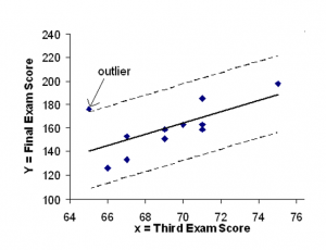
Figure 11
Numerical Identification of Outliers
In the table below, the first two columns are the third exam and final exam data. The third column shows the predicted values calculated from the line of best fit:  . The residuals, or errors, have been calculated in the fourth column of the table: observed y value- predicted y value =
  .
.
s is the standard deviation of all the  values where n = the total number of data points. If each residual is calculated and squared, and the results are added, we get the SSE. The standard deviation of the residuals is calculated from the SSE as:

Rather than calculate the value of s ourselves, we can find s using the computer or calculator. For this example, the calculator function LinRegTTest found s = 16.4 as the standard deviation of the residuals 35; -17; 16; -6; -19; 9; 3; -1; -10; -9; -1.
| x | y | |
|
| 65 | 175 | 140 | 175 − 140 = 35 |
| 67 | 133 | 150 | 133 − 150 = −17 |
| 71 | 185 | 169 | 185 − 169 = 16 |
| 71 | 163 | 169 | 163 − 169 = −6 |
| 66 | 126 | 145 | 126 − 145 = −19 |
| 75 | 198 | 189 | 198 − 189 = 9 |
| 67 | 153 | 150 | 153 − 150 = 3 |
| 70 | 163 | 164 | 163 − 164 = −1 |
| 71 | 159 | 169 | 159 − 169 = −10 |
| 69 | 151 | 160 | 151 − 160 = −9 |
| 69 | 159 | 160 | 159 − 160 = −1 |
Table 3
We are looking for all data points for which the residual is greater than 2s=2(16.4)=32.8 or less than
-32.8. Compare these values to the residuals in column 4 of the table. The only such data point is the student who had a grade of 65 on the third exam and 175 on the final exam; the residual for this student is 35.
How does the outlier affect the best fit line?
Numerically and graphically, we have identified the point (65,175) as an outlier. We should re- examine the data for this point to see if there are any problems with the data. If there is an error we should fix the error if possible, or delete the data. If the data is correct, we would leave it in the data set. For this problem, we will suppose that we examined the data and found that this outlier data was an error. Therefore we will continue on and delete the outlier, so that we can explore how it affects the results, as a learning experience.
Basic Regression Problem
A basic relationship from Macroeconomic Principles is the consumption function. This theoretical relationship states that as a person’s income rises, their consumption rises, but by a smaller amount than the rise in income. If Y is consumption and X is income the regression problem is, first, to establish that this relationship exists. and second, to determine the impact of a change in income on a person’s consumption.
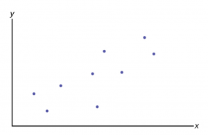
Figure 12
Each “dot” in Figure 12 represents the consumption and income of different individuals at some point in time. This was called cross-section data earlier; observations on variables at one point in time across different people or other units of measurement. This analysis is often done with time series data, which would be the consumption and income of one individual or country at different points in time. For macroeconomic problems it is common to use times series aggregated data for a whole country. For this particular theoretical concept these data are readily available in the annual report of the President’s Council of Economic Advisors.
The regression problem comes down to determining which straight line would best represent the data in Figure 12. Regression analysis is sometimes called “least squares” analysis because the method of determining which line best “fits” the data is to minimize the sum of the squared residuals of a line put through the data.
The whole goal of the regression analysis was to test the hypothesis that the dependent variable, Y, was in fact dependent upon the values of the independent variable(s) as asserted by some foundation theory, such as the consumption function example. Looking at the estimated equation:  we see that this amounts to determining the values of
  and
and  . Notice that again we are using the convention of Greek letters for the population parameters and Roman letters for their estimates.
Figure 13 shows us this “best fit” line.
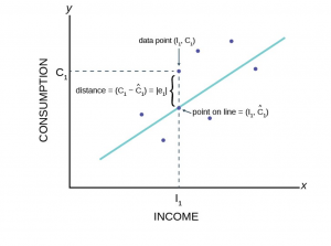
Figure 13
This figure shows the assumed relationship between consumption and income from macroeconomic theory. Here the data are plotted as a scatter plot and an estimated straight line has been drawn. From this graph we can see an error term, e1. Each data point also has an error term. Again, the error term is put into the equation to capture effects on consumption that are not caused by income changes. Such other effects might be a person’s savings or wealth, or periods of unemployment. We will see how by minimizing the sum of these errors we can get an estimate for the slope and intercept of this line.
Figure 14 shows the more general case of the notation rather than the specific case of the Macroeconomic consumption function in our example.
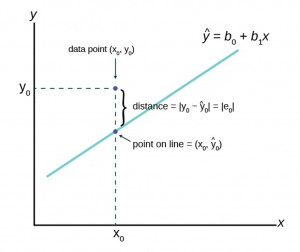
Figure 14
The is read “y hat” and is the estimated value of y. (In Figure 14  represents the estimated value of consumption because it is on the estimated line.) It is the value of y obtained using the regression line. is not generally equal to y from the data.
The term  is called the “error” or residual. It is not an error in the sense of a mistake. The error term was put into the estimating equation to capture missing variables and errors in measurement that may have occurred in the dependent variables. The absolute value of a residual measures the vertical distance between the actual value of y and the estimated value of y. In other words, it measures the vertical distance between the actual data point and the predicted point on the line as can be seen on the graph at point
  .
.
If the observed data point lies above the line, the residual is positive, and the line underestimates the actual data value for y. If the observed data point lies below the line, the residual is negative, and the line overestimates that actual data value for y. In the graph, is the residual for the point shown. Here the point lies above the line and the residual is positive.
For each data point the residuals, or errors, are calculated  for i = 1, 2, 3, …, n where n is the sample size. Each |e| is a vertical distance.
The sum of the errors squared is the term obviously called Sum of Squared Errors (SSE).
Using calculus, you can determine the straight line that has the parameter values of and that minimizes the SSE. When you make the SSE a minimum, you have determined the points that are on the line of best fit.
The sample means of the x values and the y values are and , respectively. The best fit line always passes through the point ( , ) called the points of means.
The equations that support the linear regression line are called the Normal Equations and come from another very important mathematical finding called the Gauss-Markov Theorem without which we could not do regression analysis. The Gauss-Markov Theorem tells us that the estimates we get from using the ordinary least squares (OLS) regression method will result in estimates that have some very important properties. In the Gauss-Markov Theorem it was proved that a least squares line is BLUE, which is, Best, Linear, Unbiased, Estimator. Best is the statistical property that an estimator is the one with the minimum variance. Linear refers to the property of the type of line being estimated. An unbiased estimator is one whose estimating function has an expected mean equal to the mean of the population.
Both Gauss and Markov were giants in the field of mathematics, and Gauss in physics too, in the 18th century and early 19th century. They barely overlapped chronologically and never in geography, but Markov’s work on this theorem was based extensively on the earlier work of Carl Gauss. The extensive applied value of this theorem had to wait until the middle of this last century.
Using the OLS method we can now find the estimate of the error variance which is the variance of the squared errors,  . This is sometimes called the standard error of the estimate.
The variance of the errors is fundamental in testing hypotheses for a regression. It tells us just how “tight” the dispersion is about the line. As we will see shortly, the greater the dispersion about the line, meaning the larger the variance of the errors, the less probable that the hypothesized independent variable will be found to have a significant effect on the dependent variable. In short, the theory being tested will more likely fail if the variance of the error term is high. Upon reflection this should not be a surprise. As we tested hypotheses about a mean we observed that large variances reduced the calculated test statistic and thus it failed to reach the tail of the distribution. In those cases, the null hypotheses could not be rejected. If we cannot reject the null hypothesis in a regression problem, we must conclude that the hypothesized independent variable has no effect on the dependent variable.
A way to visualize this concept is to draw two scatter plots of x and y data along a predetermined line. The first will have little variance of the errors, meaning that all the data points will move close to the line. Now do the same except the data points will have a large estimate of the error variance, meaning that the data points are scattered widely along the line. Clearly the confidence about a relationship between x and y is effected by this difference between the estimate of the error variance.
Testing the Parameters of the Line
The regression analysis output provided by the computer software will produce an estimate of and , and any other b’s for other independent variables that were included in the estimated equation. The issue is how good are these estimates? In order to test a hypothesis concerning any estimate, we have found that we need to know the underlying sampling distribution. It should come as no surprise at his stage in the course that the answer is going to be the normal distribution. This can be seen by remembering the assumption that the error term in the population, , is normally distributed. If the error term is normally distributed and the variance of the estimates of the equation parameters, b0 and b1, are determined by the variance of the error term, it follows that the variances of the parameter estimates are also normally distributed. And indeed this is just the case.
We can see this by the creation of the test statistic for the test of hypothesis for the slope parameter,  in our consumption function equation. To test whether or not Y does indeed depend upon X, or in our example, that consumption depends upon income, we need only test the hypothesis that equals zero. This hypothesis would be stated formally as:


If we cannot reject the null hypothesis, we must conclude that our theory has no validity. If we cannot reject the null hypothesis that  then , the coefficient of Income, is zero and zero times anything is zero. Therefore the effect of Income on Consumption is zero. There is no relationship as our theory had suggested.
Notice that we have set up the presumption, the null hypothesis, as “no relationship”. This puts the burden of proof on the alternative hypothesis. In other words, if we are to validate our claim of finding a relationship, we must do so with a level of significance greater than 90, 95, or 99 percent. The status quo is ignorance, no relationship exists, and to be able to make the claim that we have actually added to our body of knowledge we must do so with significant probability of being correct. John Maynard Keynes got it right and thus was born Keynesian economics starting with this basic concept in 1936.
The test statistic for this test comes directly from our old friend the standardizing formula:

where is the estimated value of the slope of the regression line, is the hypothesized value of  , in this case zero, and
  is the standard deviation of the estimate of . In this case we are asking how many standard deviations is the estimated slope away from the hypothesized slope. This is exactly the same question we asked before with respect to a hypothesis about a mean: how many standard deviations is the estimated mean, the sample mean, from the hypothesized mean?
One last note concerns the degrees of freedom of the test statistic,  =n-k. Previously we subtracted 1 from the sample size to determine the degrees of freedom in a student’s t problem. Here we must subtract one degree of freedom for each parameter estimated in the equation. For the example of the consumption function we lose 2 degrees of freedom, one for , the intercept, and one for , the slope of the consumption function. The degrees of freedom would be n – k – 1, where k is the number of independent variables and the extra one is lost because of the intercept. If we were estimating an equation with three independent variables, we would lose 4 degrees of freedom: three for the independent variables, k, and one more for the intercept.
The decision rule for acceptance or rejection of the null hypothesis follows exactly the same form as in all our previous test of hypothesis. Namely, if the calculated value of t (or Z) falls into the tails of the distribution, where the tails are defined by  ,the required significance level in the test, we cannot accept the null hypothesis. If on the other hand, the calculated value of the test statistic is within the critical region, we cannot reject the null hypothesis.
If we conclude that we cannot accept the null hypothesis, we are able to state with (1 – ) level of confidence that the slope of the line is given by . This is an extremely important conclusion. Regression analysis not only allows us to test if a cause and effect relationship exists, we can also determine the magnitude of that relationship, if one is found to exist. It is this feature of regression analysis that makes it so valuable. If models can be developed that have statistical validity, we are then able to simulate the effects of changes in variables that may be under our control with some degree of probability , of course. For example, if advertising is demonstrated to effect sales, we can determine the effects of changing the advertising budget and decide if the increased sales are worth the added expense.
Media Attributions
- LinearRegExam2
- SlopeGraphs
- ScatterPlotExam5
- ScatterPlotPattern1
- ScatterPlotPattern2
- ScatterPlotPattern3
- ScatterPlotExam6
- yhatgraph
- FinalExamExam
- r
- Correlation
- GraphicalOutliers
- SimpRegGraph
- RegEstEq
- GenregGraph
