
1 Sampling and Data
Barbara Illowsky; Susan Dean; and Margo Bergman
Sampling and Data
Student Learning Outcomes
By the end of this chapter, the student should be able to:
• Recognize and differentiate between key terms.
• Apply various types of sampling methods to data collection.
• Create and interpret frequency tables.
Introduction
You are probably asking yourself the question, “When and where will I use statistics?”. If you read any newspaper or watch television, or use the Internet, you will see statistical information. There are statistics about crime, sports, education, politics, and real estate. Typically, when you read a newspaper article or watch a news program on television, you are given sample information. With this information, you may make a decision about the correctness of a statement, claim, or “fact.” Statistical methods can help you make the “best educated guess.”
Since you will undoubtedly be given statistical information at some point in your life, you need to know some techniques to analyze the information thoughtfully. Think about buying a house or managing a budget. Think about your chosen profession. The fields of economics, business, psychology, education, biology, law, computer science, police science, and early childhood development require at least one course in statistics.
Included in this chapter are the basic ideas and words of probability and statistics. You will soon under- stand that statistics and probability work together. You will also learn how data are gathered and what “good” data are.
Statistics
The science of statistics deals with the collection, analysis, interpretation, and presentation of data. We see and use data in our everyday lives.
In this course, you will learn how to organize and summarize data. Organizing and summarizing data is called descriptive statistics. Two ways to summarize data are by graphing and by numbers (for example, finding an average). After you have studied probability and probability distributions, you will use formal methods for drawing conclusions from “good” data. The formal methods are called inferential statistics. Statistical inference uses probability to determine how confident we can be that the conclusions are correct.
Effective interpretation of data (inference) is based on good procedures for producing data and thoughtful examination of the data. You will encounter what will seem to be too many mathematical formulas for interpreting data. The goal of statistics is not to perform numerous calculations using the formulas, but to gain an understanding of your data. The calculations can be done using a calculator or a computer. The understanding must come from you. If you can thoroughly grasp the basics of statistics, you can be more confident in the decisions you make in life.
Levels of Measurement and Statistical Operations
The way a set of data is measured is called its level of measurement. Correct statistical procedures depend on a researcher being familiar with levels of measurement. Not every statistical operation can be used with every set of data. Data can be classified into four levels of measurement. They are (from lowest to highest level):
- Nominal scale level
- Ordinal scale level
- Interval scale level
- Ratio scale level
Data that is measured using a nominal scale is qualitative. Categories, colors, names, labels and favorite foods along with yes or no responses are examples of nominal level data. Nominal scale data are not ordered. For example, trying to classify people according to their favorite food does not make any sense. Putting pizza first and sushi second is not meaningful.
Smartphone companies are another example of nominal scale data. Some examples are Sony, Motorola, Nokia, Samsung and Apple. This is just a list and there is no agreed upon order. Some people may favor Apple but that is a matter of opinion. Nominal scale data cannot be used in calculations.
Data that is measured using an ordinal scale is similar to nominal scale data but there is a big difference. The ordinal scale data can be ordered. An example of ordinal scale data is a list of the top five national parks in the United States. The top five national parks in the United States can be ranked from one to five but we cannot measure differences between the data.
Another example using the ordinal scale is a cruise survey where the responses to questions about the cruise are “excellent,” “good,” “satisfactory” and “unsatisfactory.” These responses are ordered from the most desired response by the cruise lines to the least desired. But the differences between two pieces of data cannot be measured. Like the nominal scale data, ordinal scale data cannot be used in calculations.
Data that is measured using the interval scale is similar to ordinal level data because it has a defi- nite ordering but there is a difference between data. The differences between interval scale data can be measured though the data does not have a starting point.
Temperature scales like Celsius (C) and Fahrenheit (F) are measured by using the interval scale. In both temperature measurements, 40 degrees is equal to 100 degrees minus 60 degrees. Differences make sense. But 0 degrees does not because, in both scales, 0 is not the absolute lowest temperature. Temperatures like -10o F and -15o C exist and are colder than 0.
Interval level data can be used in calculations but one type of comparison cannot be done. Eighty degrees C is not 4 times as hot as 20o C (nor is 80o F 4 times as hot as 20o F). There is no meaning to the ratio of 80 to 20 (or 4 to 1).
Data that is measured using the ratio scale takes care of the ratio problem and gives you the most information. Ratio scale data is like interval scale data but, in addition, it has a 0 point and ratios can be calculated. For example, four multiple choice statistics final exam scores are 80, 68, 20 and 92 (out of a possible 100 points). The exams were machine-graded.
The data can be put in order from lowest to highest: 20, 68, 80, 92.
The differences between the data have meaning. The score 92 is more than the score 68 by 24 points.
Ratios can be calculated. The smallest score for ratio data is 0. So 80 is 4 times 20. The score of 80 is 4 times better than the score of 20.
Exercises
What type of measure scale is being used? Nominal, Ordinal, Interval or Ratio.
- High school men soccer players classified by their athletic ability: Superior, Average, Above average.
- Baking temperatures for various main dishes: 350, 400, 325, 250, 300
- The colors of crayons in a 24-crayon box.
- Social security numbers.
- Incomes measured in dollars
- A satisfaction survey of a social website by number: 1 = very satisfied, 2 = somewhat satisfied, 3 = not satisfied.
- Political outlook: extreme left, left-of-center, right-of-center, extreme right.
- Time of day on an analog watch.
- The distance in miles to the closest grocery store. 10. The dates 1066, 1492, 1644, 1947, 1944.
- The heights of 21 – 65 year-old women.
- Common letter grades A, B, C, D, F.
Probability
Probability is a mathematical tool used to study randomness. It deals with the chance (the likelihood) of an event occurring. For example, if you toss a fair coin 4 times, the outcomes may not be 2 heads and 2 tails. However, if you toss the same coin 4,000 times, the outcomes will be close to half heads and half tails. The expected theoretical probability of heads in any one toss is 1 or 0.5. Even though the outcomes of a few repetitions are uncertain, there is a regular pattern of outcomes when there are many repetitions. After reading about the English statistician Karl Pearson who tossed a coin 24,000 times with a result of 12,012 heads, one of the authors tossed a coin 2,000 times. The results were 996 heads. The fraction 996 is equal to 0.498 which is very close to 0.5, the expected probability.
The theory of probability began with the study of games of chance such as poker. Predictions take the form of probabilities. To predict the likelihood of an earthquake, of rain, or whether you will get an A in this course, we use probabilities. Doctors use probability to determine the chance of a vaccination causing the disease the vaccination is supposed to prevent. A stockbroker uses probability to determine the rate of return on a client’s investments. You might use probability to decide to buy a lottery ticket or not. In your study of statistics, you will use the power of mathematics through probability calculations to analyze and interpret your data.
Key Terms
In statistics, we generally want to study a population. You can think of a population as an entire collection of persons, things, or objects under study. To study the larger population, we select a sample. The idea of sampling is to select a portion (or subset) of the larger population and study that portion (the sample) to gain information about the population. Data are the result of sampling from a population.
Because it takes a lot of time and money to examine an entire population, sampling is a very practical technique. If you wished to compute the overall grade point average at your school, it would make sense to select a sample of students who attend the school. The data collected from the sample would be the students’ grade point averages. In presidential elections, opinion poll samples of 1,000 to 2,000 people are taken. The opinion poll is supposed to represent the views of the people in the entire country. Manufacturers of canned carbonated drinks take samples to determine if a 16 ounce can contains 16 ounces of carbonated drink.
From the sample data, we can calculate a statistic. A statistic is a number that is a property of the sample. For example, if we consider one math class to be a sample of the population of all math classes, then the average number of points earned by students in that one math class at the end of the term is an example of a statistic. The statistic is an estimate of a population parameter. A parameter is a number that is a property of the population. Since we considered all math classes to be the population, then the average number of points earned per student over all the math classes is an example of a parameter.
One of the main concerns in the field of statistics is how accurately a statistic estimates a parameter. The accuracy really depends on how well the sample represents the population. The sample must contain the characteristics of the population in order to be a representative sample. We are interested in both the sample statistic and the population parameter in inferential statistics. In a later chapter, we will use the sample statistic to test the validity of the established population parameter.
A variable, notated by capital letters like X and Y, is a characteristic of interest for each person or thing in a population. Variables may be numerical or categorical. Numerical variables take on values with equal units such as weight in pounds and time in hours. Categorical variables place the person or thing into a category. If we let X equal the number of points earned by one math student at the end of a term, then X is a numerical variable. If we let Y be a person’s party affiliation, then examples of Y include Republican, Democrat, and Independent. Y is a categorical variable. We could do some math with values of X (calculate the average number of points earned, for example), but it makes no sense to do math with values of Y (calculating an average party affiliation makes no sense).
Data are the actual values of the variable. They may be numbers or they may be words. Datum is a single value.
Two words that come up often in statistics are mean and proportion. If you were to take three exams in your math classes and obtained scores of 86, 75, and 92, you calculate your mean score by adding the three exam scores and dividing by three (your mean score would be 84.3 to one decimal place). If, in your math class, there are 40 students and 22 are men and 18 are women, then the proportion of men students is 22 and the proportion of women students is 18 .
NOTE: The words “mean” and “average” are often used interchangeably. The substitution of one word for the other is common practice. The technical term is “arithmetic mean” and “average” is technically a center location. However, in practice among non-statisticians, “average” is commonly accepted for “arithmetic mean.”
Example 1
Define the key terms from the following study: We want to know the average (mean) amount of money first year college students spend at ABC College on school supplies that do not include books. We randomly survey 100 first year students at the college. Three of those students spent $150, $200, and $225, respectively.
Solution 1
The population is all first year students attending ABC College this term.
The sample could be all students enrolled in one section of a beginning statistics course at ABC College (although this sample may not represent the entire population).
The parameter is the average (mean) amount of money spent (excluding books) by first year col- lege students at ABC College this term.
The statistic is the average (mean) amount of money spent (excluding books) by first year college students in the sample.
The variable could be the amount of money spent (excluding books) by one first year student. Let X = the amount of money spent (excluding books) by one first year student attending ABC College.
The data are the dollar amounts spent by the first year students. Examples of the data are  200, and $225.
1.4 Data may come from a population or from a sample. Small letters like x or y generally are used to represent data values. Most data can be put into the following categories:
• Qualitative
• Quantitative
Qualitative data are the result of categorizing or describing attributes of a population. Hair color, blood type, ethnic group, the car a person drives, and the street a person lives on are examples of qualitative data. Qualitative data are generally described by words or letters. For instance, hair color might be black, dark brown, light brown, blonde, gray, or red. Blood type might be AB+, O-, or B+. Researchers often prefer to use quantitative data over qualitative data because it lends itself more easily to mathematical analysis. For example, it does not make sense to find an average hair color or blood type.
Quantitative data are always numbers. Quantitative data are the result of counting or measuring attributes of a population. Amount of money, pulse rate, weight, number of people living in your town, and the number of students who take statistics are examples of quantitative data. Quantitative data may be either discrete or continuous.
All data that are the result of counting are called quantitative discrete data. These data take on only certain numerical values. If you count the number of phone calls you receive for each day of the week, you might get 0, 1, 2, 3, etc.
All data that are the result of measuring are quantitative continuous data assuming that we can measure accurately. Measuring angles in radians might result in the numbers π , π , π , π , 3π , etc. If you and your friends carry backpacks with books in them to school, the numbers of books in the backpacks are discrete data and the weights of the backpacks are continuous data.
NOTE: In this course, the data used is mainly quantitative. It is easy to calculate statistics (like the mean or proportion) from numbers. In the chapter Descriptive Statistics, you will be introduced to stem plots, histograms and box plots all of which display quantitative data. Qualitative data is discussed at the end of this section through graphs.
Example 2: Data Sample of Quantitative Discrete Data
The data are the number of books students carry in their backpacks. You sample five students. Two students carry 3 books, one student carries 4 books, one student carries 2 books, and one student carries 1 book. The numbers of books (3, 4, 2, and 1) are the quantitative discrete data.
Example 3: Data Sample of Quantitative Continuous Data
The data are the weights of the backpacks with the books in it. You sample the same five students. The weights (in pounds) of their backpacks are 6.2, 7, 6.8, 9.1, 4.3. Notice that backpacks carrying three books can have different weights. Weights are quantitative continuous data because weights are measured.
Example 4: Data Sample of Qualitative Data
The data are the colors of backpacks. Again, you sample the same five students. One student has a red backpack, two students have black backpacks, one student has a green backpack, and one student has a gray backpack. The colors red, black, black, green, and gray are qualitative data.
NOTE: You may collect data as numbers and report it categorically. For example, the quiz scores for each student are recorded throughout the term. At the end of the term, the quiz scores are reported as A, B, C, D, or F.
Exercise
What are each of the following types of (quantitative or qualitative, or depends). Indicate whether quantitative data are continuous or discrete. Hint: Data that are discrete often start with the words “the number of.”
- The number of pairs of shoes you own.
- The type of car you drive.
- Where you go on vacation.
- The distance it is from your home to the nearest grocery store.
- The number of classes you take per school year.
- The tuition for your classes
- The type of calculator you use.
- Movie ratings.
- Political party preferences.
- Weight of sumo wrestlers.
- Amount of money won playing poker.
- Number of correct answers on a quiz.
- Peoples’ attitudes toward the government.
- IQ scores. (This may cause some discussion.)
Qualitative Data Discussion
Below are tables of part-time vs full-time students at De Anza College in Cupertino, CA and Foothill College in Los Altos, CA for the Spring 2010 quarter. The tables display counts (frequencies) and percentages or proportions (relative frequencies). The percent columns make comparing the same categories in the colleges easier. Displaying percentages along with the numbers is often helpful, but it is particularly important when comparing sets of data that do not have the same totals, such as the total enrollments for both colleges in this example. Notice how much larger the percentage for part-time students at Foothill College is compared to De Anza College.
De Anza College
| Number | Percent | |
| Full-time | 9,200 | 40.9% |
| Part-time | 13,296 | 59.1% |
| Total | 22,496 | 100% |
Table 1
Foothill College
| Number | Percent | |
| Full-time | 4,059 | 28.6% |
| Part-time | 10,124 | 71.4% |
| Total | 14,183 | 100% |
Table 2
Tables are a good way of organizing and displaying data. But graphs can be even more helpful in understanding the data. There are no strict rules concerning what graphs to use. Below are pie charts and bar graphs, two graphs that are used to display qualitative data.
In a pie chart, categories of data are represented by wedges in the circle and are proportional in size to the percent of individuals in each category.
In a bar graph, the length of the bar for each category is proportional to the number or percent of individuals in each category. Bars may be vertical or horizontal.
A Pareto chart consists of bars that are sorted into order by category size (largest to smallest).
Look at the graphs and determine which graph (pie or bar) you think displays the comparisons bet- ter. This is a matter of preference.
It is a good idea to look at a variety of graphs to see which is the most helpful in displaying the data. We might make different choices of what we think is the “best” graph depending on the data and the context. Our choice also depends on what we are using the data for.
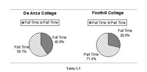
Table 3
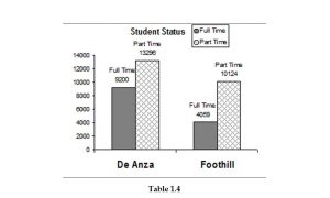
Table 4
Percentages That Add to More (or Less) Than 100%
Sometimes percentages add up to be more than 100% (or less than 100%). In the graph, the percentages add to more than 100% because students can be in more than one category. A bar graph is appropriate to compare the relative size of the categories. A pie chart cannot be used. It also could not be used if the percentages added to less than 100%.
De Anza College Spring 2010
| Characteristic/Category | Percent |
| Full-time Students | 40.9% |
| Students who intend to transfer to a 4-year educational institution | 48.6% |
| Students under age 25 | 61.0% |
| TOTAL | 150.5% |
Table 5
Omitting Categories/Missing Data
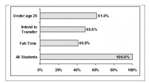
Table 6
The table displays Ethnicity of Students but is missing the “Other/Unknown” category. This category contains people who did not feel they fit into any of the ethnicity categories or declined to respond. Notice that the frequencies do not add up to the total number of students. Create a bar graph and not a pie chart.
Missing Data: Ethnicity of Students De Anza College Fall Term 2007 (Census Day)
| Frequency | Percent | |
| Asian | 8,794 | 36.1% |
| Black | 1,412 | 5.8% |
| Filipino | 1,298 | 5.3% |
| Hispanic | 4,180 | 17.1% |
| Native American | 146 | 0.6% |
| Pacific Islander | 236 | 1.0% |
| White | 5,978 | 24.5% |
| TOTAL | 22,044 out of 24,382 | 90.4% out of 100% |
Table 7
Bar graph Without Other/Unknown Category
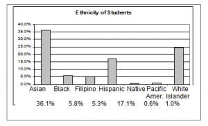
Table 8
The following graph is the same as the previous graph but the “Other/Unknown” percent (9.6%) has been added back in. The “Other/Unknown” category is large compared to some of the other categories (Native American, 0.6%, Pacific Islander 1.0% particularly). This is important to know when we think about what the data are telling us.
This particular bar graph can be hard to understand visually. The graph below it is a Pareto chart. The Pareto chart has the bars sorted from largest to smallest and is easier to read and interpret.
Bar Graph With Other/Unknown Category
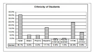
Table 9
Pareto Chart With Bars Sorted By Size
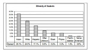
Table 10
Pie Charts: No Missing Data
The following pie charts have the “Other/Unknown” category added back in (since the percentages must add to 100%). The chart on the right is organized having the wedges by size and makes for a more visually informative graph than the unsorted, alphabetical graph on the left.
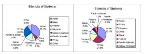
Table 11
Sampling
Gathering information about an entire population often costs too much or is virtually impossible. Instead, we use a sample of the population. A sample should have the same characteristics as the population it is representing. Most statisticians use various methods of random sampling in an attempt to achieve this goal. This section will describe a few of the most common methods.
There are several different methods of random sampling. In each form of random sampling, each member of a population initially has an equal chance of being selected for the sample. Each method has pros and cons. The easiest method to describe is called a simple random sample. Any group of n individuals is equally likely to be chosen by any other group of n individuals if the simple random sampling technique is used. In other words, each sample of the same size has an equal chance of being selected. For example, sup- pose Lisa wants to form a four-person study group (herself and three other people) from her pre-calculus class, which has 31 members not including Lisa. To choose a simple random sample of size 3 from the other members of her class, Lisa could put all 31 names in a hat, shake the hat, close her eyes, and pick out 3 names. A more technological way is for Lisa to first list the last names of the members of her class together with a two-digit number as shown below.
Class Roster
| ID | Name |
| 00 | Anselmo |
| 01 | Bautista |
| 02 | Bayani |
| 03 | Cheng |
| 04 | Cuarismo |
| 05 | Cuningham |
| 06 | Fontecha |
| 07 | Hong |
| 08 | Hoobler |
| 09 | Jiao |
| 10 | Khan |
| 11 | King |
| 12 | Legeny |
| 13 | Lundquist |
| 14 | Macierz |
| 15 | Motogawa |
| 16 | Okimoto |
| 17 | Patel |
| 18 | Price |
| 19 | Quizon |
| 20 | Reyes |
| 21 | Roquero |
| 22 | Roth |
| 23 | Rowell |
| 24 | Salangsang |
| 25 | Slade |
| 26 | Stracher |
| 27 | Tallai |
| 28 | Tran |
| 29 | Wai |
| 30 | Wood |
Table 12
Lisa can either use a table of random numbers (found in many statistics books as well as mathematical handbooks) or a calculator or computer to generate random numbers. For this example, suppose Lisa chooses to generate random numbers from a calculator. The numbers generated are:
.94360; .99832; .14669; .51470; .40581; .73381; .04399
Lisa reads two-digit groups until she has chosen three class members (that is, she reads .94360 as the groups 94, 43, 36, 60). Each random number may only contribute one class member. If she needed to, Lisa could have generated more random numbers.
The random numbers .94360 and .99832 do not contain appropriate two digit numbers. However the third random number, .14669, contains 14 (the fourth random number also contains 14), the fifth random number contains 05, and the seventh random number contains 04. The two-digit number 14 corresponds to Macierz, 05 corresponds to Cunningham, and 04 corresponds to Cuarismo. Besides herself, Lisa’s group will consist of Marcierz, and Cunningham, and Cuarismo.
Besides simple random sampling, there are other forms of sampling that involve a chance process for getting the sample. Other well-known random sampling methods are the stratified sample, the cluster sample, and the systematic sample.
To choose a stratified sample, divide the population into groups called strata and then take a proportionate number from each stratum. For example, you could stratify (group) your college population by department and then choose a proportionate simple random sample from each stratum (each department) to get a stratified random sample. To choose a simple random sample from each department, number each member of the first department, number each member of the second department and do the same for the remaining departments. Then use simple random sampling to choose proportionate numbers from the first department and do the same for each of the remaining departments. Those numbers picked from the first department, picked from the second department and so on represent the members who make up the stratified sample.
To choose a cluster sample, divide the population into clusters (groups) and then randomly select some of the clusters. All the members from these clusters are in the cluster sample. For example, if you randomly sample four departments from your college population, the four departments make up the cluster sample. For example, divide your college faculty by department. The departments are the clusters. Number each department and then choose four different numbers using simple random sampling. All members of the four departments with those numbers are the cluster sample.
To choose a systematic sample, randomly select a starting point and take every nth piece of data from a listing of the population. For example, suppose you have to do a phone survey. Your phone book contains 20,000 residence listings. You must choose 400 names for the sample. Number the population 1 – 20,000 and then use a simple random sample to pick a number that represents the first name of the sample. Then choose every 50th name thereafter until you have a total of 400 names (you might have to go back to the of your phone list). Systematic sampling is frequently chosen because it is a simple method.
A type of sampling that is nonrandom is convenience sampling. Convenience sampling involves using results that are readily available. For example, a computer software store conducts a marketing study by interviewing potential customers who happen to be in the store browsing through the available software. The results of convenience sampling may be very good in some cases and highly biased (favors certain outcomes) in others.
Sampling data should be done very carefully. Collecting data carelessly can have devastating results. Surveys mailed to households and then returned may be very biased (for example, they may favor a certain group). It is better for the person conducting the survey to select the sample respondents.
True random sampling is done with replacement. That is, once a member is picked that member goes back into the population and thus may be chosen more than once. However for practical reasons, in most populations, simple random sampling is done without replacement. Surveys are typically done without replacement. That is, a member of the population may be chosen only once. Most samples are taken from large populations and the sample tends to be small in comparison to the population. Since this is the case,sampling without replacement is approximately the same as sampling with replacement because the chance of picking the same individual more than once using with replacement is very low.
For example, in a college population of 10,000 people, suppose you want to randomly pick a sample of 1000 for a survey. For any particular sample of 1000, if you are sampling with replacement,
• the chance of picking the first person is 1000 out of 10,000 (0.1000);
• the chance of picking a different second person for this sample is 999 out of 10,000 (0.0999);
• the chance of picking the same person again is 1 out of 10,000 (very low).
If you are sampling without replacement,
• the chance of picking the first person for any particular sample is 1000 out of 10,000 (0.1000);
• the chance of picking a different second person is 999 out of 9,999 (0.0999);
• you do not replace the first person before picking the next person.
Compare the fractions 999/10,000 and 999/9,999. For accuracy, carry the decimal answers to 4 place decimals. To 4 decimal places, these numbers are equivalent (0.0999).
Sampling without replacement instead of sampling with replacement only becomes a mathematics issue when the population is small which is not that common. For example, if the population is 25 people, the sample is 10 and you are sampling with replacement for any particular sample, the chance of picking the first person is 10 out of 25 and a different second person is 9 out of 25 (you replace the first person).
If you sample without replacement, the chance of picking the first person is 10 out of 25 and then the second person (which is different) is 9 out of 24 (you do not replace the first person).
Compare the fractions 9/25 and 9/24. To 4 decimal places, 9/25 = 0.3600 and 9/24 = 0.3750. To 4 decimal places, these numbers are not equivalent.
When you analyze data, it is important to be aware of sampling errors and nonsampling errors. The actual process of sampling causes sampling errors. For example, the sample may not be large enough. Factors not related to the sampling process cause nonsampling errors. A defective counting device can cause a nonsampling error.
In reality, a sample will never be exactly representative of the population so there will always be some sampling error. As a rule, the larger the sample, the smaller the sampling error.
In statistics, a sampling bias is created when a sample is collected from a population and some members of the population are not as likely to be chosen as others (remember, each member of the population should have an equally likely chance of being chosen). When a sampling bias happens, there can be incorrect conclusions drawn about the population that is being studied.
Example 6
Determine the type of sampling used (simple random, stratified, systematic, cluster, or convenience).
1. A soccer coach selects 6 players from a group of boys aged 8 to 10, 7 players from a group of boys aged 11 to 12, and 3 players from a group of boys aged 13 to 14 to form a recreational soccer team.
2. A pollster interviews all human resource personnel in five different high tech companies.
3. A high school educational researcher interviews 50 high school female teachers and 50 high school male teachers.
4. A medical researcher interviews every third cancer patient from a list of cancer patients at a local hospital.
5. A high school counselor uses a computer to generate 50 random numbers and then picks students whose names correspond to the numbers.
6. A student interviews classmates in his algebra class to determine how many pairs of jeans a student owns, on the average.
If we were to examine two samples representing the same population, even if we used random sampling methods for the samples, they would not be exactly the same. Just as there is variation in data, there is variation in samples. As you become accustomed to sampling, the variability will seem natural.
Example 7
Suppose ABC College has 10,000 part-time students (the population). We are interested in the average amount of money a part-time student spends on books in the fall term. Asking all 10,000 students is an almost impossible task.
Suppose we take two different samples.
First, we use convenience sampling and survey 10 students from a first term organic chemistry class. Many of these students are taking first term calculus in addition to the organic chemistry class . The amount of money they spend is as follows:
$128; $87; $173; $116; $130; $204; $147; $189; $93; $153
The second sample is taken by using a list from the P.E. department of senior citizens who take
P.E. classes and taking every 5th senior citizen on the list, for a total of 10 senior citizens. They spend:
$50; $40; $36; $15; $50; $100; $40; $53; $22; $22
Problem 1
Do you think that either of these samples is representative of (or is characteristic of) the entire 10,000 part-time student population?
Solution
No. The first sample probably consists of science-oriented students. Besides the chemistry course, some of them are taking first-term calculus. Books for these classes tend to be expensive. Most of these students are, more than likely, paying more than the average part-time student for their books. The second sample is a group of senior citizens who are, more than likely, taking courses for health and interest. The amount of money they spend on books is probably much less than the average part-time student. Both samples are biased. Also, in both cases, not all students have a chance to be in either sample.
Problem 2
Since these samples are not representative of the entire population, is it wise to use the results to describe the entire population?
Solution
No. For these samples, each member of the population did not have an equally likely chance of being chosen.
Now, suppose we take a third sample. We choose ten different part-time students from the dis- ciplines of chemistry, math, English, psychology, sociology, history, nursing, physical education, art, and early childhood development. (We assume that these are the only disciplines in which part-time students at ABC College are enrolled and that an equal number of part-time students are enrolled in each of the disciplines.) Each student is chosen using simple random sampling. Using a calculator, random numbers are generated and a student from a particular discipline is selected if he/she has a corresponding number. The students spend:
$180; $50; $150; $85; $260; $75; $180; $200; $200; $150
Problem 3
Is the sample biased?
Solution
The sample is unbiased, but a larger sample would be recommended to increase the likelihood that the sample will be close to representative of the population. However, for a biased sampling technique, even a large sample runs the risk of not being representative of the population.
Students often ask if it is “good enough” to take a sample, instead of surveying the entire population. If the survey is done well, the answer is yes.
Variation
Variation in Data
Variation is present in any set of data. For example, 16-ounce cans of beverage may contain more or less than 16 ounces of liquid. In one study, eight 16 ounce cans were measured and produced the following amount (in ounces) of beverage:
15.8; 16.1; 15.2; 14.8; 15.8; 15.9; 16.0; 15.5
Measurements of the amount of beverage in a 16-ounce can may vary because different people make the measurements or because the exact amount, 16 ounces of liquid, was not put into the cans. Manufacturers regularly run tests to determine if the amount of beverage in a 16-ounce can falls within the desired range.
Be aware that as you take data, your data may vary somewhat from the data someone else is taking for the same purpose. This is completely natural. However, if two or more of you are taking the same data and get very different results, it is time for you and the others to reevaluate your data-taking methods and your accuracy.
Variation in Samples
It was mentioned previously that two or more samples from the same population, taken randomly, and having close to the same characteristics of the population are different from each other. Suppose Doreen and Jung both decide to study the average amount of time students at their college sleep each night. Doreen and Jung each take samples of 500 students. Doreen uses systematic sampling and Jung uses cluster sampling. Doreen’s sample will be different from Jung’s sample. Even if Doreen and Jung used the same sampling method, in all likelihood their samples would be different. Neither would be wrong, however.
Think about what contributes to making Doreen’s and Jung’s samples different.
If Doreen and Jung took larger samples (i.e. the number of data values is increased), their sample results (the average amount of time a student sleeps) might be closer to the actual population average. But still, their samples would be, in all likelihood, different from each other. This variability in samples cannot be stressed enough.
Size of a Sample
The size of a sample (often called the number of observations) is important. The examples you have seen in this book so far have been small. Samples of only a few hundred observations, or even smaller, are sufficient for many purposes. In polling, samples that are from 1200 to 1500 observations are considered large enough and good enough if the survey is random and is well done. You will learn why when you study confidence intervals.
Be aware that many large samples are biased. For example, call-in surveys are invariable biased because people choose to respond or not.
Critical Evaluation
We need to critically evaluate the statistical studies we read about and analyze before accepting the results of the study. Common problems to be aware of include
1. Problems with Samples: A sample should be representative of the population. A sample that is not representative of the population is biased. Biased samples that are not representative of the population give results that are inaccurate and not valid.
2. Self-Selected Samples: Responses only by people who choose to respond, such as call-in surveys are often unreliable.
3. Sample Size Issues: Samples that are too small may be unreliable. Larger samples are better if possible. In some situations, small samples are unavoidable and can still be used to draw conclusions, even though larger samples are better. Examples: Crash testing cars, medical testing for rare conditions.
4. Undue influence: Collecting data or asking questions in a way that influences the response.
5. Non-response or refusal of subject to participate: The collected responses may no longer be representative of the population. Often, people with strong positive or negative opinions may answer surveys, which can affect the results.
6. Causality: A relationship between two variables does not mean that one causes the other to occur. They may both be related (correlated) because of their relationship through a different variable.
7. Self-Funded or Self-Interest Studies: A study performed by a person or organization in order to sup- port their claim. Is the study impartial? Read the study carefully to evaluate the work. Do not automatically assume that the study is good but do not automatically assume the study is bad either. Evaluate it on its merits and the work done.
8. Misleading Use of Data: Improperly displayed graphs, incomplete data, lack of context. Confounding: When the effects of multiple factors on a response cannot be separated. Confounding makes it difficult or impossible to draw valid conclusions about the effect of each factor.
Answers and Rounding Off
A simple way to round off answers is to carry your final answer one more decimal place than was present in the original data. Round only the final answer. Do not round any intermediate results, if possible. If it becomes necessary to round intermediate results, carry them to at least twice as many decimal places as the final answer. For example, the average of the three quiz scores 4, 6, 9 is 6.3, rounded to the nearest tenth, because the data are whole numbers. Most answers will be rounded in this manner.
It is not necessary to reduce most fractions in this course. Especially in Probability Topics (Section 3.1), the chapter on probability, it is more helpful to leave an answer as an unreduced fraction.
Frequency
Twenty students were asked how many hours they worked per day. Their responses, in hours, are listed below:
5; 6; 3; 3; 2; 4; 7; 5; 2; 3; 5; 6; 5; 4; 4; 3; 5; 2; 5; 3
Below is a frequency table listing the different data values in ascending order and their frequencies.
Frequency Table of Student Work Hours
| DATA VALUE | FREQUENCY |
| 2 | 3 |
| 3 | 5 |
| 4 | 3 |
| 5 | 6 |
| 6 | 2 |
| 7 | 1 |
Table 15
A frequency is the number of times a given datum occurs in a data set. According to the table above, there are three students who work 2 hours, five students who work 3 hours, etc. The total of the frequency column, 20, represents the total number of students included in the sample.
A relative frequency is the fraction or proportion of times an answer occurs. To find the relative frequencies, divide each frequency by the total number of students in the sample – in this case, 20. Relative frequencies can be written as fractions, percents, or decimals.
Frequency Table of Student Work Hours w/ Relative Frequency
| DATA VALUE | FREQUENCY | RELATIVE FREQUENCY |
| 2 | 3 | 3/20 or 0.15 |
| 3 | 5 | 5/20 or 0.25 |
| 4 | 3 | 3/20 or 0.15 |
| 5 | 6 | 6/20 or 0.30 |
| 6 | 2 | 2/20 or 0.10 |
| 7 | 1 | 1/20 or 0.05 |
Table 16
The sum of the relative frequency column is 20 , or 1.
Cumulative relative frequency is the accumulation of the previous relative frequencies. To find the cumulative relative frequencies, add all the previous relative frequencies to the relative frequency for the current row.
Frequency Table of Student Work Hours w/ Relative and Cumulative Relative Frequency
| DATA VALUE | FREQUENCY | RELATIVE FREQUENCY | CUMULATIVE RELATIVE FREQUENCY |
| 2 | 3 | 3/20 or 0.15 | 0.15 |
| 3 | 5 | 5/20 or 0.25 | 0.15 + 0.25 = 0.40 |
| 4 | 3 | 3/20 or 0.15 | 0.40 + 0.15 = 0.55 |
| 5 | 6 | 6/20 or 0.30 | 0.55 + 0.30 = 0.85 |
| 6 | 2 | 2/20 or 0.10 | 0.85 + 0.10 = 0.95 |
| 7 | 1 | 1/20 or 0.05 | 0.95 + 0.05 = 1.00 |
Table 17
The last entry of the cumulative relative frequency column is one, indicating that one hundred percent of the data has been accumulated.
NOTE: Because of rounding, the relative frequency column may not always sum to one and the last entry in the cumulative relative frequency column may not be one. However, they each should be close to one.
The following table represents the heights, in inches, of a sample of 100 male semiprofessional soccer players.
Frequency Table of Soccer Player Height
| HEIGHTS (INCHES) | FREQUENCY | RELATIVE FREQUENCY | CUMULATIVE RELATIVE FREQUENCY |
| 59.95 – 61.95 | 5 | 5 = 0.05
100 |
0.05 |
| 61.95 – 63.95 | 3 | 3 = 0.03
100 |
0.05 + 0.03 = 0.08 |
| 63.95 – 65.95 | 15 | 15 = 0.15
100 |
0.08 + 0.15 = 0.23 |
| 65.95 – 67.95 | 40 | 40 = 0.40
100 |
0.23 + 0.40 = 0.63 |
| 67.95 – 69.95 | 17 | 17 = 0.17
100 |
0.63 + 0.17 = 0.80 |
| 69.95 – 71.95 | 12 | 12 = 0.12
100 |
0.80 + 0.12 = 0.92 |
| 71.95 – 73.95 | 7 | 7 = 0.07
100 |
0.92 + 0.07 = 0.99 |
| 73.95 – 75.95 | 1 | 1 = 0.01
100 |
0.99 + 0.01 = 1.00 |
| Total = 100 | Total = 1.00 |
Table 18
The data in this table has been grouped into the following intervals:
• 59.95 – 61.95 inches
• 61.95 – 63.95 inches
• 63.95 – 65.95 inches
• 65.95 – 67.95 inches
• 67.95 – 69.95 inches
• 69.95 – 71.95 inches
• 71.95 – 73.95 inches
• 73.95 – 75.95 inches
In this sample, there are 5 players whose heights are between 59.95 – 61.95 inches, 3 players whose heights fall within the interval 61.95 – 63.95 inches, 15 players whose heights fall within the interval 63.95 – 65.95 inches, 40 players whose heights fall within the interval 65.95 – 67.95 inches, 17 players whose heights fall within the interval 67.95 – 69.95 inches, 12 players whose heights fall within the interval 69.95 – 71.95, 7 players whose height falls within the interval 71.95 – 73.95, and 1 player whose height falls within the interval 73.95 – 75.95. All heights fall between the endpoints of an interval and not at the endpoints.
Example 8
From the table, find the percentage of heights that are less than 65.95 inches.
Solution
If you look at the first, second, and third rows, the heights are all less than 65.95 inches. There are 5 + 3 + 15 = 23 males whose heights are less than 65.95 inches. The percentage of heights less than 65.95 inches is then 23 or 23%. This percentage is the cumulative relative frequency entry in the third row.
Example 9
From the table, find the percentage of heights that fall between 61.95 and 65.95 inches.
Solution
Add the relative frequencies in the second and third rows: 0.03 + 0.15 = 0.18 or 18%.
Example 10
Use the table of heights of the 100 male semiprofessional soccer players. Fill in the blanks and check your answers.
1. The percentage of heights that are from 67.95 to 71.95 inches is:
2. The percentage of heights that are from 67.95 to 73.95 inches is:
3. The percentage of heights that are more than 65.95 inches is:
4. The number of players in the sample who are between 61.95 and 71.95 inches tall is:
5. What kind of data are the heights?
6. Describe how you could gather this data (the heights) so that the data are characteristic of all male semiprofessional soccer players.
Remember, you count frequencies. To find the relative frequency, divide the frequency by the total number of data values. To find the cumulative relative frequency, add all of the previous relative frequencies to the relative frequency for the current row.
Example 11
Nineteen people were asked how many miles, to the nearest mile they commute to work each day. The data are as follows:
2; 5; 7; 3; 2; 10; 18; 15; 20; 7; 10; 18; 5; 12; 13; 12; 4; 5; 10
The following table was produced:
Frequency of Commuting Distances
| DATA | FREQUENCY | RELATIVE FREQUENCY | CUMULATIVE RELATIVE FREQUENCY |
| 3 | 3 | 3
19 |
0.1579 |
| 4 | 1 | 1
19 |
0.2105 |
| 5 | 3 | 3
19 |
0.1579 |
| 7 | 2 | 2
19 |
0.2632 |
| 10 | 3 | 4
19 |
0.4737 |
| 12 | 2 | 2
19 |
0.7895 |
| 13 | 1 | 1
19 |
0.8421 |
| 15 | 1 | 1
19 |
0.8948 |
| 18 | 1 | 1
19 |
0.9474 |
| 20 | 1 | 1
19 |
1.0000 |
Table 19
Problem
1. Is the table correct? If it is not correct, what is wrong?
2. True or False: Three percent of the people surveyed commute 3 miles. If the statement is not correct, what should it be? If the table is incorrect, make the corrections.
3. What fraction of the people surveyed commute 5 or 7 miles?
4. What fraction of the people surveyed commute 12 miles or more? Less than 12 miles? Between 5 and 13 miles (does not include 5 and 13 miles)?
Summary
Statistics
• Deals with the collection, analysis, interpretation, and presentation of data
Probability
• Mathematical tool used to study randomness
Key Terms
• Population
• Parameter
• Sample
• Statistic
• Variable
• Data
Types of Data
• Quantitative Data (a number)
· Discrete (You count it.)
· Continuous (You measure it.)
• Qualitative Data (a category, words)
Sampling
• With Replacement: A member of the population may be chosen more than once
• Without Replacement: A member of the population may be chosen only once
Random Sampling
• Each member of the population has an equal chance of being selected
Sampling Methods
• Random
· Simple random sample
· Stratified sample
· Cluster sample
· Systematic sample
• Not Random
· Convenience sample
Frequency (freq. or f)
• The number of times an answer occurs
Relative Frequency (rel. freq. or RF)
• The proportion of times an answer occurs
• Can be interpreted as a fraction, decimal, or percent
Cumulative Relative Frequencies (cum. rel. freq. or cum RF)
An accumulation of the previous relative frequencies
10This content is available online at <http://cnx.org/content/m16023/1.10/>.
Media Attributions
- Table1_3 © Barbar Illewosky, Susan Dean is licensed under a CC BY (Attribution) license
- Table1_4
- Table1_6
- Table1_8
- Table1_9
- Table1_10
- Table1_11
