Course Design Standards
Category: Web Presentation (Format and Layout)
Content is presented in a way that allows learners to access the information without complication. Avoid overly complex sentences and jargon, and provide a clear layout and design.
Standard B2: Scanning and understanding
Description
The layout of page content supports scanning and understanding. Content must be easy to follow and understand for many learners. For most content, this means avoiding complex sentences and jargon and providing a clear layout and design. Scanning helps learners quickly find the information they are seeking.
DEI Application
People with some cognitive, language, and learning disabilities and some low vision users cannot perceive text or lose their reading place if there is too much information on a page or the information is complex. Also, people who are not fluent in English or who are not familiar with the topic also benefit from content that is easy to understand.
Example
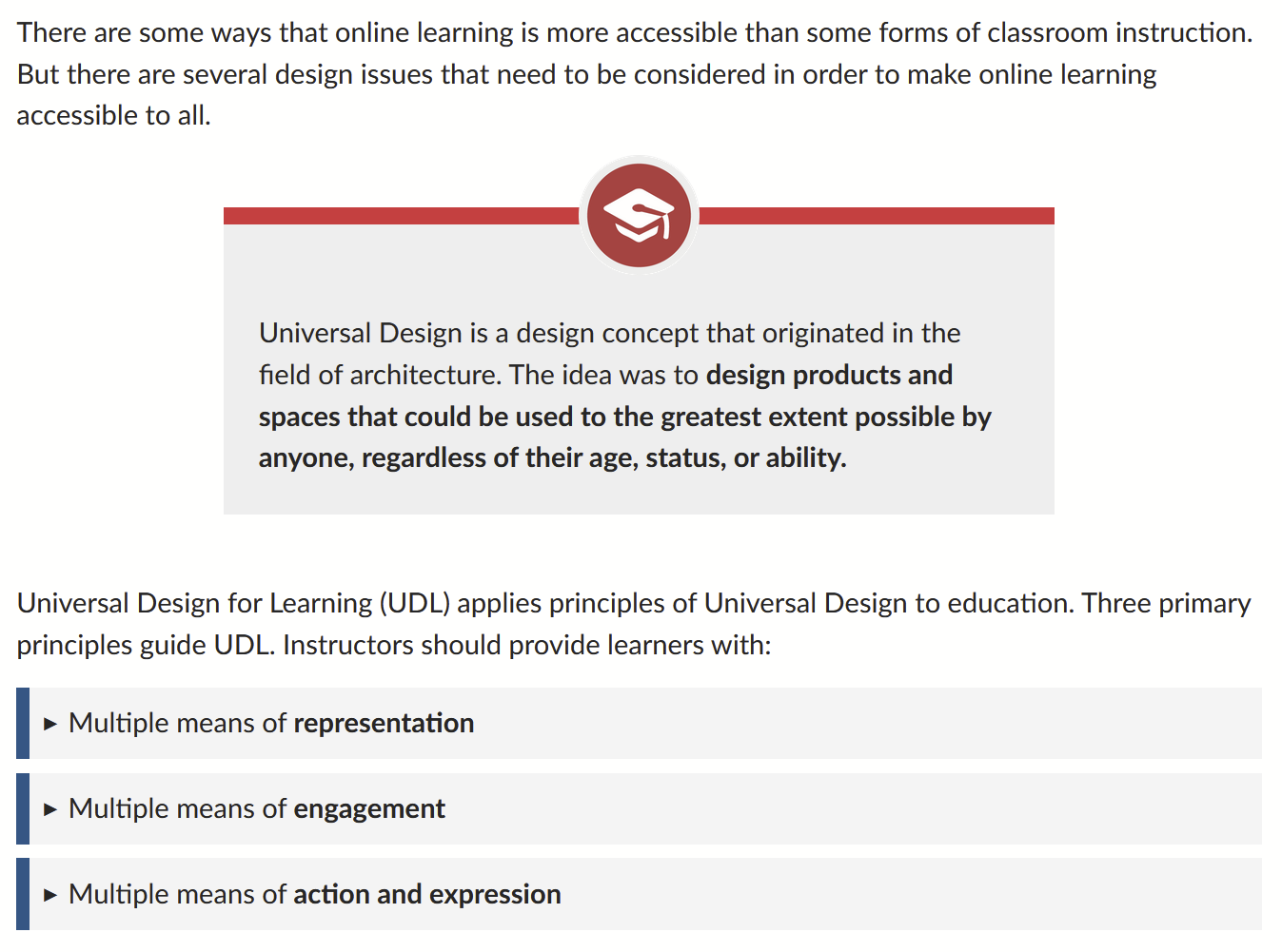
An example page from EarlyEdU Teaching Online course uses an icon and background color to highlight the definition of universal design, an important concept in the course. The page also uses a component that allows learners to hide-and-reveal content about three universal design for learning principles. The page layout presents important content about UDL using icons, color, spacing, and interaction components without overwhelming the learner with text.


